Code
library(tidyverse)
library(tsibble)
library(slider)
library(PNWColors)

bookPal <- pnw_palette("Sunset2", n = 5, type = "discrete")Most of the statistics you have learned so far assume your observations don’t care about their neighbors. Shuffle the rows of a data frame and nothing important changes. A time series breaks that assumption on purpose. The order is the data. One of the stranger facts about the universe is that time runs in one direction, and that arrow shows up in our numbers: today depends on yesterday, this month’s average temperature is similar to last month’s temperature, and you cannot shuffle the rows without destroying exactly what you set out to study. Everything else in this book follows from taking that. But before any of the interesting parts, we have to clear a mundane hurdle that trips up almost everyone: telling the computer when each observation happened.
We will use the tidyverse (Wickham 2023) for wrangling and plotting, tsibble (Wang et al. 2020) to store time series as tidy tables, lubridate for working with dates, slider (Vaughan 2025) for moving averages, and PNWColors (Lawlor 2020) for the book’s figure colors. Install them if you haven’t (e.g. install.packages(c("tidyverse", "tsibble", "slider", "PNWColors")); lubridate is part of the tidyverse).
library(tidyverse)
library(tsibble)
library(slider)
library(PNWColors)
bookPal <- pnw_palette("Sunset2", n = 5, type = "discrete")It is worth keeping your R installation and your packages reasonably current. A good habit is to run update.packages(ask = FALSE) from a fresh session every week or two. Fresh means nothing loaded yet, so restart R first (in RStudio, Session then Restart R).
A time series is a sequence of observations indexed in time order, usually taken at evenly spaced intervals. That short definition carries three ideas worth pulling apart. The observations come in a sequence, one after another. They are indexed by time, so each value is tied to a when. And the spacing is usually regular, one per day or month or year, though we will meet irregular series too.
We will write a series as \(y_t\), the value \(y\) observed at time \(t\). For a regular series the index just counts the steps, so the gap between consecutive times is always one: \(t_i - t_{i-1} = 1\). That is the whole notation. The conceptual part is easy. The part that actually slows people down is bookkeeping. Are the observations at arbitrary steps, or actual calendar dates? How do we handle leap days, or time zones? And how does the computer even store a date? We will spend this chapter getting comfortable enough with that bookkeeping to get our data into R and start working. The deeper mechanics, how R stores a date as a number, how it copes with time zones and daylight saving, and how climate-model calendars can quietly corrupt a time axis, are their own rabbit hole. I have put them in the aside on dates and times so they do not derail us here. The rest of the book is about the data, not the plumbing.
We’ll start with daily weather from the Bellingham airport. Weather data are straightforward. Everybody likes to talk about the weather after all. The file comes with the book; for where it comes from and how to refresh it, see the data appendix. For now we just read it.
kbli <- read_csv("data/kbli.csv")
glimpse(kbli)
Rows: 9,667
Columns: 4
$ DATE <date> 2000-01-01, 2000-01-02, 2000-01-03, 2000-01-04, 2000-01-05, 2000…
$ TMAX <dbl> 6.7, 4.4, 8.9, 9.4, 6.7, 5.6, 8.3, 8.3, 6.1, 3.9, 3.3, 4.4, 5.6, …
$ TMIN <dbl> 1.7, 0.0, 0.0, 3.9, 1.7, 1.1, 5.0, 1.7, 2.2, 0.0, 0.0, 0.6, 0.0, …
$ PRCP <dbl> 4.3, 1.3, 8.4, 0.5, 0.0, 4.1, 3.8, 4.1, 6.6, 4.3, 3.6, 3.0, 0.0, …Four columns: a date, the day’s high and low temperature in Celsius, and precipitation in millimeters. There is no daily mean temperature in the file, so let’s build one the standard way, as the midpoint of the high and the low. This is also your first reminder that a time series is, before anything else, data, and you wrangle it with the same tidyverse verbs you already know.
kbli <- kbli |> mutate(TEMP = (TMAX + TMIN) / 2)So far this is an ordinary tibble (a fancy data frame). To tell R that these data are an actual time series, we turn it into a tsibble and name the column that holds the time index.
kbliTs <- as_tsibble(kbli, index = DATE)
kbliTs
# A tsibble: 9,667 x 5 [1D]
DATE TMAX TMIN PRCP TEMP
<date> <dbl> <dbl> <dbl> <dbl>
1 2000-01-01 6.7 1.7 4.3 4.2
2 2000-01-02 4.4 0 1.3 2.2
3 2000-01-03 8.9 0 8.4 4.45
4 2000-01-04 9.4 3.9 0.5 6.65
5 2000-01-05 6.7 1.7 0 4.2
6 2000-01-06 5.6 1.1 4.1 3.35
7 2000-01-07 8.3 5 3.8 6.65
8 2000-01-08 8.3 1.7 4.1 5
9 2000-01-09 6.1 2.2 6.6 4.15
10 2000-01-10 3.9 0 4.3 1.95
# ℹ 9,657 more rowsLook at what the header tells you. It says [1D], meaning the data step one day at a time, and it found that out from the DATE column. That visible index is the reason we lead with the tsibble. The time is a column you can see, sitting right there in the table next to everything else. You can filter it, mutate it, group_by other columns, and pipe it into ggplot, exactly as you would any tibble. Nothing new to learn, except that one column is special.
Now a picture. We have temperature and precipitation, so this is a multivariate series, and the cleanest way to show both is to reshape to long form and facet.
kbliTs |>
  pivot_longer(c(TEMP, PRCP), names_to = "variable", values_to = "value") |>
  mutate(variable = recode_values(variable,
    "TEMP" ~ "Mean temperature (°C)",
    "PRCP" ~ "Precipitation (mm)")) |>
  ggplot(aes(x = DATE, y = value)) +
  geom_line(linewidth = 0.2) +
  facet_wrap(~variable, ncol = 1, scales = "free_y") +
  labs(x = NULL, y = NULL, title = "Daily weather at Bellingham airport") +
  theme_minimal()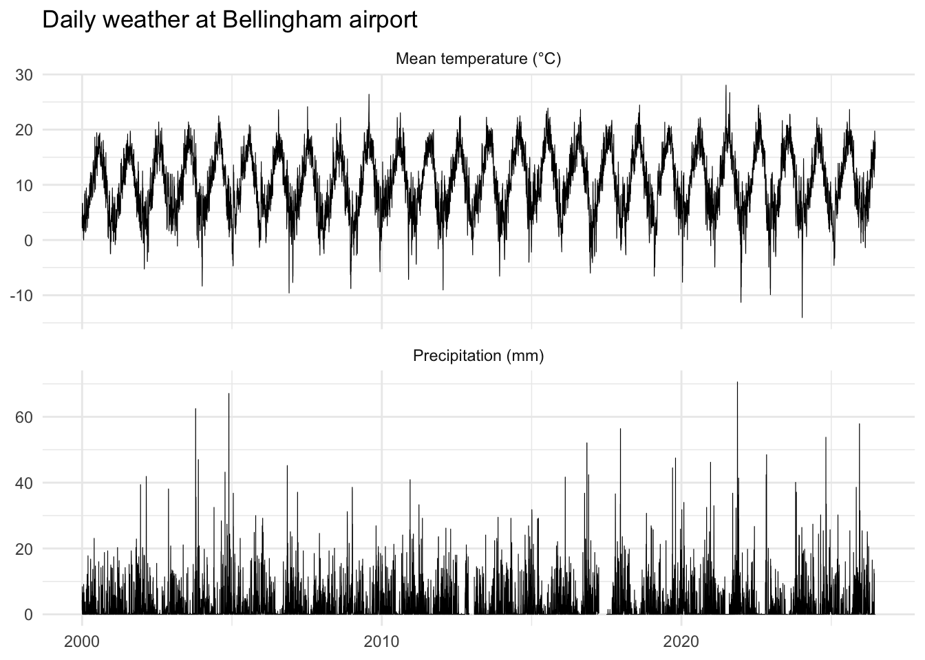
The seasonal swing in temperature jumps out, and the precipitation is the spiky, wet-winter pattern anyone who has lived in the Pacific Northwest will recognize. That is the signal we will spend the book learning to pull apart.
Before we do anything clever let’s just explore the data. A time series is still a column of numbers, and everything you would normally do to describe a variable still applies. The summary is a fine start, but I always want to see the shape of a variable too.
summary(kbli$TEMP) Min. 1st Qu. Median Mean 3rd Qu. Max. NA's
-14.05 6.15 10.30 10.39 15.00 28.05 13 This gives a standard summary and we can there are some missing values in there. More on that later.
Here is a histogram of the daily mean temperature with a normal curve laid over it, so we can eyeball how close to normal it is.
kbli |>
  ggplot(aes(x = TEMP)) +
  geom_histogram(aes(y = after_stat(density)), bins = 30,
    fill = bookPal[1], color = "white") +
  stat_function(fun = dnorm,
    args = list(mean = mean(kbli$TEMP, na.rm = TRUE),
      sd = sd(kbli$TEMP, na.rm = TRUE)),
    color = bookPal[5], linewidth = 1) +
  labs(x = "Daily mean temperature (C)", y = "Density") +
  theme_minimal()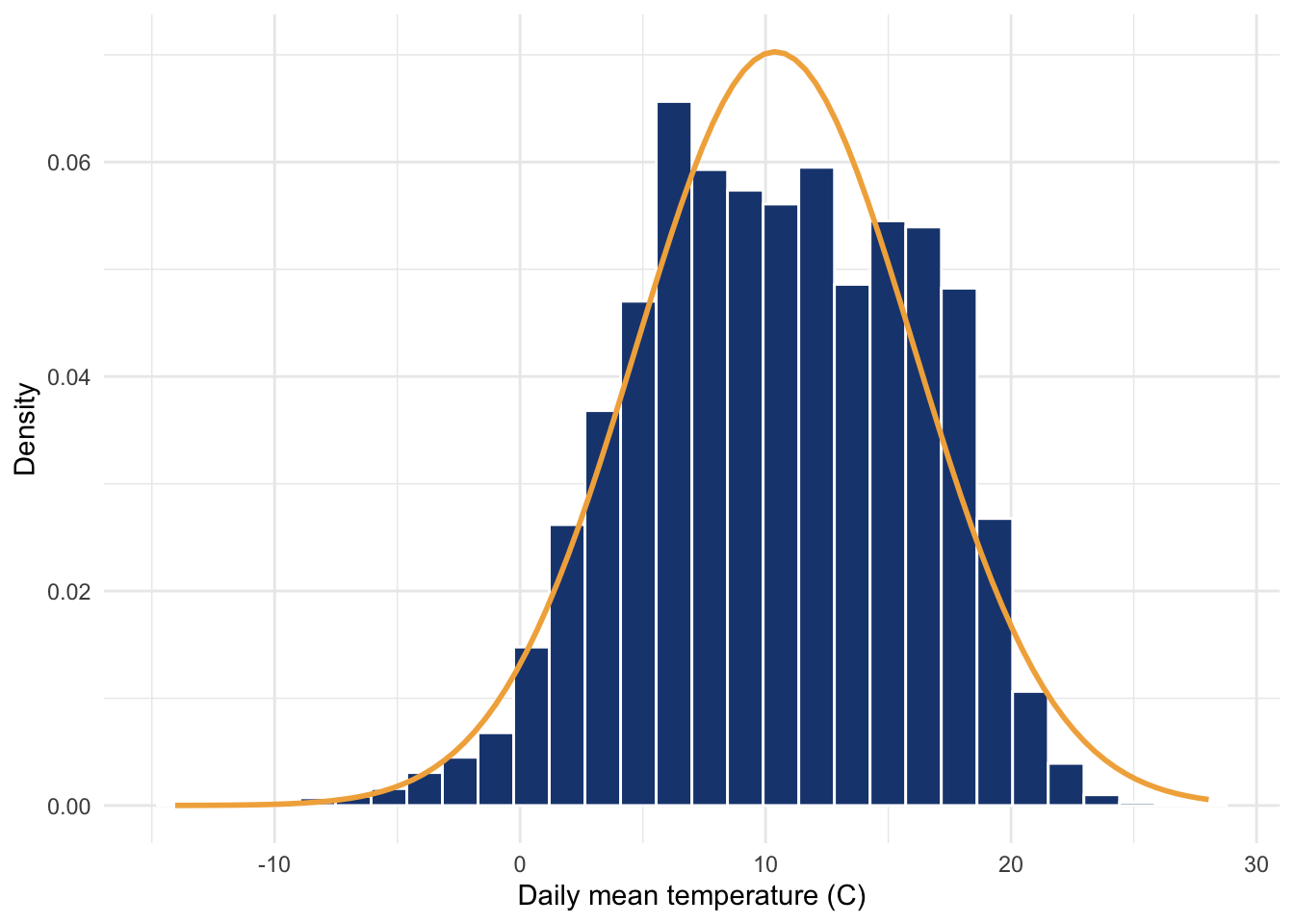
Daily temperature is a little flatter and more lopsided than a normal curve, which makes sense once you remember that this is a mixture of cold winters and warm summers stacked on top of each other. There are formal tests of normality, and resampling tricks too, but here is the single most useful habit I can give you. Plot your data. Plot your data. Plot your data. Statistical significance is a bit like what Justice Potter Stewart said about a harder-to-define thing: you know it when you see it. Other views are worth a look as well, like the empirical distribution (ecdf) or a normal QQ plot (qqnorm), but the histogram is enough to make the point.
A small sanity check. A long station record often has holes, and this one is no exception.
has_gaps(kbliTs)# A tibble: 1 × 1
.gaps
<lgl>
1 TRUE There are. Which days?
count_gaps(kbliTs)# A tibble: 2 × 3
.from .to .n
<date> <date> <int>
1 2006-06-29 2006-06-29 1
2 2012-02-28 2012-02-28 1Two days. But read that carefully, because count_gaps finds missing rows, days that are absent from the table entirely. The station logged nothing, so there is no row to hold an NA. The day simply isn’t there. That is the kind of hole ordinary tools sail past, because there is nothing to trip over, and it is exactly what the tsibble’s regular [1D] index lets it catch.
That is not the only way data go missing, and here it is not even the common one. A row can be present and still carry an NA where a measurement should be. Those we count directly:
kbliTs |>
  as_tibble() |>
  summarise(across(c(TMAX, TMIN, PRCP, TEMP), \(x) sum(is.na(x))))
# A tibble: 1 × 4
TMAX TMIN PRCP TEMP
<int> <int> <int> <int>
1 11 11 167 13Two missing rows, but 167 missing precipitation values. And they do not fall evenly across the record:
missingPrcp <- kbli |> filter(is.na(PRCP))

kbliTs |>
  ggplot(aes(DATE, PRCP)) +
  geom_vline(data = missingPrcp, aes(xintercept = DATE),
    colour = bookPal[1], alpha = 0.6, linewidth = 0.5) +
  geom_line(linewidth = 0.2, na.rm = TRUE) +
  labs(x = NULL, y = "Precipitation (mm)",
    title = "Daily precipitation; navy marks days with no measurement") +
  theme_minimal()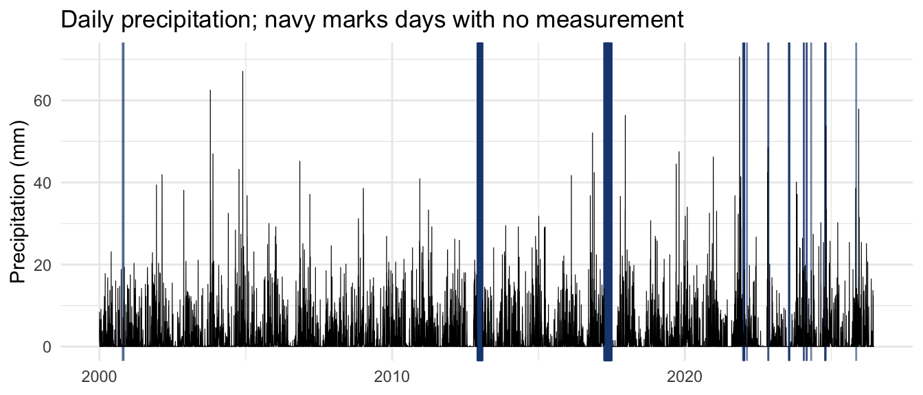
The navy bands are gauge outages, not dry spells. The rain gauge went quiet for most of December 2012 into January 2013, and again from April through June of 2017. A missing value and a recorded zero look identical on a careless plot, and treating one as the other will bias anything you compute. So a series can be missing data two ways: a row that isn’t there, and a value that is NA. The tsibble’s index catches the first, a plain count catches the second, and a long station record usually has some of both. We will leave them alone for now and come back to handling missing data later, in the filters chapter.
Daily data is not always the scale you want to think at. Often you want a season, or a monthly value, or an annual average. This is where treating time as a visible column pays off, because lubridate gives you functions that pull pieces out of a date.
Say we want only the summer months. The month function turns a date into its month number, and from there it is an ordinary filter.
summer <- kbliTs |> filter(month(DATE) %in% 6:8)That summer object now holds every June, July, and August day in the record, about 2,400 of them. A boxplot makes a nice summary of the three months, and if we jitter the raw days behind it we get the distribution and the summary in one picture. The boxplot gives the medians and spread; the cloud of points reminds us how much day-to-day variation those tidy boxes are hiding.
summer |>
  mutate(Month = month(DATE, label = TRUE)) |>
  ggplot(aes(x = Month, y = TEMP)) +
  geom_jitter(width = 0.2, alpha = 0.15, size = 0.5, color = bookPal[1]) +
  geom_boxplot(outlier.shape = NA, fill = NA, linewidth = 0.6) +
  labs(x = NULL, y = "Daily mean temperature (°C)",
    title = "Summer daily temperatures at Bellingham airport") +
  theme_minimal()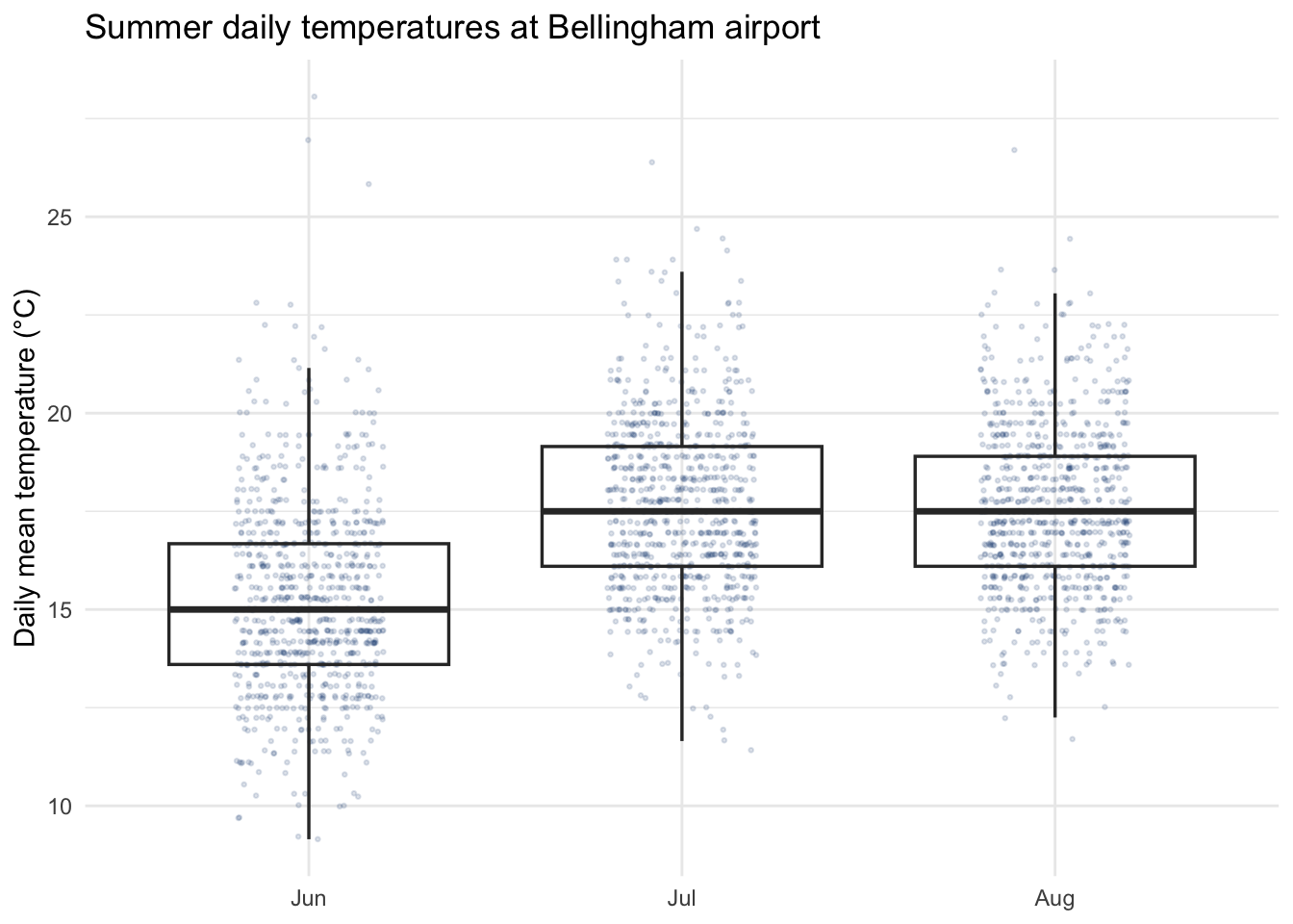
July and August run a touch warmer than June, but the overlap is enormous. Any single warm June day could pass for a cool August one. That spread is exactly the kind of thing a plot shows you and a table of monthly means hides.
More often you want to collapse the series to a coarser step, say a yearly mean. In the tidyverse you would reach for group_by and summarise. A tsibble has a time-aware version of that pair: index_by groups by a function of the time index, and summarise then collapses each group. Here we aggregate the daily data to an annual mean temperature. The last calendar year in the file is only partway done, so I drop it first to keep from averaging half a year against full ones.
annual <- kbliTs |>
  filter(year(DATE) < 2026) |>
  index_by(Year = ~ year(.)) |>
  summarise(TEMP = mean(TEMP, na.rm = TRUE))
head(annual)
# A tsibble: 6 x 2 [1Y]
Year TEMP
<dbl> <dbl>
1 2000 9.35
2 2001 9.54
3 2002 9.54
4 2003 10.4
5 2004 10.6
6 2005 10.1 The ~ year(.) is just shorthand for “apply year to the index,” and the new index steps one year at a time, as the [1Y] in the header confirms. The same move with yearmonth(.) would give you monthly means instead. That dropped partial year is a small thing, but it is the kind of small thing that quietly corrupts an analysis if you don’t catch it, which is reason enough to plot and inspect at every step.
One of the first questions anyone asks of a series like this is whether it is going anywhere. Is Bellingham warming? The workhorse answer is a linear model with time as the predictor, and because our annual tsibble carries Year as a plain column, the model is the same lm call you already know.
trendFit <- lm(TEMP ~ Year, data = annual)
coef(trendFit)
(Intercept) Year
-95.76176308 0.05275433 annual |>
ggplot(aes(x = Year, y = TEMP)) +
geom_line(color = "grey70") +
geom_point(color = "grey40", size = 2) +
geom_smooth(method = "lm", se = FALSE, color = bookPal[5]) +
labs(x = NULL, y = "Annual mean temperature (C)",
title = "Bellingham annual mean temperature, 2000-2025") +
theme_minimal()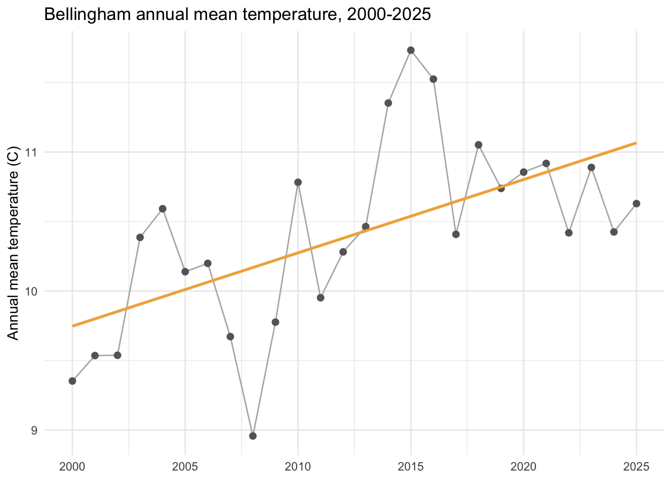
The slope comes out to about 0.053 degrees C per year, which is roughly half a degree per decade of local warming. Before you trust that number, a warning that the whole book is built around: fitting a straight line to a time series and reading off the slope is easy, but deciding whether to believe the slope is hard, because the observations are correlated through time and the usual standard errors assume they are not. We will come back and do this responsibly. For now, notice how little code it took, and stay a little suspicious of how clean it looks.
ts ClassThe tsibble is the main way we will work with time series data. But it is not the only way R stores a time series, and you will meet the other ways constantly. The oldest and most common is the ts class, built into base R. Most of R’s time-series functions speak ts, a great deal of older code and many packages return it, and almost every example you find online uses it. So we need to be on friendly terms.
R includes a pile of example datasets, and several are already ts objects. Lake Huron’s annual water level is a classic.
data(LakeHuron)
class(LakeHuron)
[1] "ts"plot(LakeHuron)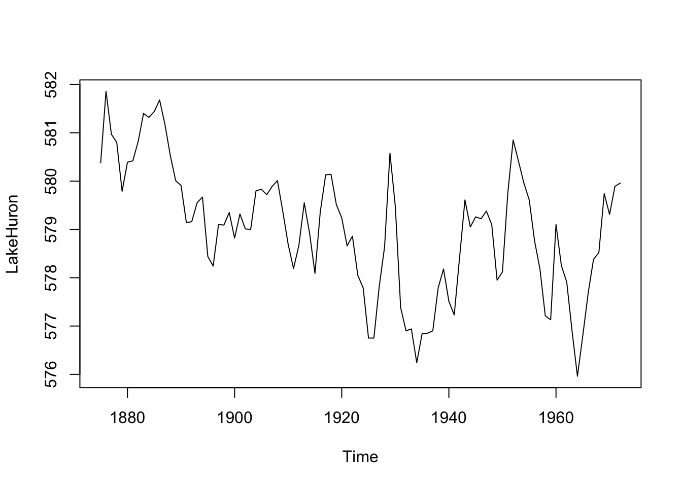
Notice we called plain plot and got a proper time-series plot with the years on the axis. That is because LakeHuron has class ts, and plot quietly dispatched to the ts plotting method, plot.ts. If that idea is fuzzy, the aside on methods and generics walks through it.
Here is where ts differs from a tsibble, and why folks find it slippery. The time index is not a column. It is not stored anywhere as values at all. Instead the object keeps three numbers, a start, an end, and a frequency, and computes the times on demand. You can see those three with tsp, which stands for time series properties. It is a useful function to reach for whenever you want to know what a ts object thinks it is.
tsp(LakeHuron)[1] 1875 1972 1That says the series starts in 1875, ends in 1972, and has one observation per unit of time. The actual time values are generated when you ask for them.
head(time(LakeHuron))Time Series:
Start = 1875
End = 1880
Frequency = 1
[1] 1875 1876 1877 1878 1879 1880It is tempting to read this as a wart, some old hack to save memory. There is a grain of truth there. The ts class comes from S, the Bell Labs language R is built on, born in the late 1970s when memory was scarce, and keeping three numbers instead of a full column of times did save space.
But that is the smaller half of it. For a regular series, the time of observation \(i\) is exactly start + (i-1)/frequency. The times are not something you measured. They are determined by two numbers, so storing them in a column would be writing the same information down over and over. Seen that way, ts has the representation right, and it is the explicit-index approach that is redundant.
The price is the word regular. Because the index is computed from a frequency, ts can represent only the perfectly even case. No calendar dates, no time zones, no leap days, no gaps, no irregular sampling. That is most environmental data, and it is why zoo, xts, and tsibble all pay to store an explicit index instead. There is no formula that recovers a missing day or a daylight-saving jump from a start and a frequency.
The catch is that frequency is just a number, and ts will believe whatever you tell it. Watch what happens when we build a few series with the same data but different frequencies and ask what times they imply.
n <- 24
good  <- ts(rnorm(n), start = 2000, frequency = 12)   # monthly
silly <- ts(rnorm(n), start = 2000, frequency = 0.1)  # ?
head(time(good))
Jan Feb Mar Apr May Jun
2000 2000.000 2000.083 2000.167 2000.250 2000.333 2000.417head(time(silly))Time Series:
Start = 2000
End = 2050
Frequency = 0.1
[1] 2000 2010 2020 2030 2040 2050With frequency = 12 the times come out as months, which is what we wanted. With frequency = 0.1 the times march along in steps of ten, so R thinks each observation is a decade apart. The data are identical. Only the bookkeeping changed, and nothing warned us. That fragility, an index you cannot see and cannot trust without checking, is exactly why we keep our data in a tsibble, where the time is a column you can read.
None of this means you should avoid ts. You can’t, and you shouldn’t want to. The fix is to keep your data in a tsibble and convert to ts only at the moment a function demands it. The bridge runs both ways.
# a ts object becomes a tidy tsibble
lakeTs <- as_tsibble(LakeHuron)
lakeTs
# A tsibble: 98 x 2 [1Y]
index value
<dbl> <dbl>
1 1875 580.
2 1876 582.
3 1877 581.
4 1878 581.
5 1879 580.
6 1880 580.
7 1881 580.
8 1882 581.
9 1883 581.
10 1884 581.
# ℹ 88 more rows# and a tsibble can go back to ts when a base function needs it
head(as.ts(annual))Time Series:
Start = 2000
End = 2005
Frequency = 1
[1] 9.352322 9.535302 9.537500 10.385714 10.591803 10.138767A second example shows how much work that little frequency number is doing for you. R’s co2 dataset is the monthly record of atmospheric carbon dioxide measured at Mauna Loa, the Keeling curve, running from 1959 to 1997. It is a ts object, so let’s print the first few years.
data(co2)
window(co2, end = c(1962, 12))
Jan Feb Mar Apr May Jun Jul Aug Sep Oct
1959 315.42 316.31 316.50 317.56 318.13 318.00 316.39 314.65 313.68 313.18
1960 316.27 316.81 317.42 318.87 319.87 319.43 318.01 315.74 314.00 313.68
1961 316.73 317.54 318.38 319.31 320.42 319.61 318.42 316.63 314.83 315.16
1962 317.78 318.40 319.53 320.42 320.85 320.45 319.45 317.25 316.11 315.27
Nov Dec
1959 314.66 315.43
1960 314.84 316.03
1961 315.94 316.85
1962 316.53 317.53That is not how a plain vector of numbers prints. Because the frequency is 12, the print method lays the series out as a grid, one row per year and one column per month, with the columns labeled January through December. The frequency we met earlier is not only feeding time(). The print and plot methods read it too. This is the same dispatch we saw with plot: typing co2 calls print.ts, which knows that a frequency of 12 means a calendar year of months and arranges the output to match.
The plot method uses the frequency the same way.
plot(co2, ylab = expression(CO[2] ~ (ppm)),
  main = "Monthly atmospheric CO2 at Mauna Loa")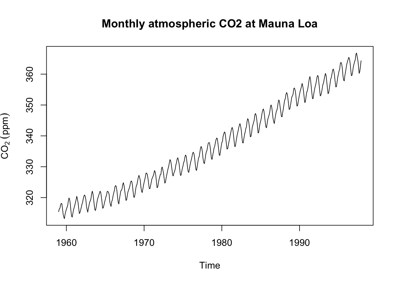
The steady climb is the Keeling curve, one of the most recognizable figures in science. The fuzz riding on top of it is the seasonal cycle, the planet breathing in and out once a year as Northern Hemisphere plants leaf out and die back. That annual wiggle is the twelve monthly values we just saw spelled out in the printed grid, now drawn instead of tabulated. Converting to a tsibble carries the calendar across, turning the implied months into an explicit yearmonth index.
as_tsibble(co2)# A tsibble: 468 x 2 [1M]
index value
<mth> <dbl>
1 1959 Jan 315.
2 1959 Feb 316.
3 1959 Mar 316.
4 1959 Apr 318.
5 1959 May 318.
6 1959 Jun 318
7 1959 Jul 316.
8 1959 Aug 315.
9 1959 Sep 314.
10 1959 Oct 313.
# ℹ 458 more rowsSo the plan for the whole book is simple. Keep your data in a tsibble, convert to ts only when a function asks for it, and never be surprised by either.
The mildly tedious look at the way data get stored above was the cost of getting started, and we are done with it. A time series is data with a clock attached: store it in a tsibble where the index is a column you can see, drop to ts at the door when a base function asks, and convert back. That is the whole data-handling story for the book, and we will not belabor it much again.
Underneath the plumbing are the ideas the rest of the book turns on. For instance, we fit a trend with lm and then refused to trust it, because the values are correlated through time and ordinary regression assumes they are not. That refusal is the entire book in miniature. The order of a time series carries information, each observation leans on its neighbors, and almost every tool you already own assumes they do not. Learning to measure that dependence, and to know when you are allowed to ignore it, is what these chapters are about. The next one begins by pulling a series apart into the pieces that create the dependence: the slow trend, the repeating season, and the noise left over.
These all use the kbli data you already have loaded, so no new files. They pick up where the body left off, with index_by and a linear trend, and push on two ideas we touched only lightly: that different variables call for different aggregation, and that a trend can hide inside a season.
In the body we aggregated temperature to an annual value with mean, because temperature is a state and the yearly number you want is a typical day. Precipitation is different. It is a flux that accumulates, so the natural annual summary is the total, not the average.
kbliTs, using index_by with sum instead of mean. Drop the partial final year first, the way we did for temperature, or your last total will be a half year masquerading as a full one.sum(PRCP, na.rm = TRUE) quietly treats a missing day as zero, so any year with flagged or missing days reads a little dry. How many such days are there, and does knowing that make you trust the trend more or less?A single annual mean can blur very different stories in different seasons. In much of the world winters are warming faster than summers, and we can check Bellingham.
filter on month(DATE) to pick the months, then aggregate by year as before.color to the season is one clean way to do it.If you want to be careful with the winter, December belongs with the January and February that follow it, not the ones from the same calendar year. Handling that properly is a good lubridate puzzle, but grouping by plain calendar year is fine for a first pass.
As a stretch on either exercise, add a five-year centered moving average with slide_dbl from slider to smooth the year-to-year noise and show the slower movement underneath. Look at its .before, .after, and .complete arguments.
tsibble belongs to. We borrow its data structures while keeping our own from-scratch approach to the methods.tsibble data structure, if you want the design thinking behind treating the time index as a column.lubridate, for when dates and times start fighting back.