Code
library(tidyverse)
library(PNWColors)
library(dplR)
library(waveslim)

bookPal <- pnw_palette("Sunset2", n = 5, type = "discrete")The last chapter ended on a warning: a periodogram assumes a series’s frequency content holds steady for the whole record, whatever cycles are there at the beginning are assumed to still be there at the end. Plenty of environmental signals don’t cooperate with that assumption. An animal’s activity cycle can shift with the seasons. A lake’s plankton bloom can drift earlier as the water warms. A tree’s dominant growth rhythm can change once it ages past its fastest-growing years. A climate teleconnection’s period can wander across decades. A periodogram will still run on data like that, and it will still hand back an answer, but the answer is a single spectrum averaged over the whole record, blind to when anything happened. Wavelets are the tool built to keep both questions open at once: what frequency, and when.
dplR (Bunn et al. 2026) supplies morlet() and wavelet.plot() for the continuous wavelet transform, built on the algorithm from Torrence and Compo (1998). waveslim (Whitcher 2024) supplies mra() for the discrete version. tidyverse (Wickham 2023) and PNWColors (Lawlor 2020) handle the planted demo.
library(tidyverse)
library(PNWColors)
library(dplR)
library(waveslim)
bookPal <- pnw_palette("Sunset2", n = 5, type = "discrete")Build a signal that changes its mind partway through: a period-10 cycle for the first 200 points, a period-30 cycle for the next 200, plus a little noise so it isn’t too tidy.
n <- 400
tm <- 1:n
switchPoint <- 200

switchDat <- tibble(tm = tm,
  signal = ifelse(tm <= switchPoint,
    sin(2 * pi * tm / 10),
    sin(2 * pi * tm / 30)) +
    rnorm(n, sd = 0.75))
# arima.sim(model=list(ar=0.1),n=n))

ggplot(switchDat, aes(tm, signal)) +
  geom_line(color = bookPal[1]) +
  geom_vline(xintercept = switchPoint, linetype = "dashed", color = "grey40") +
  labs(x = "Time", y = "Signal", title = "A period-10 cycle, then a period-30 cycle") +
  theme_minimal()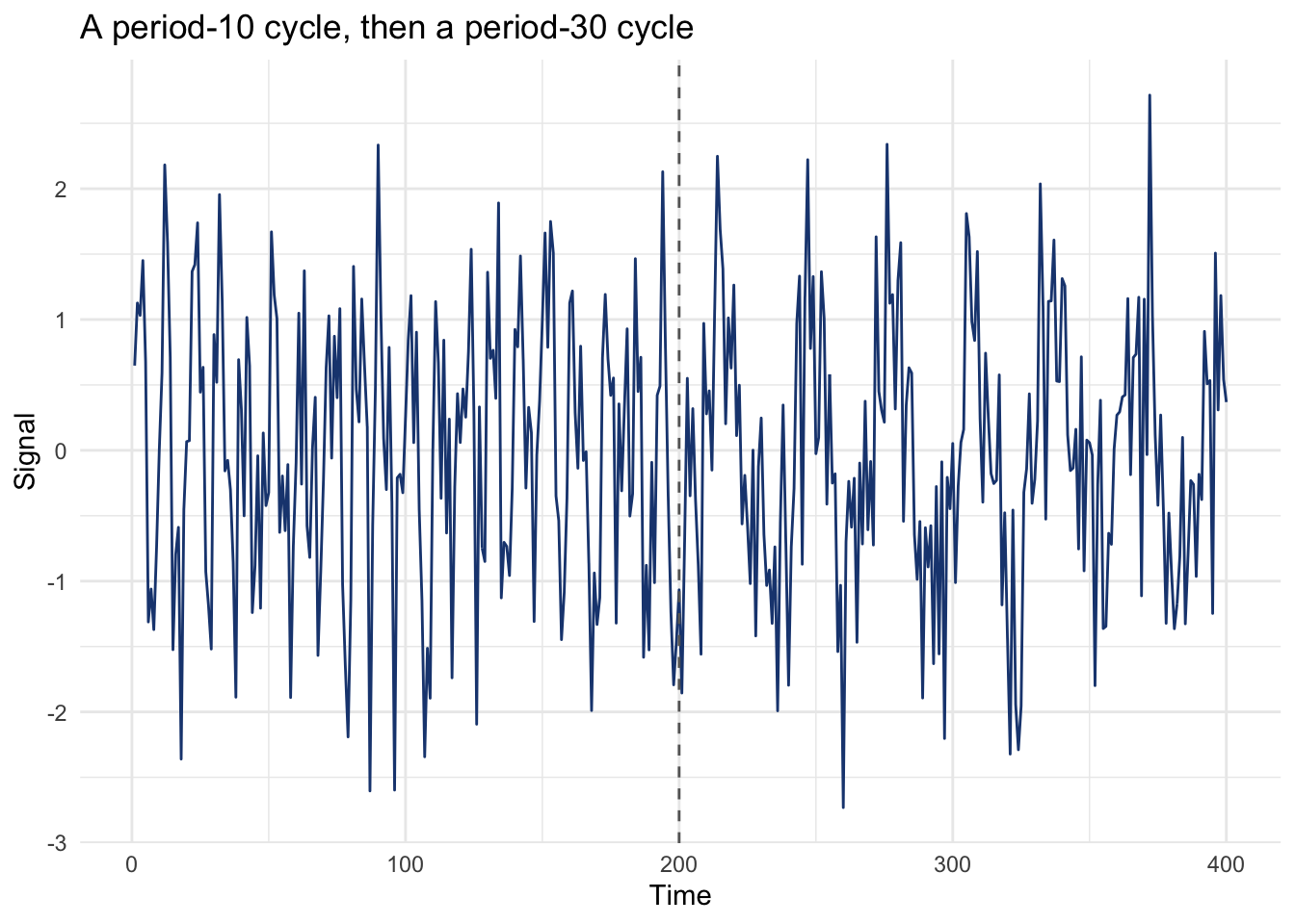
The switch is obvious by eye. Now run it through the same tool the last chapter built the whole book’s frequency intuition on.
switchSpec <- spectrum(switchDat$signal, plot = FALSE)
switchSpecDat <- tibble(freq = switchSpec$freq, spec = switchSpec$spec)

ggplot(switchSpecDat, aes(freq, spec)) +
  geom_line(color = bookPal[5]) +
  geom_vline(xintercept = c(1 / 10, 1 / 30), linetype = "dashed", color = "grey40") +
  labs(x = "Frequency", y = "Spectral density", title = "The periodogram finds both periods") +
  theme_minimal()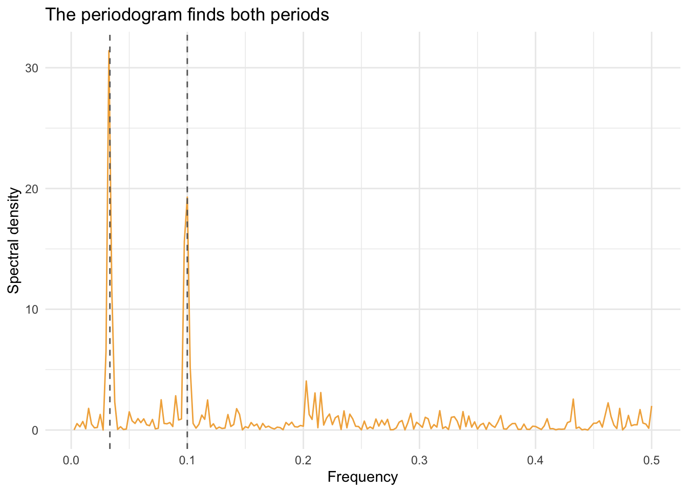
Both periods show up, cleanly, right where they should. As far as identifying what’s in the signal, the periodogram did its job. But look at the plot again: there’s no time axis on it anywhere. It cannot tell you that period 10 ran first and period 30 ran second, or that they never overlapped, or where the handoff happened, because none of that information is in a periodogram’s design. It reports how much of the whole record’s variance belongs to each frequency, full stop. Feed it a series whose rhythm changes and it will still answer confidently, just not the question you actually wanted asked.
A continuous wavelet transform (CWT) keeps time on one axis and period on the other, with color showing how much power a given period carries at a given moment. Run it on the exact same series.
switchCwt <- morlet(y1 = switchDat$signal, x1 = switchDat$tm, p2 = 8, dj = 0.1, siglvl = 0.99)
wavelet.plot(switchCwt, reverse.y = TRUE, crn.lab = "Signal", crn.col = "grey50")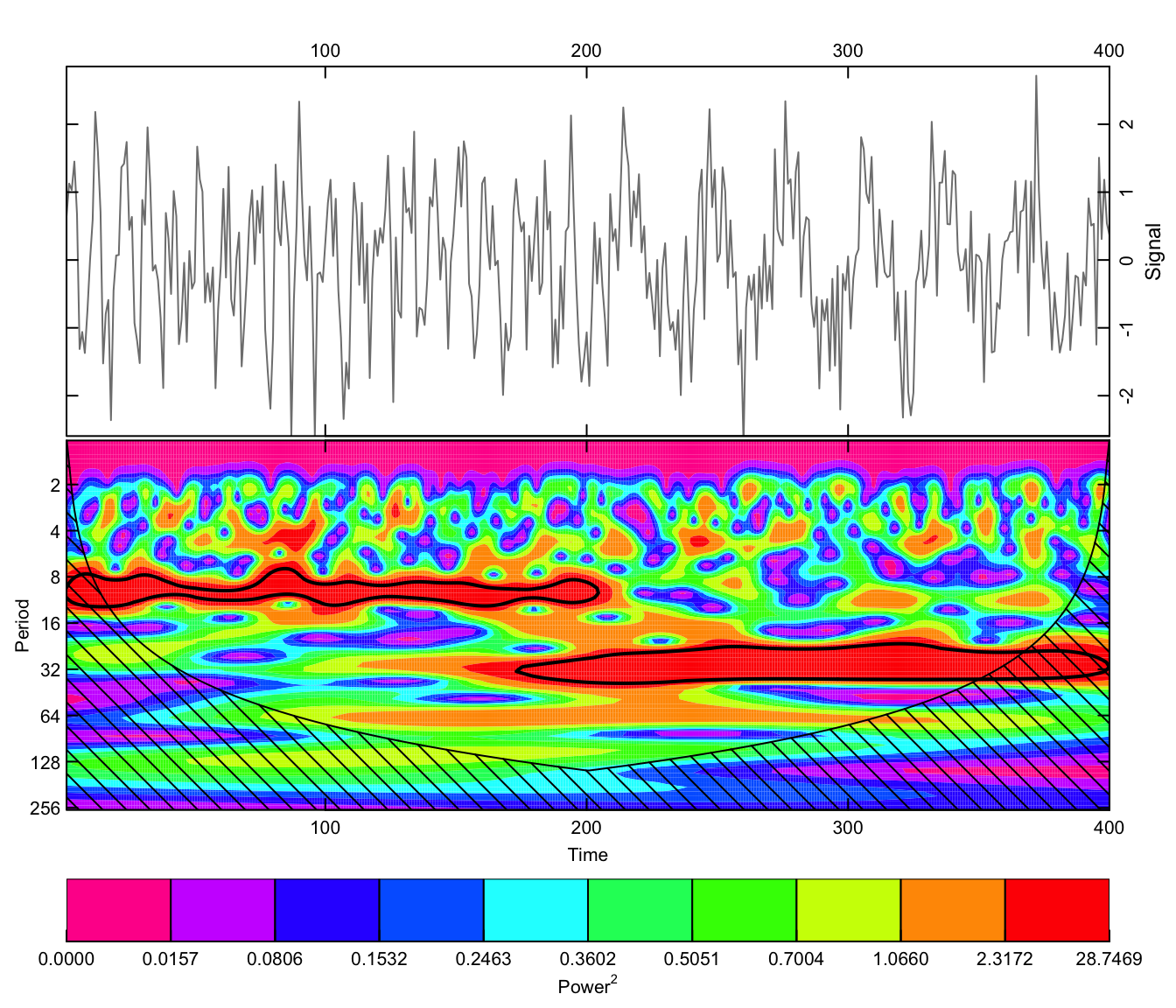
Now the switch is right there in the picture: a band of power around period 10 that holds from the start and fades out near \(t=200\), and a second band around period 30 that starts almost exactly where the first one stops. Nothing about what frequencies are present changed from the periodogram’s answer. What changed is that this plot also answers when.
The hatched regions at the edges and at long periods are the cone of influence: past that line, the wavelet’s window runs off the end of the record, and the estimate there is built on less evidence than it looks like it is. That’s the same edge problem the filters chapter found with loess, drawn explicitly onto the plot instead of left for you to notice on your own.
The continuous transform makes a picture. There’s also a discrete version, a multiresolution analysis (MRA), that works more like the by-hand decomposition from the earliest chapters: it splits a series into additive pieces, one per timescale, and summing every piece back together reconstructs the original series exactly.
Each piece gets a name that says how fast or slow it is. D1 is the finest detail, whatever wiggle two neighboring points can resolve. D2 is one octave slower, D3 another octave slower than that, and so on, doubling the timescale at every step up the ladder. Whatever’s left once the ladder runs out, everything slower than the coarsest detail level, gets swept into one smooth term, S. How a filter cascade actually produces each level is more machinery than we need here; Percival and Walden (2000) has the full derivation if you want it.
Run it on the switching series first, the same one the CWT plot above just localized.
switchScales <- trunc(log(n) / log(2)) - 1
switchDwt <- mra(switchDat$signal, wf = "la8", J = switchScales, method = "modwt", boundary = "periodic")
The stacked plot below is the same style this chapter reuses for the tree-ring chronology later on, so it’s worth building as a small helper now, one with a scale switch built in since that turns out to matter.
plotMra <- function(dwtOut, x, xlab, unit, title, scale = TRUE) {
  nLevels <- length(dwtOut)
  levelNames <- names(dwtOut)
  scaleLabels <- c(paste0(2^(1:(nLevels - 1)), " ", unit),
    paste0("> ", 2^(nLevels - 1), " ", unit))
  labelDat <- tibble(level = factor(levelNames, levels = levelNames),
    label = paste0(levelNames, " (", scaleLabels, ")"))

  dwtDat <- as_tibble(dwtOut) |>
    mutate(x = x) |>
    pivot_longer(-x, names_to = "level", values_to = "value") |>
    mutate(level = factor(level, levels = levelNames))

  if (scale) {
    dwtDat <- dwtDat |> mutate(value = as.numeric(scale(value)), .by = level)
  }

  ggplot(dwtDat, aes(x, value)) +
    geom_line(color = bookPal[1]) +
    geom_label(data = labelDat, aes(x = -Inf, y = Inf, label = label),
      inherit.aes = FALSE, hjust = 0, vjust = 1, size = 3.2, color = "grey30",
      label.size = 0, label.padding = unit(0.15, "lines"), fill = alpha("white", 0.75)) +
    facet_wrap(~level, ncol = 1, scales = if (scale) "fixed" else "free_y") +
    labs(x = xlab, y = NULL, title = title) +
    theme_minimal() +
    theme(strip.text = element_blank(), strip.background = element_blank(),
      panel.spacing.y = unit(0.15, "lines"))
}plotMra(switchDwt, switchDat$tm, "Time", "pts", "Multiresolution decomposition of the switching demo")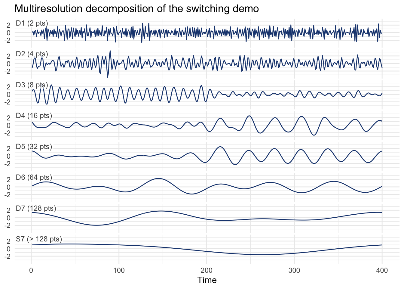
D3 and D4 are the two bands worth watching, the closest this dyadic ladder gets to periods 10 and 30. The picture suggests a handoff around the middle of the record. Numbers make it exact.
tibble(level = names(switchDwt),
  varFirstHalf  = map_dbl(switchDwt, ~ var(.x[1:switchPoint])),
  varSecondHalf = map_dbl(switchDwt, ~ var(.x[(switchPoint + 1):n]))) |>
  mutate(across(starts_with("var"), \(x) round(x, 3)))
# A tibble: 8 × 3
level varFirstHalf varSecondHalf
<chr> <dbl> <dbl>
1 D1 0.225 0.224
2 D2 0.126 0.094
3 D3 0.363 0.045
4 D4 0.021 0.18
5 D5 0.014 0.087
6 D6 0.007 0.005
7 D7 0.003 0.001
8 S7 0 0.001D3, the detail level tuned closest to a period-10 cycle, carries far more variance in the first half than the second. D4, tuned closer to period 30, does the opposite. Same conclusion as the heat map above, reached by a completely different route: split the series into timescales, and the timescales themselves tell you where the switch happened.
The scale argument in plotMra() isn’t decorative. Turn it off and see what changes.
plotMra(switchDwt, switchDat$tm, "Time", "pts", "Same decomposition, unscaled", scale = FALSE)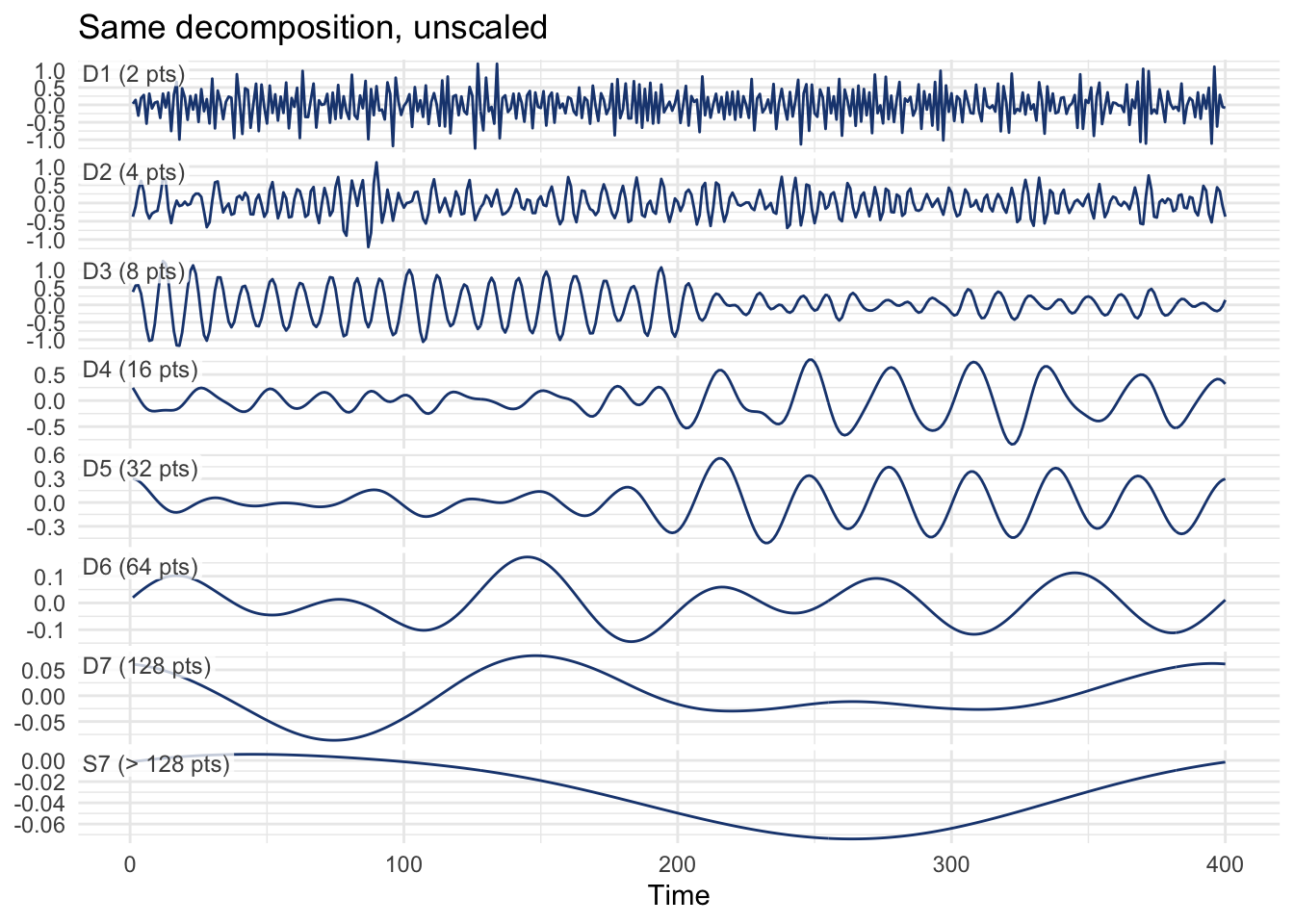
Nothing goes flat here. Each panel still gets its own y-axis, so D1’s wiggle is just as visible as it was above even though it’s tiny next to S7’s. What changed is that the panels no longer share a scale. D1’s axis covers a much narrower range than S7’s, because the finest detail actually varies less than the smooth trend does, measured in the switching demo’s own units. That’s useful if the amplitude of a single level, in its own units, is what you care about. It’s useless for comparing levels against each other, since a tall wiggle in one panel and a tall wiggle in another can mean two very different sizes once you check the axis labels. The scaled version above throws those units away on purpose: every level gets forced onto the same footing, so D3 growing while D4 shrinks (or the other way around) shows up directly as a difference in wiggle height, no axis-checking required. Pick whichever question you’re actually asking: relative variance across levels wants scaling, a level’s amplitude in its own units doesn’t.
Measured records rarely hand you a clean, one-time switch. What they give you instead is a cycle that comes and goes, gets stronger, gets weaker, and maybe reappears somewhere else in the record. Here’s the same co021 tree-ring data the filters chapter used, this time averaged across many trees into a single site chronology rather than looked at core by core.
data(co021)
co021Rwi <- detrend(co021, method = "AgeDepSpline")
co021Crn <- chron(co021Rwi)

chronVal <- co021Crn[, 1]
chronYrs <- as.numeric(time(co021Crn))

plot(co021Crn, add.spline = TRUE, nyrs = 64)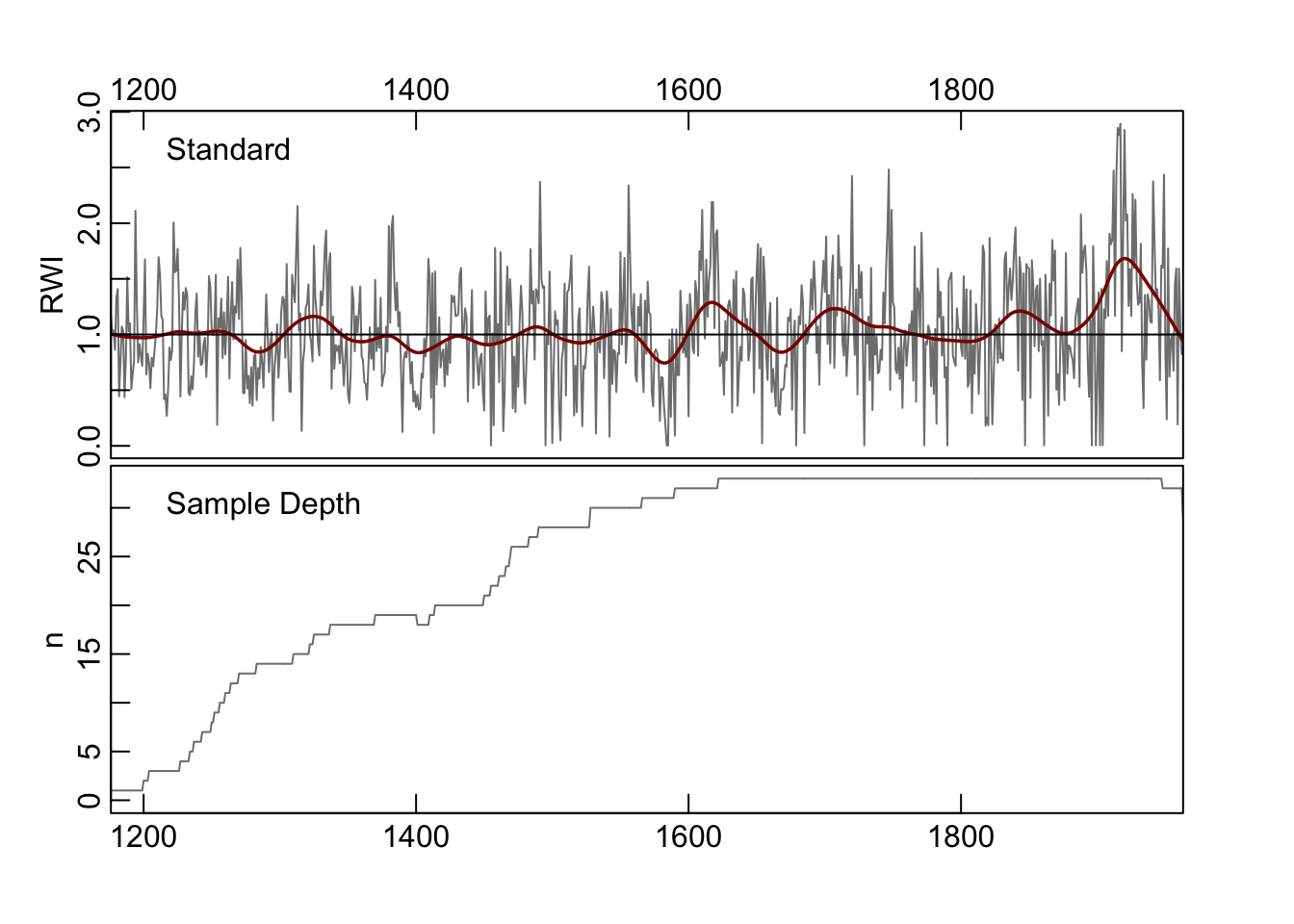
Run the same continuous transform on the chronology.
treeCwt <- morlet(y1 = chronVal, x1 = chronYrs, p2 = 8, dj = 0.1, siglvl = 0.99)
wavelet.plot(treeCwt, crn.col = "grey50", reverse.y = TRUE)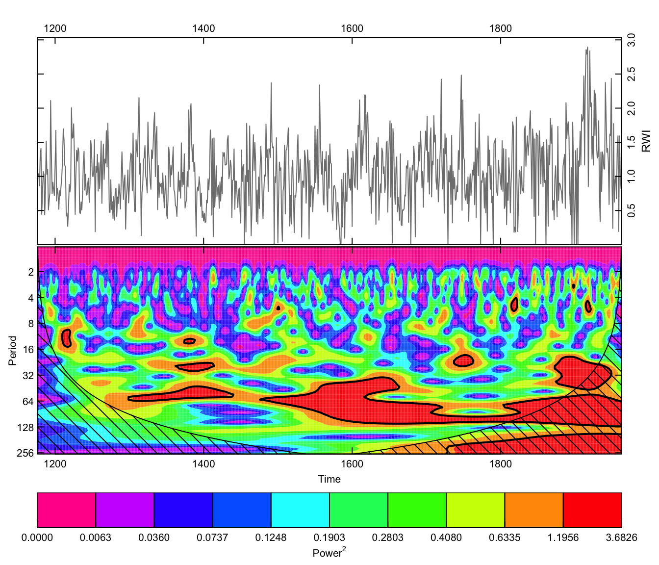
Read this one like a topographic map of frequency content over time. A horizontal band means that period stayed active for as long as the band runs; a band that appears, breaks up, and reappears somewhere else is exactly the kind of feature a single periodogram of the whole 788-year record would average into invisibility. Whatever produces the multi-decadal wiggle in a tree’s growth (drought cycles, temperature regimes, competition among neighboring trees) apparently doesn’t run at a constant strength the whole time, and this is the tool that lets you say so.
The same ladder of D1 through D8 levels applies here, just on 788 years of tree growth instead of 400 planted points.
nScales <- trunc(log(length(chronYrs)) / log(2)) - 1
dwtOut <- mra(chronVal, wf = "la8", J = nScales, method = "modwt", boundary = "periodic")plotMra(dwtOut, chronYrs, "Years", "yrs", "Multiresolution decomposition of the chronology")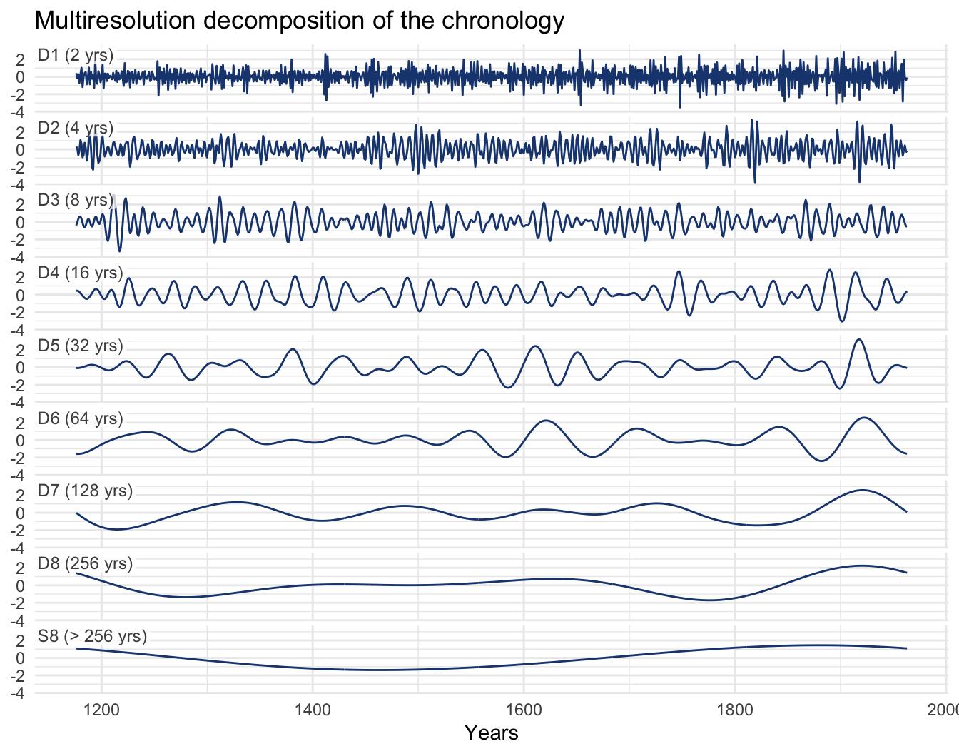
S8 at the bottom is the closest thing here to a long-term trend, whatever survives past 256 years; everything above it runs faster. Line this plot up against the CWT plot above it: wherever a D level swells, that’s the same signal the color plot lit up, caught this time by a transform built to hand you a number instead of a picture.
A wavelet transform buys you something a periodogram can’t give you (localization in time) but nothing is free: sharpening the time axis costs you some sharpness on the frequency axis, so a wavelet’s estimate of “what period” is fuzzier than a periodogram’s. That trade is worth making the moment you suspect a series’s rhythm isn’t constant, which for environmental data is more often than not.
This closes out the book’s tour of the frequency domain. The early chapters lived entirely in the time domain, tracking a series left to right and asking what today has to do with yesterday. The frequency chapter flipped that around and asked what cycles a series is built from, no clock required. This chapter split the difference: time and frequency, together, on one plot. Between the three views, you have three lenses to reach for on whatever series lands on your desk next, and knowing which one fits the question is most of the job.
Rebuild the planted demo with the switch happening somewhere other than the midpoint (try switchPoint <- 100 or switchPoint <- 320), or add a second switch back to the original period so the series goes period-10, period-30, period-10 again. Does the wavelet plot still localize the change cleanly? What happens to the cone of influence near a switch that sits close to either end of the record?
The wave-switch-dwt-check chunk above compared the variance of each MRA detail level across the two halves of the planted demo for one pair of periods. Redo that comparison for the tree-ring chronology instead: pick a detail level from the wave-dwt output, split the 788-year record into an early half and a late half, and compare variances the same way. Does the split match anything visible in the continuous wavelet plot above it?
Everything so far has been a planted switch or 788 years of tree growth. Try both tools on something this chapter hasn’t touched: bi-daily adult counts from one of A. J. Nicholson’s classic laboratory blowfly populations, in data/blowfly.csv (Nicholson 1957). Nicholson raised Lucilia cuprina on a fixed food ration and counted the population every two days for two years; nothing here is seasonal in the climate sense, the whole cycle comes from food-limited generations feeding back on their own numbers a generation later.
Plot the raw counts first, before reaching for either transform. Then run the series through both a CWT and an MRA the way this chapter ran the switching demo and the chronology. Does the dominant period hold steady across the two years, or does it drift? Look past period, too: does the size of the swings change along with it, and does that show up in the CWT plot the same way a period shift does? If the CWT plot shows a drift, does the MRA back it up the same way it did for the switching demo?
dplR’s morlet() and wavelet.plot() implement, written for exactly this audience: readers who want to use a wavelet transform without first sitting through the full functional-analysis derivation.waveslim’s mra() and the maximal overlap discrete wavelet transform.