Code
library(tidyverse)
library(tsibble)
library(PNWColors)

bookPal <- pnw_palette("Sunset2", n = 5, type = "discrete")A series like the Bellingham temperature from the last chapter is really three things added together. There is a slow movement, the part that climbs or falls over years and does not repeat. There is a season, the part that comes around every twelve months. And there is the noise, the day-to-day or month-to-month jostle that is left once you account for the other two. Decomposition is the act of pulling those three pieces apart so you can look at each one on its own. We will build the pieces by hand first, with a moving average and some subtraction, and then let R do the same work in a single function call. The catch, and it is a thread that runs through the whole book, is that the function will hand you a trend and a season whether or not the data have one. So we will also feed it pure noise and watch it invent structure out of nothing. Knowing how to read that is the difference between describing your data and fooling yourself.
We keep the tsibble (Wang et al. 2020) framework for storing and plotting data, with tidyverse (Wickham 2023) for wrangling and PNWColors (Lawlor 2020) for the figure colors, but the decomposition machinery itself lives in base R. The decompose function and the ts class it works on are both built into R, so there is nothing extra to load for the analysis.
library(tidyverse)
library(tsibble)
library(PNWColors)
bookPal <- pnw_palette("Sunset2", n = 5, type = "discrete")In my work I routinely use series that have a seasonal component: monthly weather, streamflow, atmospheric chemistry. These often carry a periodic signal that ties back to geophysics or biology. We call it seasonal whether or not it lines up with actual seasons, because the mathematics is the same either way.
When the three pieces add together to make the series, we write it as an additive model. At time \(t\),
\[y_t = m_t + s_t + z_t\]
where \(y_t\) is what we observed, \(m_t\) is the trend, \(s_t\) is the seasonal component, and \(z_t\) is the residual noise. There is also a multiplicative version, where the pieces multiply instead of add, and we will get to it at the end of the chapter. For now, addition.
The trouble with learning decomposition on measured data is that you never get to check your answer. The lake does not tell you what its true trend was. So we will start somewhere better: a series I build myself, where I know the trend, the season, and the noise exactly, because I put them there. Then when we recover them, we can hold the recovery up against the truth and see how close we got.
Here are the three pieces. A trend that climbs slowly and steadily, a seasonal cycle that repeats every twelve months, and a draw of random noise. I add them together to make the series y, then wrap it in ts with a monthly frequency so the later functions know there are twelve steps to a year.
n <- 240 # twenty years of monthly data
tt <- 1:n

trendTrue <- 10 + 0.05 * tt # a slow linear climb
seasonTrue <- 4 * sin(2 * pi * tt / 12) # an annual cycle
noiseTrue <- rnorm(n, sd = 2) # the jostle

y <- trendTrue + seasonTrue + noiseTrue
y <- ts(y, start = c(2000, 1), frequency = 12)ggplot(tibble(t = tt, y = as.numeric(y)), aes(t, y)) +
geom_line() +
labs(x = "Month", y = expression(y[t]), title = "A planted series") +
theme_minimal()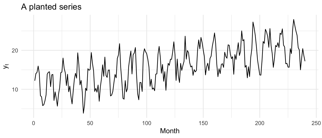
You can see all three ingredients at once: the gentle upward drift, the regular wave riding on it, and the fuzz that keeps any two neighboring points from lining up perfectly. We know exactly what each of those is worth because we set them. The job now is to get them back out using only y, the way we would with data we did not build.
There are a couple of ways to estimate the trend \(m_t\). We could fit a straight line as a function of time. But a line can only ever be straight, and an actual trend wanders. So instead we use a moving average, which smooths the series enough to wipe out the season while keeping whatever slow movement is underneath, bends and all.
For monthly data the natural window is twelve months wide, so that a full year of seasonality averages out. The wrinkle is that a twelve-wide window has no center. The fix is a centered moving average that gives the two end months half weight each:
\[\hat m_t = \frac{\tfrac{1}{2}y_{t-6} + y_{t-5} + \cdots + y_{t-1} + y_{t} + y_{t+1} + \cdots + y_{t+5} + \tfrac{1}{2}y_{t+6}}{12}\]
This runs from \(t = 7\) to \(t = n-6\), because we need six months on each side. We lose the first six and last six values. To see exactly what the formula does, let’s write it as a loop. We start an empty vector, step through the interior of the series, and at each spot compute that weighted average.
mLoop <- rep(NA, n) # an empty vector to fill
for (i in 7:(n - 6)) {
  mLoop[i] <- (0.5 * y[i - 6] + y[i - 5] + y[i - 4] + y[i - 3] + y[i - 2] + y[i - 1] +
    y[i] + y[i + 1] + y[i + 2] + y[i + 3] + y[i + 4] + y[i + 5] +
    0.5 * y[i + 6]) / 12
}
mLoop <- ts(mLoop, start = start(y), frequency = 12)
The loop is a bit ugly, the way loops usually are, but it is worth seeing once. We march through the data, look back six steps and forward six steps, average them with the half-weights on the ends, and write the answer into the \(i\)th slot. Once you understand that, you never have to write it again, because R has a function that does the same convolution in one line. It is stats::filter. The name matters: if you have the tidyverse loaded, dplyr::filter is sitting on the same name, and you want the one from stats. Watch those masking messages when you load packages.
f <- frequency(y)
filt <- c(0.5, rep(1, f - 1), 0.5) / f # the weights from the formula
m_hat <- stats::filter(y, filter = filt)
That is the same trend with far less typing. We can prove it is the same by checking the largest disagreement between the loop and the filter.
max(abs(mLoop - m_hat), na.rm = TRUE)[1] 1.421085e-14A number that small is zero with rounding dust on it. Now the part we could never do with measured data. Lay the recovered trend over the true one we planted.
tibble(t = tt, planted = trendTrue, recovered = as.numeric(m_hat)) |>
  pivot_longer(c(planted, recovered), names_to = "series", values_to = "value") |>
  ggplot(aes(t, value, color = series)) +
  geom_line(na.rm = TRUE) +
  scale_color_manual(values = c(planted = bookPal[1], recovered = bookPal[5])) +
  labs(
    x = "Month", y = "Trend", color = NULL,
    title = "Recovered trend vs. the truth"
  ) +
  theme_minimal()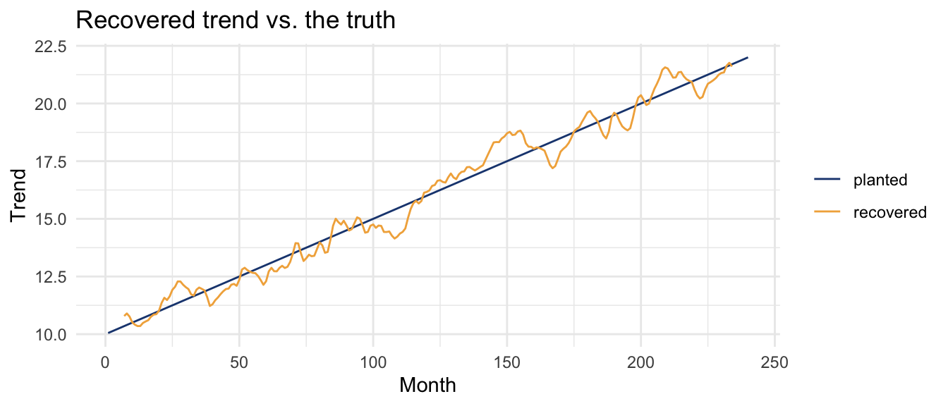
The moving average lands right on the line we planted, give or take a small wobble where a year’s worth of noise did not quite cancel. We pulled the trend back out, and because we know the answer, we know we got it.
With an estimate of the trend in hand, the season falls out by subtraction. Whatever is left after you remove the trend is the season plus the noise:
\[\hat s_t + \hat z_t = y_t - \hat m_t\]
sDetrended <- y - m_hatTo separate the season from the noise, we lean on the one thing that makes a season a season: it repeats. The seasonal effect for, say, every March should be the same. So we average the detrended series within each month. The cycle function tells us which month of the year each observation belongs to, and tapply averages within those twelve groups.
monthlyMeans <- tapply(sDetrended, cycle(y), FUN = mean, na.rm = TRUE)
monthlyMeans <- monthlyMeans - mean(monthlyMeans) # center on zero
monthlyMeans
1 2 3 4 5 6
2.08658952 3.77284116 3.56696254 4.01960129 2.09148397 0.05815725
7 8 9 10 11 12
-2.28657004 -3.79248086 -4.59727058 -2.83945876 -2.05019651 -0.02965897 That gives twelve numbers, one per month, and we center them so the seasonal component neither adds to nor subtracts from the overall level. Those twelve values are the estimated seasonal pattern. Compare them to the true season we built from a sine wave.
tibble(
  month = 1:12,
  planted = 4 * sin(2 * pi * (1:12) / 12),
  recovered = as.numeric(monthlyMeans)
) |>
  pivot_longer(c(planted, recovered), names_to = "series", values_to = "value") |>
  ggplot(aes(month, value, color = series)) +
  geom_line() +
  geom_point() +
  scale_x_continuous(breaks = 1:12) +
  scale_color_manual(values = c(planted = bookPal[1], recovered = bookPal[5])) +
  labs(
    x = "Month", y = "Seasonal effect", color = NULL,
    title = "Recovered season vs. the truth"
  ) +
  theme_minimal()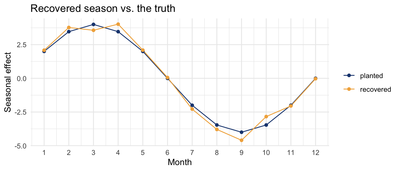
The recovered monthly effects trace the sine wave we planted. To turn those twelve numbers back into a full series the length of y, we repeat them across all twenty years.
s_hat <- rep(monthlyMeans, length.out = n)
s_hat <- ts(s_hat, start = start(y), frequency = 12)Now there is nothing clever left. The trend and the season are both estimated, so the residual noise is whatever they fail to explain:
\[\hat z_t = y_t - \hat m_t - \hat s_t\]
z_hat <- y - m_hat - s_hatThis is where you ask whether the model is any good. We look at the residuals the same way we would in a regression or any other model: are they patternless, do they center on zero, how big are they? A common summary is the mean squared error, or its square root, the root mean squared error, which is back in the units of the data.
sqrt(mean(z_hat^2, na.rm = TRUE)) # RMSE[1] 2.03022We planted noise with a standard deviation of two, and the residual comes back with that. The decomposition recovered the noise about as well as it recovered the trend and the season. If we were comparing two ways of decomposing the same series, the one with the smaller RMSE would be doing a better job of accounting for the data.
Stack the four pieces together and you can see the whole model at once. Watch the vertical scales: the trend spans several units, the season a few, and the noise barely moves.
tibble(
  t = tt,
  Observed = as.numeric(y),
  Trend = as.numeric(m_hat),
  Seasonal = as.numeric(s_hat),
  Noise = as.numeric(z_hat)
) |>
  pivot_longer(-t, names_to = "component", values_to = "value") |>
  mutate(component = factor(component,
    levels = c("Observed", "Trend", "Seasonal", "Noise")
  )) |>
  ggplot(aes(t, value)) +
  geom_line(na.rm = TRUE) +
  facet_wrap(~component, ncol = 1, scales = "free_y") +
  labs(
    x = "Month", y = NULL,
    title = "The planted series, taken apart by hand"
  ) +
  theme_minimal()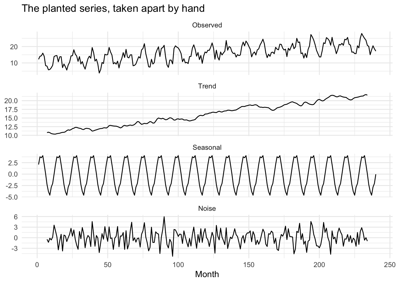
decompose()As much as I hope you enjoyed the loop, you will be relieved to know that R does all of this in one function. decompose runs the same centered moving average, the same subtraction, the same monthly averaging, and returns the pieces in a tidy object.
yDecomp <- decompose(y, type = "additive")decompose comes with its own plot method, but it crams all four panels into base graphics that are hard to read. Since we are going to look at several of these, let’s write a small helper that pulls the pieces into a tidy frame and draws them with ggplot. It works on any decomposed.ts, additive or multiplicative.
tidyDecomp <- function(d) {
  tibble(
    time = as.numeric(time(d$x)),
    Observed = as.numeric(d$x),
    Trend = as.numeric(d$trend),
    Seasonal = as.numeric(d$seasonal),
    Random = as.numeric(d$random)
  ) |>
    pivot_longer(-time, names_to = "component", values_to = "value") |>
    mutate(component = factor(component,
      levels = c("Observed", "Trend", "Seasonal", "Random")
    ))
}ggplot(tidyDecomp(yDecomp), aes(time, value)) +
geom_line(na.rm = TRUE) +
facet_wrap(~component, ncol = 1, scales = "free_y") +
labs(x = NULL, y = NULL, title = "decompose() on the planted series") +
theme_minimal()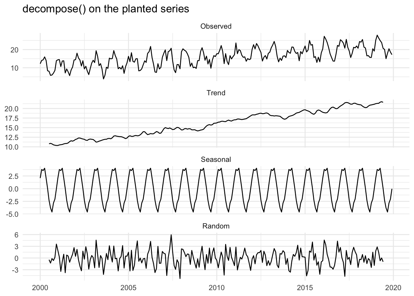
Same four panels, same story. And it is not just similar to our hand work, it is identical, because it is the same arithmetic. Check the trend and the season against what we built.
max(abs(yDecomp$trend - m_hat), na.rm = TRUE)[1] 0max(abs(yDecomp$seasonal - s_hat), na.rm = TRUE)[1] 0Zero and zero. Everything we did by hand, decompose did in one line. Look at what it gives back.
str(yDecomp)List of 6
$ x : Time-Series [1:240] from 2000 to 2020: 12.2 14 14.4 16 14.1 ...
$ seasonal: Time-Series [1:240] from 2000 to 2020: 2.09 3.77 3.57 4.02 2.09 ...
$ trend : Time-Series [1:240] from 2000 to 2020: NA NA NA NA NA ...
$ random : Time-Series [1:240] from 2000 to 2020: NA NA NA NA NA ...
$ figure : num [1:12] 2.09 3.77 3.57 4.02 2.09 ...
$ type : chr "additive"
- attr(*, "class")= chr "decomposed.ts"It is a list of class decomposed.ts with the original data, the three components, and a note that the model was additive. You reach into it the usual way, yDecomp$trend and so on, which is what we just did to check the recovery. The same function handles a multiplicative model too, which we will use at the end of the chapter.
So why grind through the loop and the subtraction if one function does it all? Because the function will run on anything, and it will always return a trend and a season, and it will never tell you whether those pieces mean anything. We are about to see that. But first, now that we trust the tool, let’s point it at data where we do not know the answer.
We used the co2 data in the last chapter. It is the monthly record of atmospheric carbon dioxide measured at Mauna Loa, the Keeling curve, climbing from 1959 to 1997. It has an obvious trend and an obvious season, but unlike our planted series, nobody handed us the true pieces. We decompose it and trust the tool because we just watched it work on data we built.
data(co2)
co2Decomp <- decompose(co2, type = "additive")
ggplot(tidyDecomp(co2Decomp), aes(time, value)) +
  geom_line(na.rm = TRUE) +
  facet_wrap(~component, ncol = 1, scales = "free_y") +
  labs(
    x = NULL, y = NULL,
    title = "decompose() on the Keeling curve",
    subtitle = "Units are ppm of carbon dioxide"
  ) +
  theme_minimal()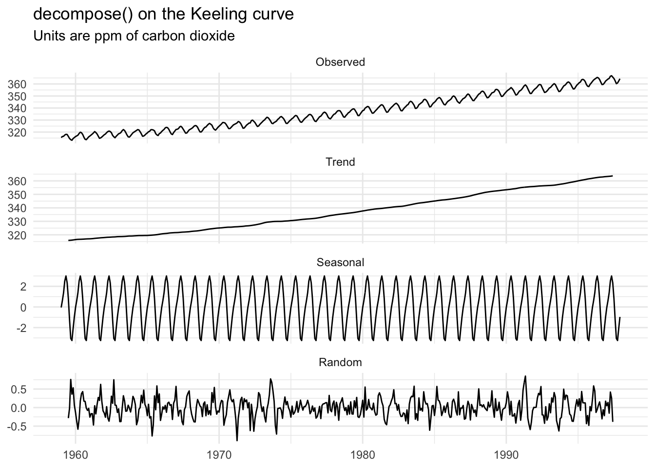
The trend is the steady rise everyone recognizes. The seasonal panel shows the planet breathing: carbon dioxide drops through the Northern Hemisphere summer as plants leaf out and pull it down, then climbs back through the winter as they die back. That is a season with nothing to do with the calendar quarters we usually mean by the word, which is exactly why we are careful to say seasonal rather than summer or winter.
We said at the start that you could also get a trend by fitting a line against time. Let’s do that and see how it compares to the moving-average trend decompose gave us.
co2Lm <- lm(co2 ~ time(co2))
coef(co2Lm)
(Intercept) time(co2)
-2249.774198 1.307497 The slope says carbon dioxide rose about 1.31 ppm per year on average over this record. Put that line on the data.
tibble(year = as.numeric(time(co2)), co2 = as.numeric(co2)) |>
  ggplot(aes(year, co2)) +
  geom_line(color = bookPal[1]) +
  geom_abline(intercept = coef(co2Lm)[1], slope = coef(co2Lm)[2], color = bookPal[5]) +
  labs(x = "Year", y = expression(CO[2] ~ (ppm))) +
  theme_minimal()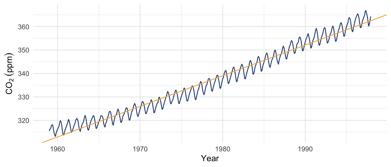
The line fits, in the sense that it passes through the middle of the climb. But a line is committed to a single rate forever. Now put the same line against the trend from the decomposition.
tibble(year = as.numeric(time(co2Decomp$trend)), trend = as.numeric(co2Decomp$trend)) |>
  ggplot(aes(year, trend)) +
  geom_line(color = bookPal[1], na.rm = TRUE) +
  geom_abline(intercept = coef(co2Lm)[1], slope = coef(co2Lm)[2], color = bookPal[5]) +
  labs(
    x = "Year", y = expression(CO[2] ~ (ppm)),
    title = "Decomposition trend (navy) vs. linear fit (gold)"
  ) +
  theme_minimal()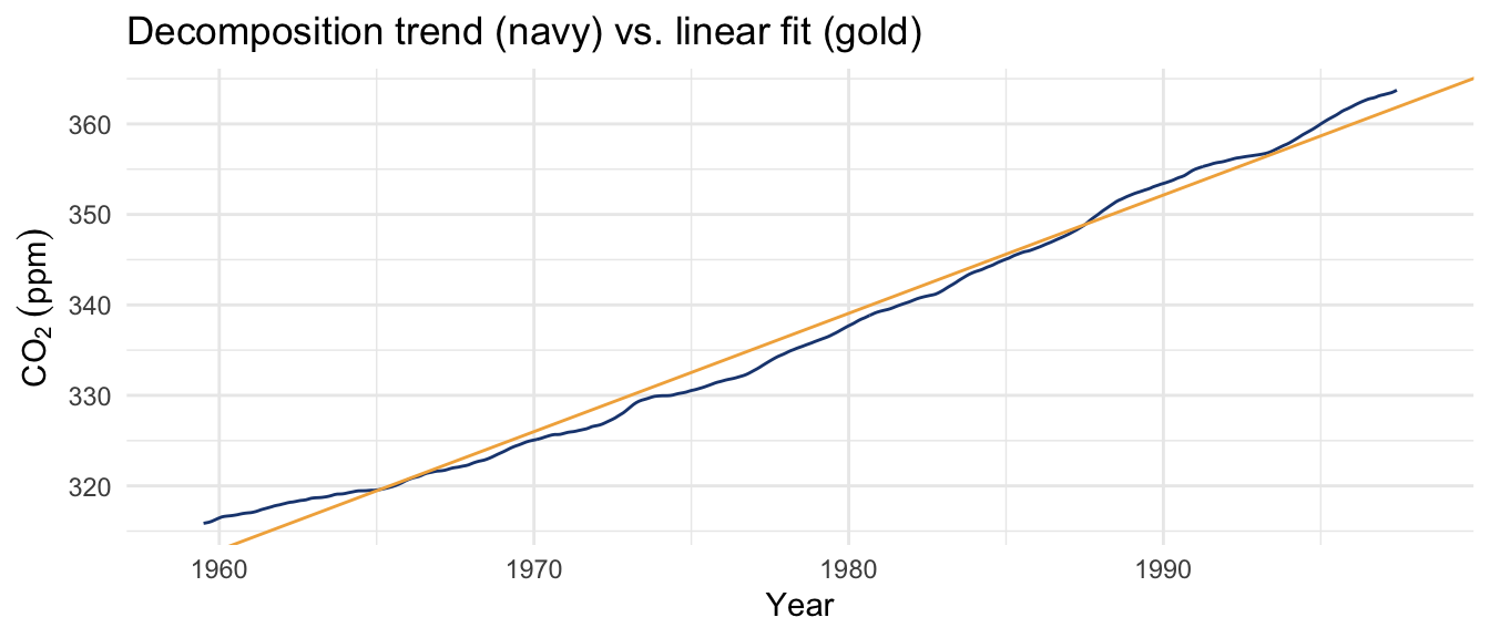
Both are trends, and both are reasonable, but they answer different questions. The straight line gives you one number, an average rate, and assumes the rate never changed. The moving-average trend makes no such promise. It follows the data, and you can see it steepening: the curve pulls above the straight line at both ends and dips below it in the middle, because the rise actually accelerated over these decades. The regression slope is a summary. The decomposition trend is a description. Which one you want depends on whether you care about a single headline rate or the shape of the climb.
Here is a thread that runs through the book. A computer does what it is told. decompose will pull a trend and a season out of any series you hand it, including one that has neither. To prove it, I will make ten years of monthly numbers that are pure noise, with no trend and no season anywhere in them, and decompose that.
junk <- ts(rnorm(120), start = c(2010, 1), frequency = 12)
junkDecomp <- decompose(junk)
ggplot(tidyDecomp(junkDecomp), aes(time, value)) +
  geom_line(na.rm = TRUE) +
  facet_wrap(~component, ncol = 1, scales = "free_y") +
  labs(x = NULL, y = NULL, title = "decompose() on pure noise") +
  theme_minimal()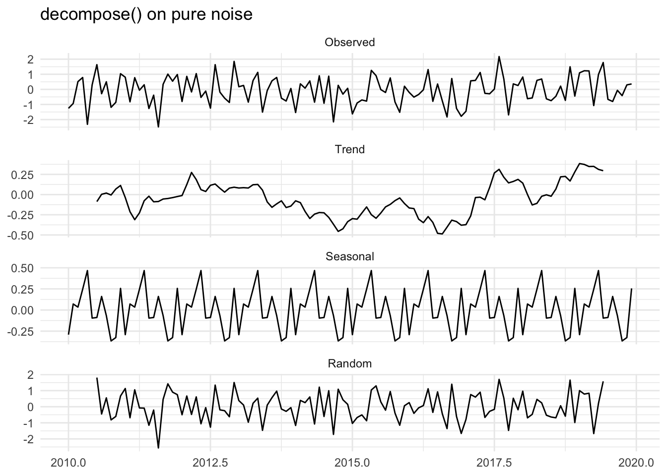
There is no trend in junk. There is no season in junk. It is rnorm, full stop. But decompose was happy to report a wandering trend and a tidy twelve-month season anyway. The one tell is the vertical scale. Look at the magnitude on the trend and seasonal panels and compare it to the noise: there is very little there, and what little there is, is the moving average chewing on randomness. If you did not know better, you could stare at that seasonal panel and start telling yourself a story about why these data peak in March.
This is the planted-signal exercise run in reverse. Earlier we planted actual structure and recovered it, and the recovery meant something because we knew it was there. Here we planted nothing, and the function still returned a full decomposition. The output looks the same in both cases. R prints a trend and a season either way. Whether they are worth anything is a question software cannot answer, and you have to. Plotting the components and watching their scale, knowing something about the process that generated the data, and being suspicious of structure you cannot explain are the habits that keep you from fooling yourself.
Everything so far assumed the pieces add. Sometimes they multiply instead:
\[y_t = m_t \times s_t \times z_t\]
The difference comes down to whether the season is a fixed quantity or a fraction of the level. An additive season adds the same amount every July no matter what else is going on. A multiplicative season is a percentage, so it is large when the level is high and small when the level is low. The cleanest place to see that is a series that grows, because as the level climbs a percentage season fans out with it while a fixed one cannot.
Arizona electricity does exactly that. The file data/az_electricity.csv holds monthly residential electricity sales for the state from the U.S. Energy Information Administration, in gigawatt-hours (the EIA reports it as millions of kilowatt-hours, the same unit). Phoenix runs on air conditioning, and the state has grown fast with its population. These data are already monthly, so there is no aggregation to do; we read them and build a ts directly.
azElec <- read_csv("data/az_electricity.csv")
elecTs <- ts(azElec$SALES, start = c(2001, 1), frequency = 12)azElec |>
ggplot(aes(DATE, SALES)) +
geom_line() +
labs(
x = NULL, y = "Residential sales (GWh)",
title = "Arizona monthly residential electricity"
) +
theme_minimal()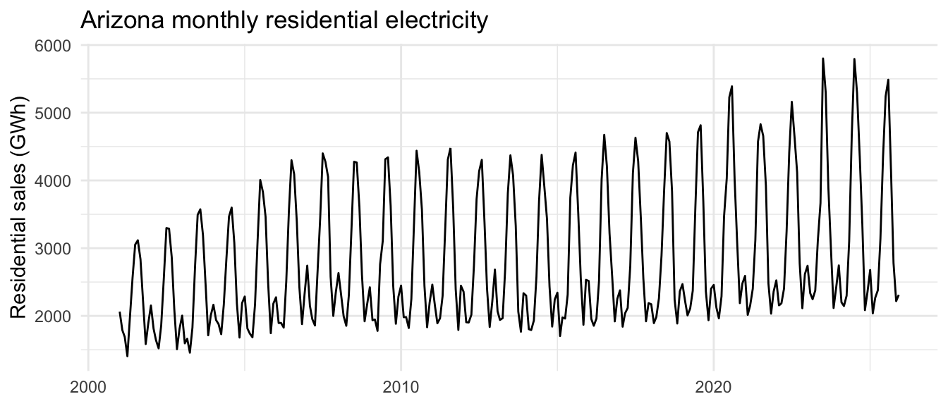
Every summer throws up a tall peak as the air conditioners run, and every winter settles into a low trough. Two things are worth seeing. The summer peaks climb steadily across the record, from about 3,100 GWh in 2001 to nearly 5,800 by the 2020s, while the winter troughs barely move. So the gap between summer and winter is widening over time. That widening is the multiplicative signature: cooling is a percentage of total demand, so as the state’s electricity use grew, the absolute size of the summer swing grew with it. A fixed additive season could not keep up with that.
We tell decompose the model is multiplicative.
elecDecomp <- decompose(elecTs, type = "multiplicative")
ggplot(tidyDecomp(elecDecomp), aes(time, value)) +
  geom_line(na.rm = TRUE) +
  facet_wrap(~component, ncol = 1, scales = "free_y") +
  labs(
    x = NULL, y = NULL,
    title = "decompose() on Arizona residential electricity"
  ) +
  theme_minimal()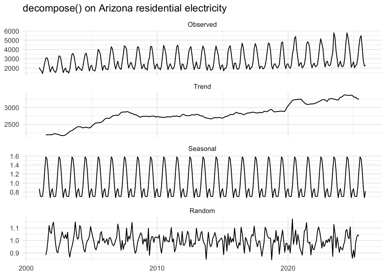
Read the scales. The trend is in gigawatt-hours, the rising demand, but the seasonal and random panels are centered on 1 and have no units, because they are multipliers rather than amounts. The seasonal panel says July runs at about 1.6 times the trend and the winter low at about 0.7 times, every year, whatever the trend happens to be. Read that July multiplier as cooling load: a typical July pulls something like sixty percent more electricity than the annual trend, almost all of it air conditioning. A random value of 1.1 means that month came in ten percent above what the trend and season together predicted. The additive intuition carries straight over: swap addition for multiplication, and swap zero for one as the do-nothing value.
How do you know multiplicative is the right call and not additive? You fit both and compare their errors. You will do that in the exercises.
A trend, a fanning variance, and a season are all ways a series can change its character over time, and a series that does is not stationary. Stationarity is the assumption most of the tools in this book rest on, so it gets its own chapter. See Stationarity.
We took a series apart into three pieces: a slow trend, a repeating season, and the noise left over. We did it by hand with a moving average and some subtraction, checked the recovery against a signal we planted ourselves, and then let decompose do the same work in one call. The most important thing we did was hand it pure noise and watch it return a trend and a season anyway. Decomposition is description, and description is only as trustworthy as your judgment about whether the pieces are there.
There is one piece we kind of glossed over. The noise term \(z_t\) we treated as structureless, the part left over once the interesting bits were removed. But is it actually structureless? In our planted series it was, because we built it from rnorm, where each value ignores the one before it. Measured residuals are rarely so well behaved. The leftover noise often remembers its recent past: a warm month tends to follow a warm month even after you take out the trend and the season. That memory is the subject of the next chapter, autocorrelation, and learning to measure it is where time series analysis starts to earn its name.
In the body we decomposed the Arizona electricity multiplicatively and read the widening summer-winter gap as the sign that the season scales with the level. Put a number on which model the data actually prefer.
elecTs from the body and decompose it the other way too, additively. For each fit, reconstruct the fitted series (trend + seasonal for the additive model, trend * seasonal for the multiplicative one) and compute the MSE of the residual. Which model fits better, and by how much?Go back to the kbli data from the last chapter. It is daily, and decompose wants a regular series with a clear seasonal frequency, so first aggregate to monthly values, then convert to ts.
data/kbli.csv, build the daily mean temperature as (TMAX + TMIN) / 2, and make a tsibble. Then use index_by with yearmonth(.) to aggregate to a monthly series, taking the mean of temperature and the sum of precipitation. Temperature is a state, so its monthly summary is an average; precipitation accumulates, so its monthly summary is a total.ts with frequency = 12 and decompose it. What does the temperature trend look like? The seasonal panel? Report what you find for precipitation too.decompose moving average that handles changing seasonality. Free online.