Code
library(tidyverse)
library(PNWColors)
library(cowplot)

bookPal <- pnw_palette("Sunset2", n = 5, type = "discrete")Every plot in this book, up to now, has put time on the x-axis, measurements marching left to right in the order they happened. That’s such a natural choice it barely feels like one. Here’s the swap this chapter makes: take the exact same data and put frequency on the x-axis instead, not when something happens, but how often. Same numbers, same variance, filed by repetition instead of by date.
Every chapter up to now has also kept a time-domain question in view: given what a series has done, what does that say about what it does next, or what it used to do? That’s the right question for autocorrelation, ARMA, forecasting, and reconstruction. Filtering, the last chapter, already gave you a preview of where this is headed: a moving average that erased a planted cycle rather than finding it. That was frequency behavior without the vocabulary to say so. This chapter supplies the vocabulary.
It takes a minute to get used to. A time-domain plot and a frequency-domain plot of the same series don’t look anything alike, but they carry the same information, organized differently, the way a chord and a list of its individual notes describe the same sound. Once you can move between the two views, some questions that are nearly impossible to answer by eyeballing a time-domain plot become almost trivial. Is there an eleven-year cycle buried in three centuries of sunspot counts? Is there a signature of the Earth’s own orbit hiding in five million years of sunlight? The sunspot cycle shows up later in this chapter; the orbital one is waiting for you in the exercises. In both cases nobody could point to the cycle in the raw time-domain plot. The frequency domain finds it anyway.
We’ll use base R’s own spectrum() function here, so nothing about a Fourier transform happens out of view. tidyverse (Wickham 2023) does the wrangling and plotting, PNWColors (Lawlor 2020) supplies the figure colors, and cowplot (Wilke 2025) stacks a time-domain plot on top of its frequency-domain twin.
library(tidyverse)
library(PNWColors)
library(cowplot)
bookPal <- pnw_palette("Sunset2", n = 5, type = "discrete")Thus far we’ve looked at a time series as a squiggly line, some variable changing as a function of time, with the horizontal axis marking when things happen. That view is built for detecting trends, abrupt shifts, and autocorrelation, and it’s the one this whole book has used up to here.
The frequency domain asks a different question: what cycles are embedded in this series? Instead of “when,” it asks “how often,” and it represents the series as a set of periodic components, the frequencies that make it up. The result is a plot of variance as a function of frequency: how much of the up-and-down in the data comes from a process operating at a fast timescale, and how much from a slow one.
This isn’t just a mathematical trick. Plenty of environmental systems are driven by periodic forcing (daily, seasonal, tidal, orbital), and working in the frequency domain often gives a clearer view of what’s driving them. It’s also good at pulling a signal out of noise, since a cycle that’s invisible against the day-to-day jitter of a time-domain plot can stand out sharply once its variance is concentrated in one narrow slice of frequency.
The tool behind all of this is spectral analysis: decomposing a signal into its component frequencies. The idea goes back to Joseph Fourier, who showed that any periodic signal can be written as a sum of sine and cosine waves, a Fourier series. Even signals that aren’t obviously periodic can often be approximated this way. A time series that looks like noise may just be several overlapping cycles at different frequencies and amplitudes, stacked on top of each other.
The Fourier transform is the machinery that does the decomposing, and it’s the same idea behind MP3 audio compression and JPEG images: represent something complicated as a sum of simple waves, then keep only the ones that matter. Here we’ll use it to find the frequencies embedded in a time series and ask which are strong, which are weak, and which are just noise.
The payoff we’re after is mechanism, not just description. When a peak in the frequency domain lines up with a known physical driver, whether El Niño, the solar cycle, or Milankovitch forcing, that’s what turns a periodogram from a plot into evidence.
Here are two plots of the same signal, one in each domain.
n <- 1000
tm <- 1:n
twoDomainSignal <- sin(2 * pi * tm / 50) + 0.5 * sin(2 * pi * tm / 200) + rnorm(n, sd = 0.75)
twoDomainDat <- tibble(time = tm, signal = twoDomainSignal)

pTime <- ggplot(twoDomainDat, aes(time, signal)) +
  geom_line(color = bookPal[1]) +
  labs(title = "Time Domain", x = "Time", y = "Signal") +
  theme_minimal()

twoDomainSpec <- spectrum(twoDomainSignal, plot = FALSE)
twoDomainSpecDat <- tibble(freq = twoDomainSpec$freq, spec = twoDomainSpec$spec)

pFreq <- ggplot(twoDomainSpecDat, aes(freq, spec)) +
  geom_line(color = bookPal[5]) +
  labs(title = "Frequency Domain", x = "Frequency (1 / time unit)", y = "Spectral Density") +
  theme_minimal()

plot_grid(pTime, pFreq, ncol = 1)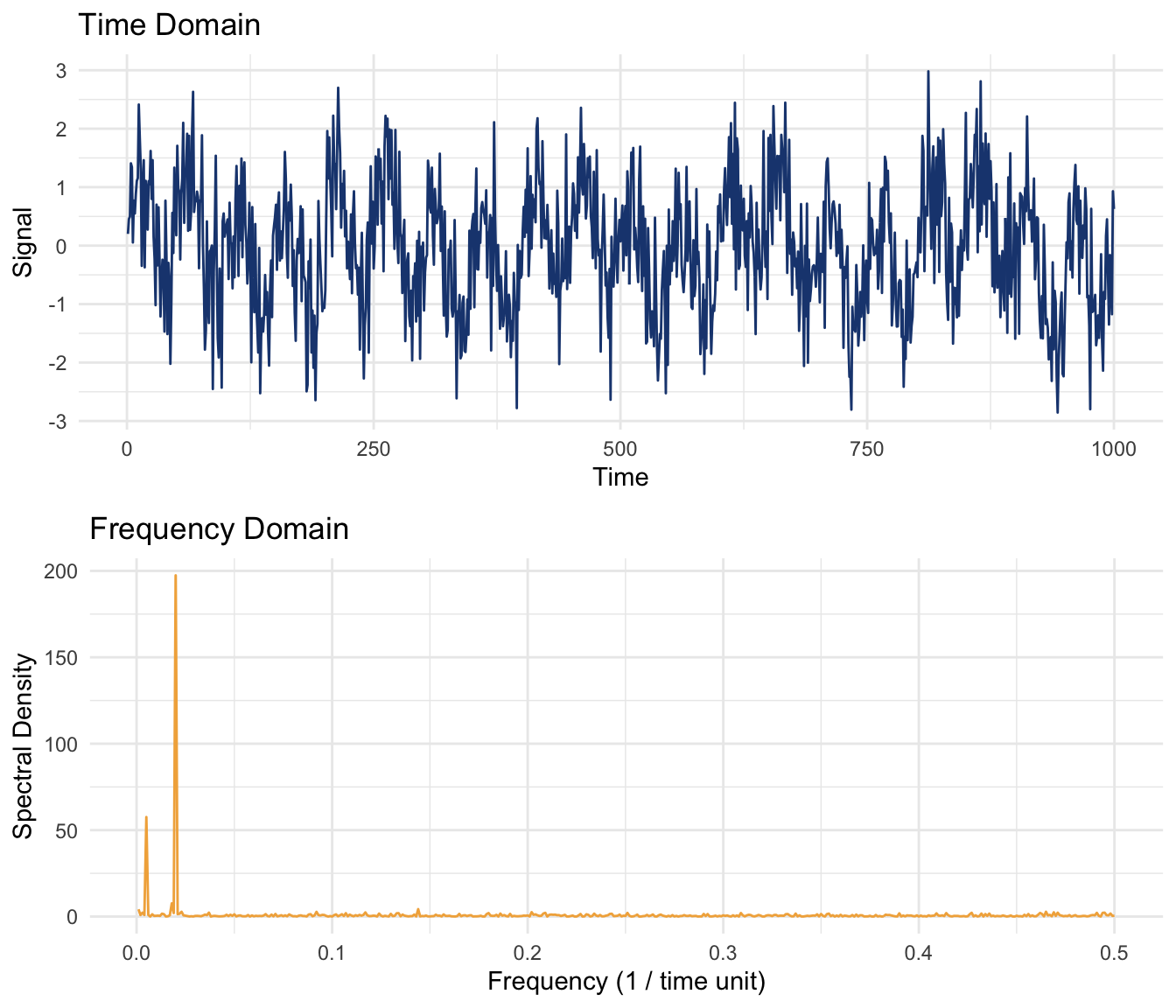
The two plots carry exactly the same information, just through a different lens.1 The time-domain plot shows the signal as it changes; the frequency-domain plot shows how much of the signal’s variance sits at each frequency. You can see strong peaks around 0.02 (a 50-unit cycle) and 0.005 (a 200-unit cycle), exactly the two sine waves this signal was built from. That’s spectral analysis working as advertised: it reveals periodicity that’s actually there even when the time-domain plot just looks like noise.
Frequency is cycles per unit time. Period is time per cycle. They’re reciprocal: \(f = 1/p\) and \(p = 1/f\). A cycle that repeats every 50 years has a frequency of \(1/50 = 0.02\) cycles per year. Turn either number over and you get the other back.
This chapter uses both, on purpose. spectrum() reports frequency, so that’s the native axis for every periodogram below. But a tree-ring or sunspot record is easier to picture in years per cycle than cycles per year, so expect a period to get called out whenever it makes a number easier, and a couple of plots later in the chapter carry a period axis for exactly that reason.
One more wrinkle. frequency already has a job earlier in this book: it’s the number a ts object stores to say how many observations there are per unit time, 12 for a monthly series, 1 for annual (see the Measure of Time chapter). That’s a sampling frequency, not the spectral frequency the rest of this chapter is about, though the two aren’t strangers. The sampling frequency sets a hard ceiling on how far the spectral frequency axis can reach, the Nyquist limit, and you’ll watch that ceiling move later in this chapter when the sunspot record gets resampled from annual to monthly.
Let’s do that again but more explicitly.
Simulated data are convenient for exactly this reason: you get to write the answer key before you look at the periodogram. We’ll build a signal out of four sine waves with known periods, bury it in noise, and check whether spectrum() finds all four.
Here’s the first one, a sine wave with a period of 250 (a frequency of 1/250 = 0.004), so over 1000 observations it completes four full cycles.
waveDat <- tibble(tm = 1:1000, wav250 = 0.3 * sin(2 * pi / 250 * tm))

ggplot(waveDat, aes(tm, wav250)) +
  geom_line(color = bookPal[1]) +
  labs(x = "Time", y = "Signal",
    title = "Period 250, frequency = 0.004", subtitle = "Amplitude = 0.3") +
  theme_minimal()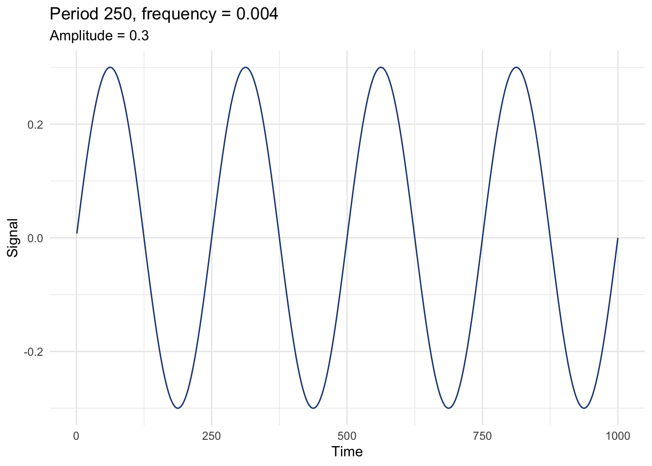
Now three more, each with its own period and amplitude.
waveDat <- waveDat |>
  mutate(wav50 = 0.75 * sin(2 * pi / 50 * tm),
    wav10 = 1.00 * sin(2 * pi / 10 * tm),
wav5 = 0.50 * sin(2 * pi / 5 * tm))ggplot(waveDat, aes(tm, wav50)) +
geom_line(color = bookPal[2]) +
labs(x = "Time", y = "Signal",
title = "Period 50, frequency = 0.02", subtitle = "Amplitude = 0.75") +
theme_minimal()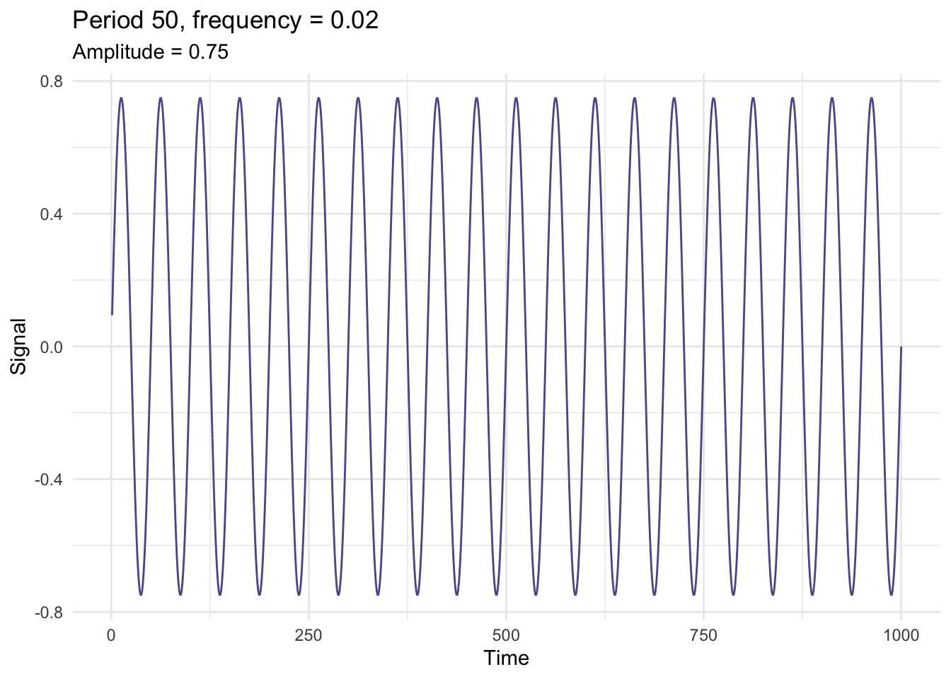
ggplot(waveDat, aes(tm, wav10)) +
  geom_line(color = bookPal[3]) +
  labs(x = "Time", y = "Signal",
    title = "Period 10, frequency = 0.1", subtitle = "Amplitude = 1") +
  theme_minimal()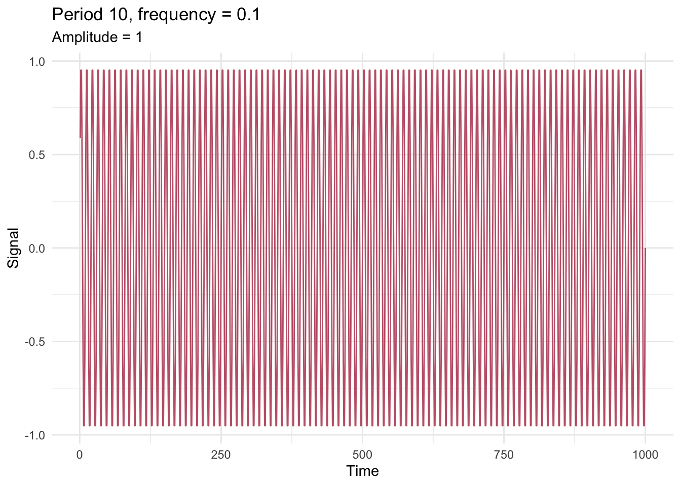
ggplot(waveDat, aes(tm, wav5)) +
  geom_line(color = bookPal[4]) +
  labs(x = "Time", y = "Signal",
    title = "Period 5, frequency = 0.2", subtitle = "Amplitude = 0.5") +
  theme_minimal()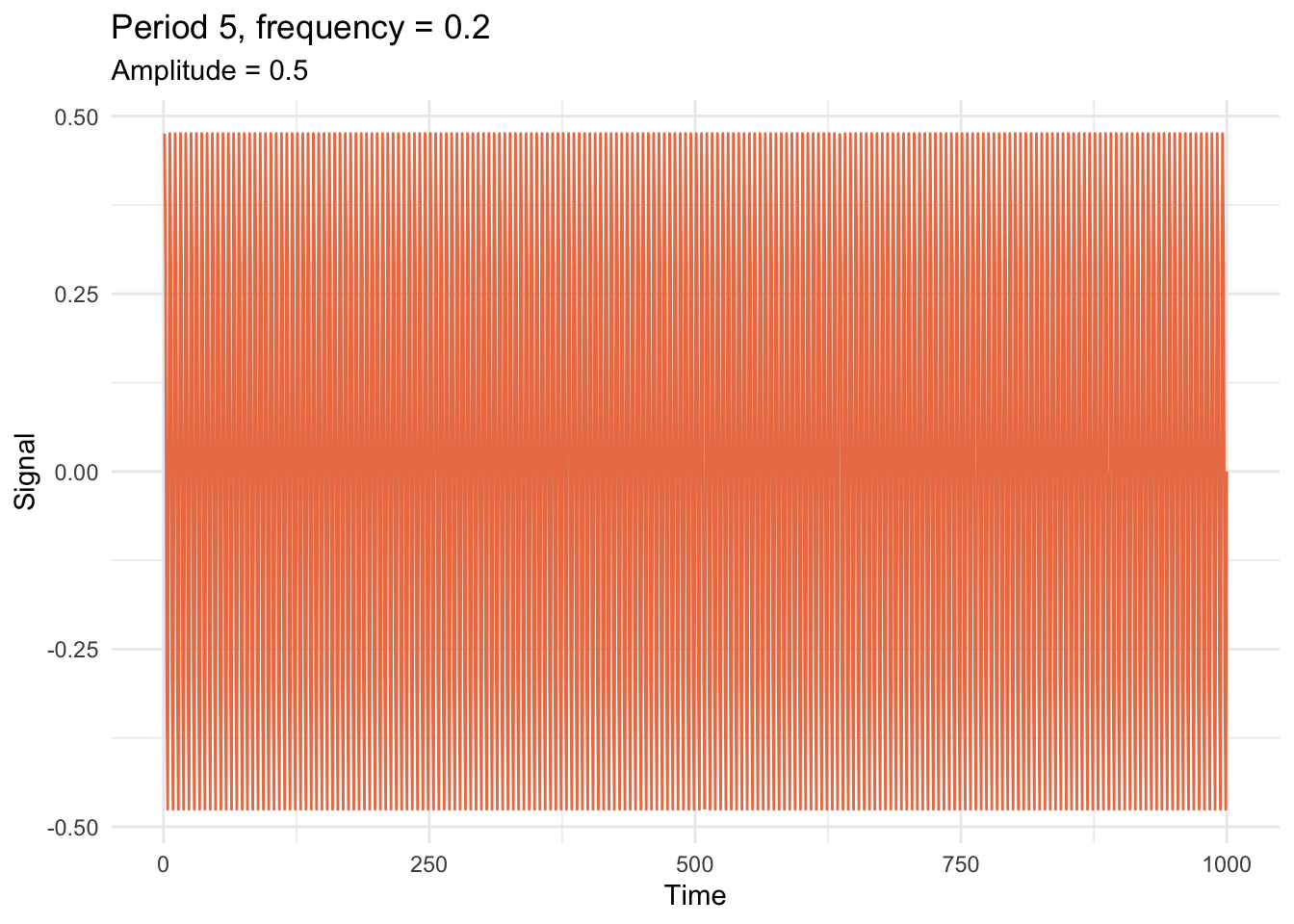
Sum all four and the individual waves blur into something that already looks a lot less tidy.
waveDat <- waveDat |> mutate(allWave = wav250 + wav50 + wav10 + wav5)

ggplot(waveDat, aes(tm, allWave)) +
  geom_line(color = bookPal[5]) +
  labs(x = "Time", y = "Signal", title = "Four frequencies combined") +
  theme_minimal()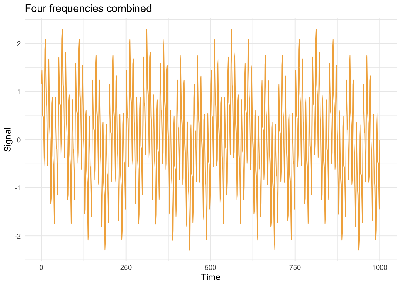
Add some noise and this looks a lot like something you’d actually meet in the field: a little wiggle, a lot of repeating structure, none of it obvious from the plot alone.
waveDat <- waveDat |> mutate(allWaveNoisy = allWave + rnorm(1000))

ggplot(waveDat, aes(tm, allWaveNoisy)) +
  geom_line(color = bookPal[5]) +
  labs(x = "Time", y = "Signal", title = "Four frequencies plus noise") +
  theme_minimal()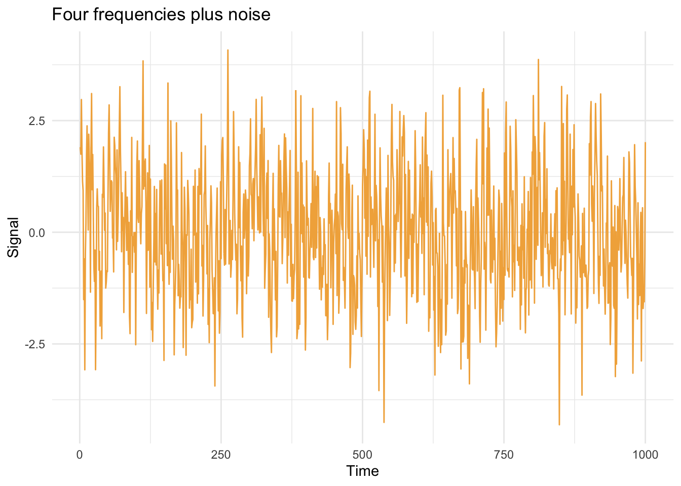
Zoom in on a hundred-point stretch and the mix is even harder to read by eye.
ggplot(waveDat, aes(tm, allWaveNoisy)) +
  geom_line(color = bookPal[5]) +
  labs(x = "Time", y = "Signal", title = "Four frequencies plus noise") +
  lims(x = c(500, 600)) +
  theme_minimal()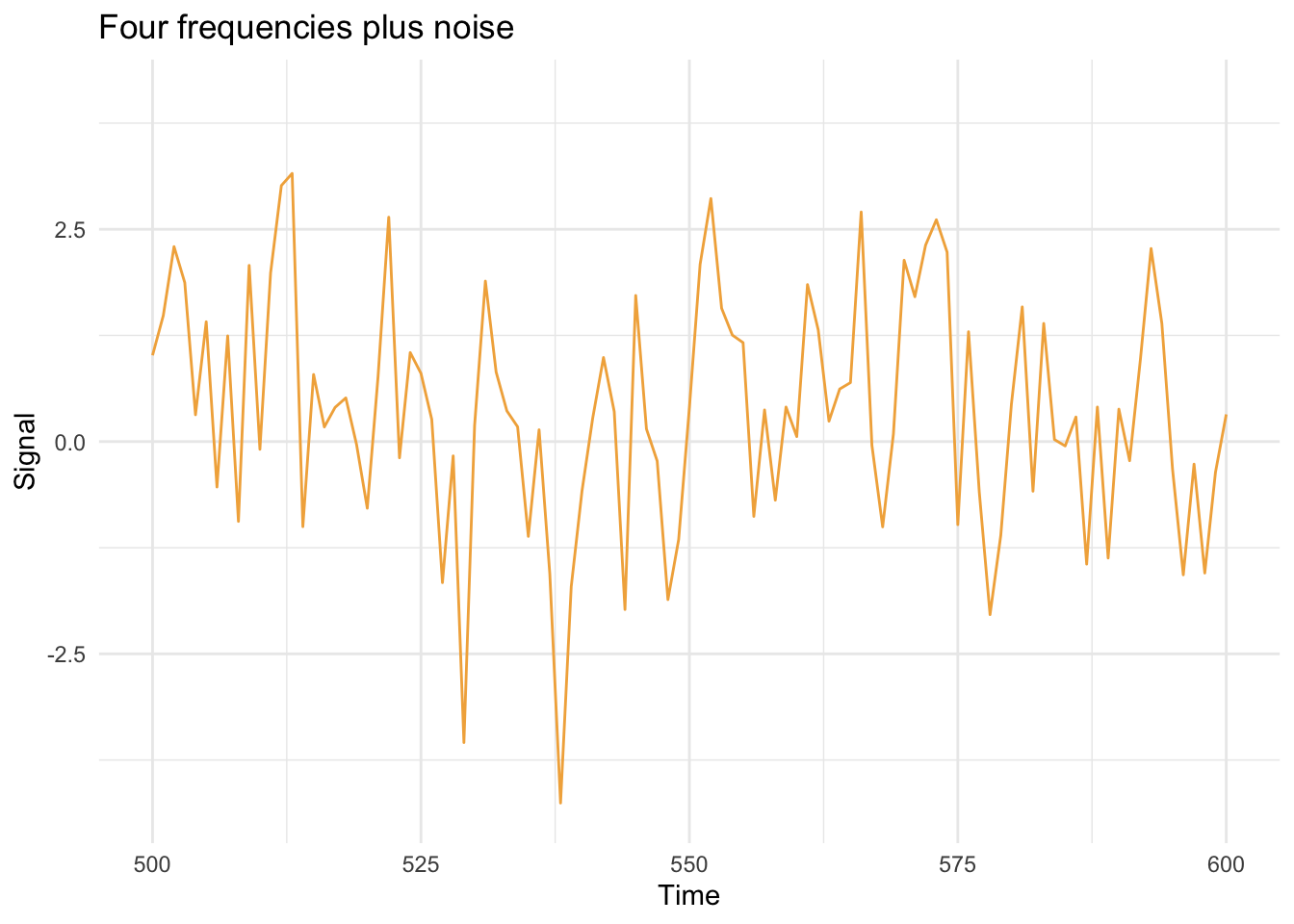
Now the question: can spectrum() recover the four cycles we know are buried in there? We’ll look at the raw periodogram, unsmoothed, since we already know exactly what we’re looking for.
waveSpec <- spectrum(waveDat$allWaveNoisy, plot = FALSE)
waveSpecDat <- tibble(freq = waveSpec$freq, spec = waveSpec$spec)

knownFreqs <- tibble(period = c(5, 10, 50, 250)) |> mutate(freq = 1 / period)

ggplot(waveSpecDat, aes(freq, spec)) +
  geom_line(color = "grey40") +
  geom_vline(data = knownFreqs, aes(xintercept = freq),
    linetype = "dashed", color = bookPal[5]) +
  labs(x = "Frequency", y = "Spectral density",
    title = "The periodogram recovers all four planted cycles",
    subtitle = "Dashed lines mark the frequencies we built in: periods 5, 10, 50, 250") +
  theme_minimal()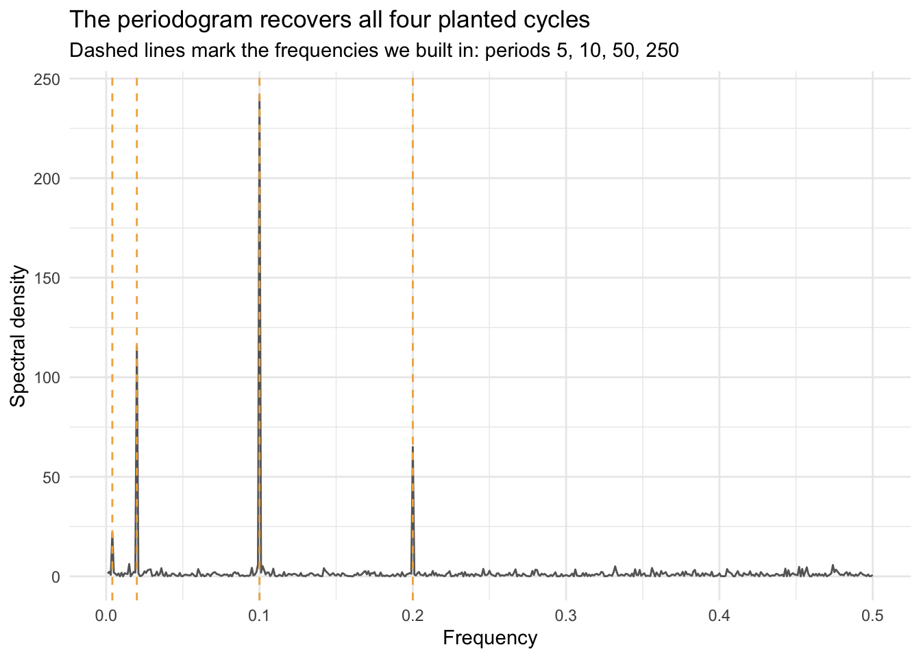
By default the straight spectrum() plot puts the spectral density on a log axis, which I didn’t do above. But run spectrum(waveDat$allWaveNoisy) yourself to see the log version, since that’s what you’ll get if you don’t ask otherwise. The spectrum is scaled so that the area under the curve equals about half the variance of the series. spectrum() can also smooth the periodogram (the span argument), which matters once the data get noisy enough that every point looks like its own tiny spike; Cowpertwait and Metcalfe (2009) works through why that smoothing is needed and what it costs. For this signal, though, the raw periodogram is exactly what we want, because we already know it should show four sharp peaks and nothing else.
The four tallest peaks in that plot land right on the four dashed lines, periods 5, 10, 50, and 250, in that order by strength. Nothing was fit or tuned to make that happen. spectrum() just took the noisy sum and handed back the pieces it was built from, which is the whole promise of this chapter: a squiggly line can be a stack of cycles in disguise, and the frequency domain is how you find out which ones.
Every plot in this chapter has put something called spectral density on the y-axis, and up to now that’s been a bit of a black box: a number spectrum() hands back that happens to spike in the right places. It’s worth unpacking.
For a series \(x_1, \dots, x_n\), the discrete Fourier transform (DFT) at frequency \(f\) is
\[X(f) = \sum_{t=1}^n x_t\, e^{-2\pi i f t}\]
a single complex number measuring how well the series lines up with a wave oscillating at frequency \(f\): large when \(x_t\) has a strong component at that frequency, small when it doesn’t. Evaluate \(X(f)\) at the Fourier frequencies \(f_k = k/n\) for \(k = 1, \dots, \lfloor n/2 \rfloor\), the finest grid of frequencies a series of length \(n\) can tell apart (why that’s the ceiling is the sunspot section’s Nyquist story, not this one), and the periodogram is just
\[I(f_k) = \frac{1}{n}\left| X(f_k) \right|^2\]
That’s the entire recipe. No smoothing, no fitting, just a change of basis: the same \(n\) numbers, rearranged from a list of amounts-at-each-time into a list of amounts-at-each-frequency.
The rearrangement doesn’t lose or manufacture anything. The DFT obeys an exact accounting rule, Parseval’s theorem: \(\sum_t x_t^2 = \frac{1}{n}\sum_{k=0}^{n-1}|X(f_k)|^2\). Every bit of squared variation in the series shows up somewhere on the frequency axis. Because \(x_t\) is real-valued, \(|X(f_k)|\) and \(|X(f_{n-k})|\) mirror each other, so the positive frequencies spectrum() actually draws carry almost exactly half that total (all of it except the mean, at \(k=0\), and one lone unmirrored bin at the Nyquist frequency). That’s the arithmetic behind the “area under the curve is about half the variance” claim from a few pages back, and it’s checkable on data already sitting in memory:
round(2 * sum(waveSpec$spec) / length(waveDat$allWaveNoisy), 2)[1] 1.93round(var(waveDat$allWaveNoisy), 2)[1] 1.93Same number twice, to two decimal places (the small remaining gap is spectrum()’s default tapering and detrending, both there to tame edge effects, not something worth chasing down here). A periodogram isn’t measuring some new quantity invented for this chapter. It’s the variance you already know how to compute, filed by frequency instead of summed into one number.
The raw periodogram above worked because we already knew the answer and were hunting for four specific spikes. Turn that around: imagine you didn’t know what was in the noise and had to trust the whole shape of the curve, spike by spike. That’s a worse position than it sounds, because a raw periodogram is a surprisingly poor estimator of the true spectrum, and more data does not fix it the way more data fixes almost everything else in this book.
First, let’s look at a periodogram of white noise just to get us oriented.
noiseSpec <- spectrum(rnorm(n), plot = FALSE)
noiseSpecDat <- tibble(freq = noiseSpec$freq, spec = noiseSpec$spec)

ggplot(noiseSpecDat, aes(freq, spec)) +
  geom_line(color = "grey40") +
  labs(x = "Frequency", y = "Spectral density",
    title = "White noise") +
  theme_minimal()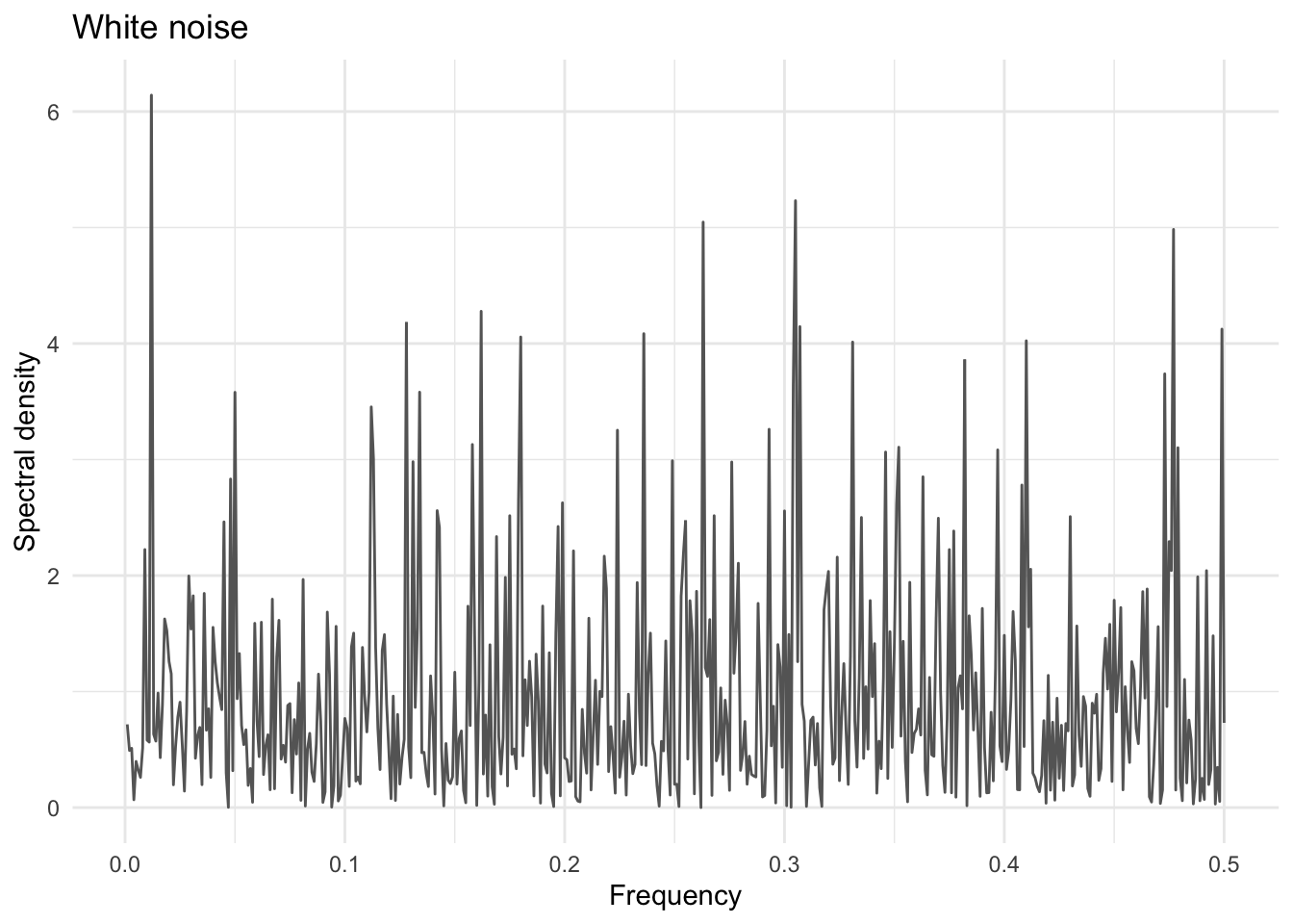
That’s a random spectrum. Run that a few times. Change n and continue after being comfortable with what noise looks like in the frequency domain.
Back in the autocorrelation chapter, an AR(1) with \(\phi = 0.7\) earned the name red noise just by looking smoother and more given to wandering than plain rnorm(), white noise. The periodogram is where that eyeball call turns into a number. White noise’s spectrum is flat, exactly the plot above: every frequency carries about the same variance, because there’s no memory pulling the series toward slow change over fast. Red noise tilts that flatness toward the low end, more power at slow frequencies and less at fast ones, which is exactly what positive autocorrelation does to a series. Push \(\phi\) all the way to one, the random walk from the stationarity chapter, and the tilt runs away entirely: power piles up as frequency goes to zero instead of leveling off. That extreme has its own name too, brown noise, a pun on Brownian motion rather than one more shade of red.
The vocabulary earns its keep outside this book. Climate scientists routinely fit an AR(1) as the red-noise null hypothesis before trusting a periodogram peak: plenty of climate series are reddened by ordinary persistence alone, and a peak has to clear that reddened background, not a flat white one, before anyone calls it a cycle.
Now, here’s the demonstration. Draw 500 independent white-noise series, compute the periodogram of each, and look at just one frequency bin (0.1) across all 500 draws. White noise has a flat spectrum everywhere, so every one of those 500 numbers is estimating the same true value. Do it once with series of length 100 and again with series ten times longer.
noiseOrdinate <- function(n) {
  x <- rnorm(n)
  sp <- spectrum(x, plot = FALSE)
  sp$spec[which.min(abs(sp$freq - 0.1))]
}

ordinates100  <- replicate(500, noiseOrdinate(100))
ordinates1000 <- replicate(500, noiseOrdinate(1000))

tibble(n = factor(rep(c("100", "1000"), each = 500), levels = c("100", "1000")),
  value = c(ordinates100, ordinates1000)) |>
  ggplot(aes(value, fill = n)) +
  geom_histogram(position = "identity", alpha = 0.6, bins = 30) +
  scale_fill_manual(values = c(`100` = bookPal[1], `1000` = bookPal[5])) +
  labs(x = "Periodogram value at frequency 0.1", y = "Count", fill = "n",
    title = "Ten times the data, the same amount of noise") +
  theme_minimal()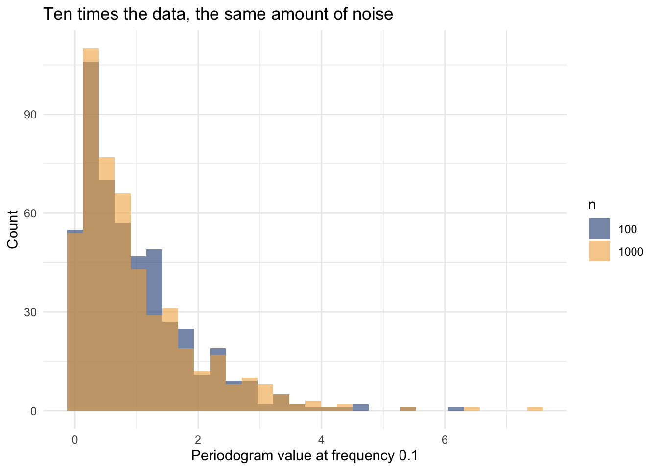
The two histograms sit right on top of each other. Ten times the data bought nothing: the coefficient of variation (standard deviation divided by mean) is 0.94 at \(n=100\) and 0.99 at \(n=1000\). That’s not a fluke of this particular simulation; it’s a property of the periodogram itself. Each ordinate is built from just two numbers (a sine and a cosine coefficient at that frequency), and adding more data doesn’t give any single ordinate more information, it just adds more ordinates alongside it. A longer series gives you a finer-grained frequency axis, not a more precise reading at any one frequency on it.
Two fixes are in play, and you’ve already seen a pointer to the first one: spectrum()’s span argument averages a periodogram ordinate together with its neighbors, borrowing strength across frequency the same way a moving average borrows strength across time.
smoothedOrdinate <- function(span) {
  x <- rnorm(400)
  sp <- spectrum(x, span = span, plot = FALSE)
  sp$spec[which.min(abs(sp$freq - 0.1))]
}
arOrdinate <- function() {
  x <- rnorm(400)
  sp <- spectrum(x, method = "ar", plot = FALSE)
  sp$spec[which.min(abs(sp$freq - 0.1))]
}

cv <- function(x) sd(x) / mean(x)
tibble(estimator = c("raw", "span = 5", "span = 21", "spec.ar()"),
  cv = c(cv(replicate(500, smoothedOrdinate(NULL))),
    cv(replicate(500, smoothedOrdinate(5))),
    cv(replicate(500, smoothedOrdinate(21))),
    cv(replicate(500, arOrdinate()))))
# A tibble: 4 × 2
estimator cv
<chr> <dbl>
1 raw 1.05
2 span = 5 0.489
3 span = 21 0.235
4 spec.ar() 0.132Widening the smoothing span from 5 to 21 roughly halves the coefficient of variation again, the usual averaging-more-neighbors payoff, at the cost of blurring together frequencies that used to be distinguishable. The other fix is spectrum(x, method = "ar"), which sidesteps the whole averaging trade-off by fitting an AR model to the series (the same ar() the forecasting chapter used) and reporting that model’s own theoretical spectrum instead of the raw Fourier transform. Borrowing a smooth parametric shape from an AR fit turns out to be an even more efficient way to estimate a spectrum than averaging neighboring frequencies, provided the AR model is a reasonable description of the series. Every periodogram in this chapter so far has used span = 5 for exactly this reason: not to make the plots prettier, but because an unsmoothed periodogram is close to untrustworthy on its own.
Smoothing a periodogram with a moving average of neighboring frequencies is itself a filter, just applied to a different axis than the ones the filters chapter used. That coincidence is worth taking literally: a filter has its own frequency response, a curve that tells you exactly what fraction of a cycle at each frequency survives it, and computing one settles a question the filters chapter left as an observation rather than a derivation.
Recall the finding: a 100-point moving average completely erased a planted 100-period cycle, while a 100-point Hanning filter, built from the same 100 points, did not. Here’s why, computed directly instead of just watched happening. A moving average of width \(W\) has a closed-form frequency response (the same “Dirichlet kernel” shape that turns up all over signal processing):
\[H(f) = \left| \frac{\sin(\pi f W)}{W \sin(\pi f)} \right|\]
boxWidth <- 100
Hbox <- function(f) abs(sin(pi * f * boxWidth) / (boxWidth * sin(pi * f)))

hanWeights <- 1 - cos(2 * pi / (boxWidth - 1) * (0:(boxWidth - 1)))
hanWeights <- hanWeights / sum(hanWeights)
Hhan <- function(f) Mod(sapply(f, \(ff) sum(hanWeights * exp(-2i * pi * ff * (0:(boxWidth - 1))))))

fseq <- seq(0.0002, 0.035, length.out = 3000)
filterRespDat <- bind_rows(
  tibble(freq = fseq, response = Hbox(fseq), filter = "100-point moving average"),
  tibble(freq = fseq, response = Hhan(fseq), filter = "100-point Hanning")
)

ggplot(filterRespDat, aes(freq, response, color = filter)) +
  geom_line(linewidth = 0.8) +
  geom_vline(xintercept = 1 / boxWidth, linetype = "dashed", color = "grey40") +
  scale_color_manual(values = c("100-point moving average" = bookPal[1], "100-point Hanning" = bookPal[5])) +
  labs(x = "Frequency", y = "Fraction of amplitude that survives", color = NULL,
    title = "The same 100-point width, two very different filters",
    subtitle = "Dashed line: the period-100 cycle from the filters chapter") +
  theme_minimal()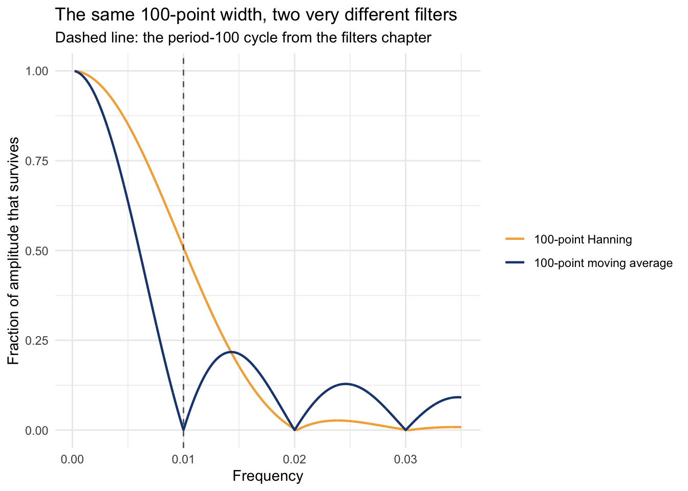
At the dashed line, the moving average’s response is 1.0e-16, zero to floating-point precision, not an approximation. A box filter’s response has an exact null at every frequency \(f = k/W\), and \(f = 1/100\) sits precisely on the first one, which is the whole mechanism behind the filters chapter’s “erases the cycle exactly” finding. The Hanning filter’s response at that same frequency is 0.51, roughly half the amplitude gone but nowhere near zero, because a Hanning window’s main lobe is close to twice as wide as a box filter’s, so its own first null gets pushed out past period 100 rather than landing on it. Same width, same target frequency, completely different fates: one filter is exactly blind at that frequency, and the other merely needs glasses.
Simulated series are a good place to learn the mechanics, but let’s point the same tool at data nobody built, starting with a periodic driver: the tide. data/cherry_point_tides.csv holds hourly water level for all of 2023 at Cherry Point, a NOAA tide gauge just north of Bellingham.
tides <- read_csv("data/cherry_point_tides.csv")

tides |>
  filter(DateTime < as.POSIXct("2023-01-16", tz = "UTC")) |>
  ggplot(aes(DateTime, water_level_m)) +
  geom_line(color = bookPal[1]) +
  labs(x = "Date", y = "Water level (m, MLLW)", title = "Two weeks of Cherry Point tides") +
  theme_minimal()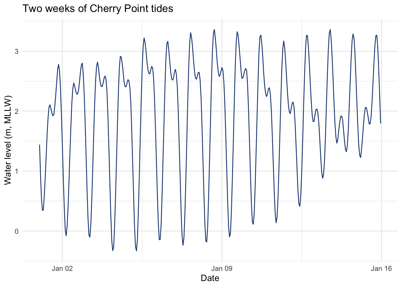
Two highs and two lows a day, but not identical highs or identical lows: some days show a barely-there notch on the way up, others show the tide almost stall halfway before finishing the climb. That lopsidedness is called diurnal inequality, and it’s the visible fingerprint of more than one cycle stacked on top of each other. Run the whole year through spectrum() and find out which ones.
tideSpec <- spectrum(tides$water_level_m, span = 5, plot = FALSE)
tideSpecDat <- tibble(freq = tideSpec$freq, spec = tideSpec$spec) |>
  filter(freq < 0.12)

tidalConstituents <- tibble(
  label     = c("K1", "O1", "M2", "S2"),
  name      = c("K1 (diurnal)", "O1 (diurnal)", "M2 (semidiurnal)", "S2 (semidiurnal)"),
  periodHr = c(23.9345, 25.8193, 12.4206, 12.0)
) |>
  mutate(freq    = 1 / periodHr,
    labelY = max(tideSpecDat$spec) * c(1.15, 0.55, 1.15, 0.55),
    labelH = c(-0.3, 1.3, 1.3, -0.3))

periodBreaksHr <- c(8, 12, 16, 24, 48)

ggplot(tideSpecDat, aes(freq, spec)) +
  geom_line(color = "grey40") +
  geom_vline(data = tidalConstituents, aes(xintercept = freq, color = label),
    linetype = "dashed", linewidth = 0.7) +
  geom_text(data = tidalConstituents, aes(x = freq, y = labelY, label = label, color = label, hjust = labelH),
    fontface = "bold", show.legend = FALSE) +
  scale_color_manual(values = setNames(bookPal[c(1, 2, 4, 5)], tidalConstituents$label), guide = "none") +
  scale_y_continuous(expand = expansion(mult = c(0.02, 0.18))) +
  scale_x_continuous(name = "Frequency (cycles / hour)",
    sec.axis = sec_axis(~., breaks = 1 / periodBreaksHr, labels = periodBreaksHr,
      name = "Period (hr / cycle)")) +
  labs(y = "Spectral density",
    title = "Named tidal constituents recovered from a year of hourly data",
    subtitle = "K1/O1 are diurnal (daily); M2/S2 are semidiurnal (twice daily)") +
  theme_minimal()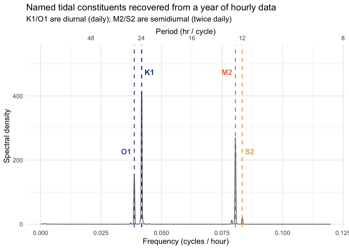
Four peaks, four names, each one a named gravitational term with a period nobody had to estimate: K1 and O1 come from the moon and sun’s daily pull as the Earth spins under them, M2 and S2 from the same pull acting roughly twice a day. Puget Sound and the rest of the Salish Sea sit in what oceanographers call a mixed, mainly semidiurnal regime (Pugh and Woodworth 2014): the semidiurnal M2/S2 pair sets the basic twice-a-day rhythm, but the diurnal K1/O1 pair is strong enough here to throw the two highs and two lows out of balance every day rather than fading into a footnote, which is exactly the notch-and-stall pattern in the two-week plot above. Four cycles nobody had to plant, recovered from a single year of hourly readings, each one traceable to a specific piece of orbital mechanics. Very cool.
Now for a cycle further from daily experience: the sunspot count, one of the longest continuously kept scientific records there is.
data(sunspot.year)
plot(sunspot.year)
The cycling is obvious by eye, but how regular is it, really? Compute the periodogram and find out.
sunspotAnnualSpec <- spectrum(sunspot.year, span = 5, plot = FALSE)
plot(sunspotAnnualSpec, log = "no", type = "h",
  xlab = "Frequency (cycles / yr)", ylab = "Spectral density")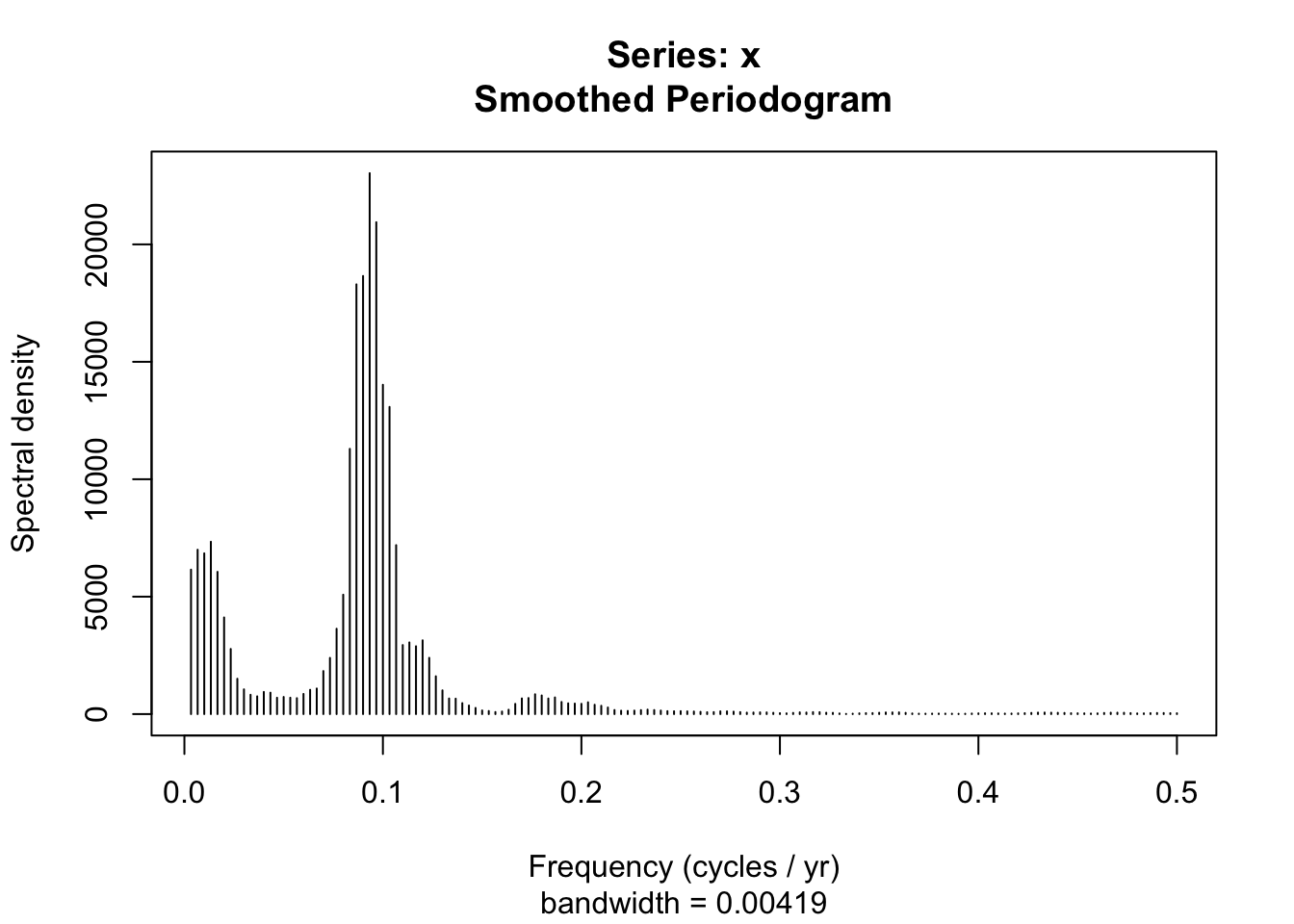
There’s a sharp spike around a frequency of 0.09. Since \(f = 1/p\), that’s a period of about 10.7 years, right where the well-known eleven-year solar cycle should land, in a record that goes back to 1700.
Zoom in on the low end of the frequency axis and there’s more going on.
plot(sunspotAnnualSpec, log = "no", type = "h",
  xlab = "Frequency (cycles / yr)", ylab = "Spectral density", xlim = c(0, 0.2))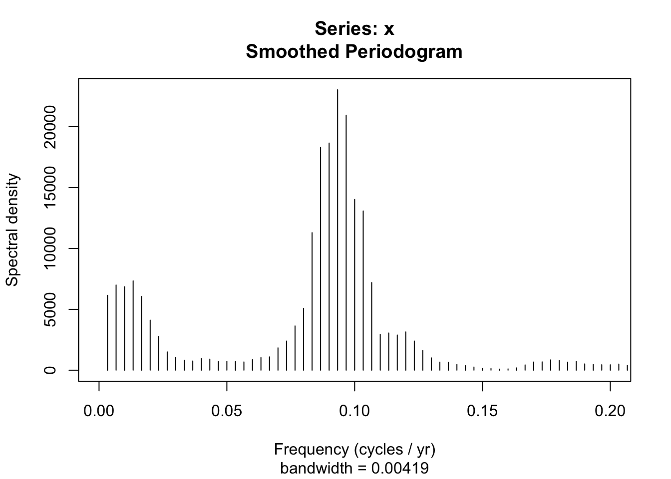
Below the eleven-year spike there’s a broad rise in power at much lower frequencies, periods out past fifty years, that never resolves into a single sharp peak the way the eleven-year cycle does. That’s consistent with the Gleissberg cycle (Peristykh and Damon 2003), a slower, roughly eighty-to-one-hundred-year modulation of how strong each eleven-year cycle runs (some cycles stronger, some weaker, riding a slower wave of their own). sunspot.year only spans 288 years, not even three full Gleissberg cycles, so what shows up here is a broad rise rather than a resolvable peak. That’s worth remembering the next time a periodogram gives you a shapeless bump instead of a clean spike: sometimes that’s a cycle the record is simply too short to pin down, not an absence of one.
You can also plot an object of class spec with plot(), as we just did (see ?plot.spec for the full set of options). Here’s a version built in ggplot, with a second x-axis for period, since after all this time I still think in periods, not frequencies.
sunspotAnnualDat <- tibble(freq = sunspotAnnualSpec$freq, spec = sunspotAnnualSpec$spec)

freqBreaks <- pretty(sunspotAnnualDat$freq)
periodLabels <- round(1 / freqBreaks, 2)

ggplot(sunspotAnnualDat, aes(x = freq, xend = freq, y = 0, yend = spec)) +
  geom_segment() +
  scale_y_continuous(name = "Spectral density", expand = c(0, 0)) +
  scale_x_continuous(name = "Frequency (cycle / yr)",
    sec.axis = sec_axis(~., breaks = freqBreaks, labels = periodLabels,
      name = "Period (yr / cycle)")) +
  theme_minimal()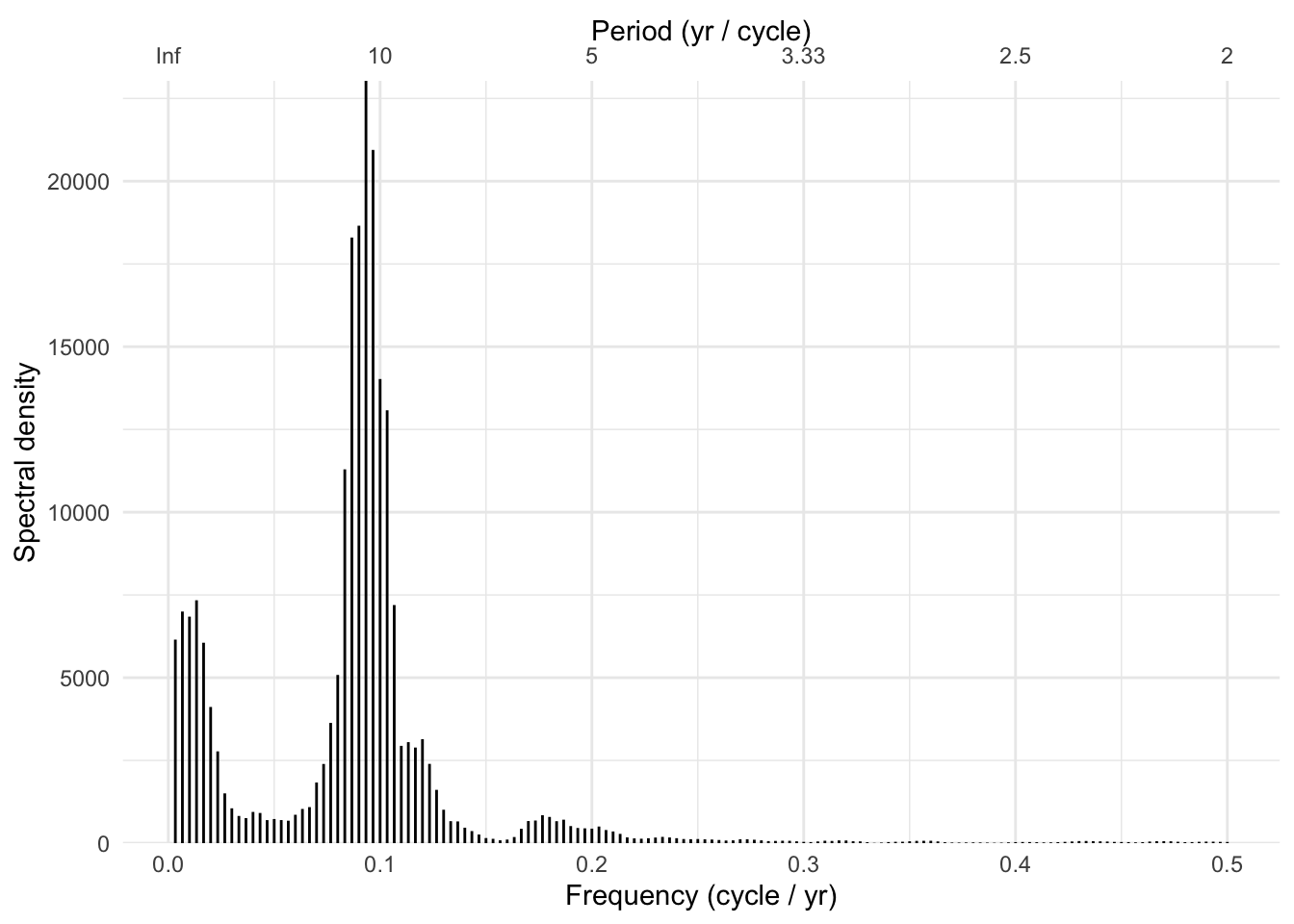
Now the same data at monthly resolution instead of yearly.
data(sunspot.month)
plot(sunspot.month)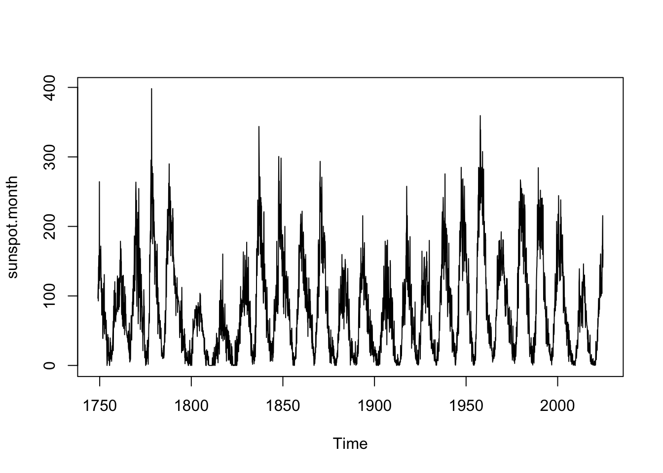
frequency(sunspot.month)[1] 12sunspot.month is the same underlying phenomenon, sampled twelve times a year instead of once; frequency() reports 12, the same start/frequency bookkeeping the intro chapter’s ts bridge relies on. Think about what that change in sampling rate should do to the frequency axis before you look at the next plot.
sunspotMonthlySpec <- spectrum(sunspot.month, span = 5, plot = FALSE)
sunspotMonthlyDat <- tibble(freq = sunspotMonthlySpec$freq, spec = sunspotMonthlySpec$spec)

ggplot(sunspotMonthlyDat, aes(freq, spec)) +
  geom_line(color = bookPal[1]) +
  labs(x = "Frequency (cycle / yr)", y = "Spectral density") +
  theme_minimal()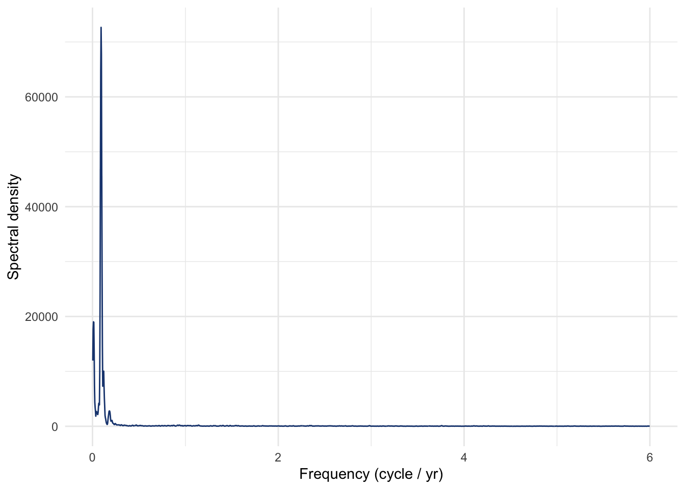
The x-axis now reaches out to 6 cycles per year instead of stopping at 0.5. That’s the Nyquist limit at work: the highest frequency a periodogram can resolve is always half the sampling rate, and twelve samples a year instead of one pushes the ceiling from 0.5 to 6. The eleven-year cycle is still the tallest thing in the plot (10.8 years, same story as the annual version), just squeezed into a sliver near zero on an axis that now stretches six times further. The extra room on that axis is empty for sunspot counts, since there’s no meaningful monthly-scale cycle in how many spots the sun has, but the same Nyquist logic is exactly what would let a faster-sampled instrument (daily solar irradiance, say) pick up faster solar phenomena that yearly or monthly counts were never going to resolve either way.
One frequency deserves a special mention: zero. A straight-line trend running the length of an entire record, what climatologists sometimes call secular change, never completes so much as one full cycle, so it isn’t really a cycle at all. The periodogram still has to put it somewhere, though, and it lands in the very lowest frequency bins available, right up against zero. A strong enough trend can dump so much variance into that first sliver of the axis that every other peak gets rescaled into invisibility beside it. That’s exactly why spectrum() removes a linear trend by default before computing anything (the small residual gap in the Parseval check a few pages back came from that same default): left in place, a lingering trend behaves like the biggest, slowest cycle in the record, one nobody intended to plant. The exercises let you turn that default off and see for yourself.
The frequency domain answers a question the time domain can’t: not when does something happen, but how often, and how much of the total variance belongs to each timescale. We built that idea from scratch with four sine waves whose periods we already knew, buried them in noise, and watched spectrum() hand every one of them back. Then we pointed the same tool at data nobody built: a year of hourly tide readings that resolved into four named lunar and solar constituents, and three centuries of sunspot counts that gave up an eleven-year cycle with a slower one hiding underneath it. Both were sitting there the whole time, waiting for the right axis to become visible. The exercises push the same tool out to the biggest timescale in the book: five million years of the Earth’s own orbit, and the ice ages it paces.
One thing worth carrying forward: a periodogram assumes the frequency content of a series stays put for the whole record, whatever cycles are there at the beginning are assumed to still be there at the end. That’s a stationarity assumption wearing a different costume, and it isn’t automatically true of environmental data (a species’ calling frequency shifting as its habitat warms, a tree’s dominant growth cycle changing as it ages past its fastest-growing years). When that assumption breaks down, a plain periodogram will average two very different eras together and hand you a blurred picture of both. There’s a fix, wavelets, and it gets the next chapter.
Generate a reasonably long white-noise series, an AR(1) series, and a random walk (cumsum() of white noise works fine). Compute and plot the periodogram of each. Do the shapes match what you’d have guessed beforehand? Hint: think about which of the three series counts as stationary in the sense the stationarity chapter defined, and what that might do to a tool that assumes a series’s frequency content doesn’t drift over the record.
Go back to the four-sine-wave demo and make it your own. Change an amplitude, add a fifth wave, or lay a linear trend on top of everything and see what happens to the periodogram. Guess first: where should a trend show up in the frequency domain? (Hint: a trend is about as low-frequency as a signal gets.) Then check ?spectrum for its detrend argument before you decide your guess was right or wrong. Also try smoothing the periodogram with the span argument, and see how much detail you can smooth away before the four peaks blur into the noise floor.
Now for the biggest jump in scale this book will make: from eleven years to five million. Many of you have run into the idea of orbital forcing through Milankovitch cycles: the slow changes in Earth’s orbital eccentricity, its axial tilt (obliquity), and the wobble of that axis (precession). Each cycles on its own timescale, tens to hundreds of thousands of years, and together they’re the leading explanation for the pacing of the ice ages.
data/jul65N.csv holds a reconstruction of July insolation (incoming solar energy, in W/m²) at 65°N latitude for the past five million years, from Berger and Loutre (1991). Unlike every other dataset in this chapter, nothing here was measured. The whole series is calculated straight from celestial mechanics: given the Earth, the sun, and Newton’s laws, you can work out exactly how much sunlight fell on 65°N in July at any point over that span. kya counts thousands of years relative to the present and runs negative into the past (0 is now, -5000 is five million years ago). W.per.m2 is the insolation itself.
Plot the series first. It’s a mess to eyeball: there’s clearly some rhythm buried in there, but no single obvious period the way the eleven-year sunspot cycle jumps out of a time-domain plot. Compute the periodogram and go looking for it there instead.
Three orbital cycles are the usual suspects: precession (roughly 19 to 24 thousand years), obliquity (about 41 thousand years), and eccentricity (about 100 thousand years). Mark those three bands on your periodogram. Do all three show up? Which one is the tallest peak, and which is barely there at all?
Here’s the payoff to chew on once you have the spectrum in front of you. The last 800,000 years of ice-core and ocean-sediment records are dominated by a roughly 100,000-year cycle between glacial and interglacial periods. If eccentricity turns out to be the runt of the three peaks in your periodogram, what does that say about how the ice-sheet and carbon-cycle system responds to orbital forcing? This is an unresolved question in paleoclimatology, known as the 100-kyr problem. Nobody expects you to settle it here, but you should be able to see exactly why it’s a problem once you’ve looked at the spectrum yourself.
span) is doing for you.jul65N.csv, computed well before satellite-era climate science and still a standard reference in paleoclimatology.In theory the time and frequency domains are mathematically equivalent, and you can reconstruct one from the other with a full Fourier transform. In practice, smoothing, truncation, or sampling limits can obscure some details in one domain that the other shows plainly.↩︎