Code
library(tidyverse)
library(tsibble)
library(forecast)
library(PNWColors)

bookPal <- pnw_palette("Sunset2", n = 5, type = "discrete")Autocorrelation asked how a series relates to its own past. Cross-correlation asks the same question about two different series: how does \(x\) at one time relate to \(y\) at another? It is the bivariate version of the function we built in the autocorrelation chapter, and it earns its keep by finding the lag at which one series tracks another. That lag is the payoff. If river discharge peaks a few days after a storm, or grazers bloom a few weeks after the algae they eat, the cross-correlation will show it, and the offset is a clue to which series drives which. Knowing that \(x\) leads \(y\) also hands you something to forecast \(y\) with that beats \(y\)’s own history alone, a thread we pick up later in this part.
The same warning from before applies. Two series that happen to share a trend, or a season, or even just strong memory of their own, will produce a large cross-correlation that means nothing. “If you smooth them, they will correlate,” my grad school mentor Jeremy Littell used to say. The function will hand you a number whether or not there is anything between the two series, so a good cross-correlation analysis involves stripping out the structure each series carries on its own and then asking what is left. We will end the chapter on exactly that move.
We stay in the tsibble (Wang et al. 2020) framework, with tidyverse (Wickham 2023) for wrangling, and read example data from CSV. forecast (Hyndman et al. 2026) gives us Ccf, we lean on base R’s ar and filter for the prewhitening at the end, and PNWColors (Lawlor 2020) supplies the book’s palette for the figures.
library(tidyverse)
library(tsibble)
library(forecast)
library(PNWColors)
bookPal <- pnw_palette("Sunset2", n = 5, type = "discrete")Everything here rests on shifting one series in time relative to another, so it is worth being precise about what a lag is. To lag a series by one step is to slide it forward so that yesterday’s value lines up with today’s row. dplyr::lag does this, padding the front with NA because there is no value before the first one.
x <- c(3, 1, 4, 1, 5, 9)
tibble(x, lag1 = dplyr::lag(x), lag2 = dplyr::lag(x, 2))
# A tibble: 6 × 3
x lag1 lag2
<dbl> <dbl> <dbl>
1 3 NA NA
2 1 3 NA
3 4 1 3
4 1 4 1
5 5 1 4
6 9 5 1Read across a row: lag1 holds the value from one step back, lag2 from two steps back. That is all a lag is. The only thing that trips people up is the bookkeeping of which direction counts as positive, and the cross-correlation function has its own convention for that. Ccf(x, y) reports the correlation between \(x_{t+k}\) and \(y_t\) for a range of lags \(k\). A negative \(k\) lines up an earlier \(x\) with a later \(y\), so a peak at negative lag means \(x\) leads \(y\). That is the case you want for forecasting: \(x\) moves first, \(y\) follows, and the values of \(x\) you already have tell you something about the \(y\) you have not seen yet. Keep that straight and the plots read themselves. My own dyslexia makes me think through these plots for a spell before I remember which way to read them, but that’s my own issue.
Let’s plant a relationship we know the answer to and see if the cross-correlation can find it. Take a white-noise series \(x\) and build \(y\) as a scaled copy of \(x\) from three steps back, plus some noise of its own. By construction \(x\) leads \(y\) by exactly three.
set.seed(872)
n <- 200
x <- rnorm(n)

lagTrue <- 3
xShifted <- dplyr::lag(x, lagTrue)        # x from three steps back
y <- 0.8 * xShifted + rnorm(n, sd = 0.5)
Always look at what you built. Here are the first thirty points of both series, and if you stare at the peaks you can (almost) see \(y\) echoing \(x\) a few steps later.
tibble(time = 1:n, x, y) |>
  filter(time <= 30) |>
  pivot_longer(c(x, y)) |>
  ggplot(aes(time, value, color = name)) +
  geom_line() +
  geom_point(alpha = 0.3, size = 2) +
  scale_color_manual(values = c(x = bookPal[1], y = bookPal[5])) +
  labs(x = "Time", y = NULL, color = NULL) +
  theme_minimal()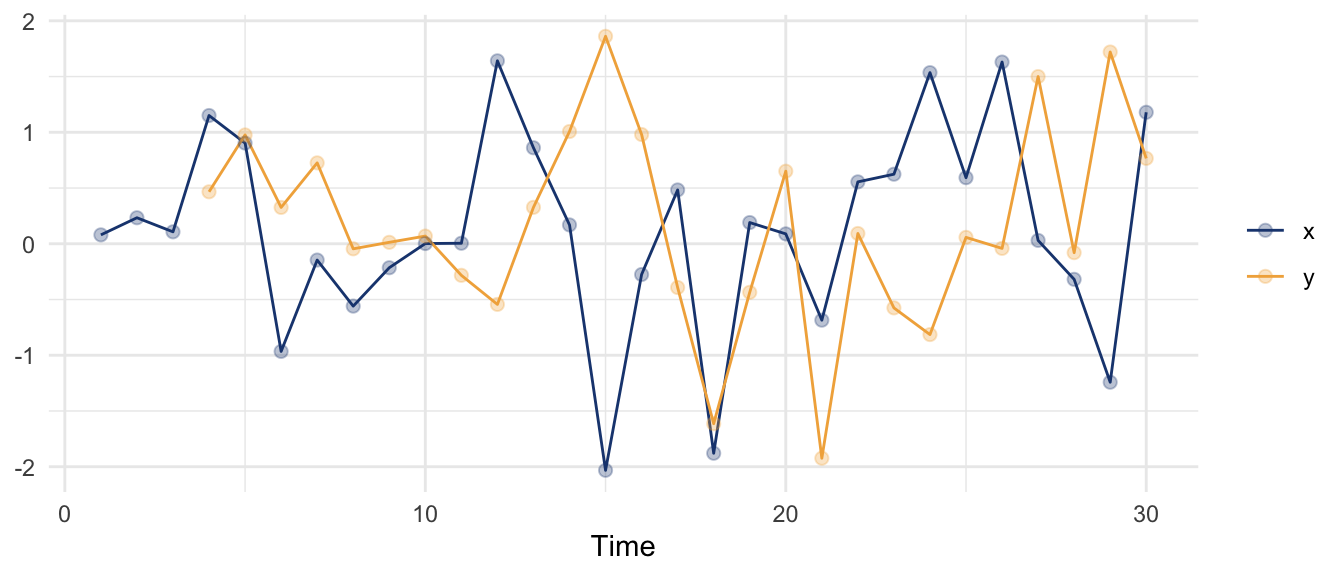
Line the two series up at the same time and there is nothing there.
cor(x, y, use = "complete.obs")[1] -0.07996565Line \(y\) up against \(x\) from three steps back and the relationship snaps into focus.
aligned <- tibble(x, y) |> drop_na()
cor(aligned$x, aligned$y)                   # same-time correlation
[1] -0.07996565lagged <- tibble(xLag3 = dplyr::lag(x, 3), y) |> drop_na()
cor(lagged$xLag3, lagged$y) # y against x from 3 steps back[1] 0.8636116The same-time correlation is essentially zero; the lag-three correlation is strong. The cross-correlation function does this for a whole range of lags at once and plots the result.
ggCcf(x, y, lag.max = 12) +
  theme_minimal()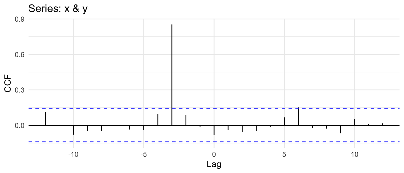
One spike stands out at a lag of negative three, which by the convention above says \(x\) leads \(y\). We planted a lead of three, and the function recovered it without being told. Everything else sits inside the dashed band, which is where correlations land when there is nothing behind them. When the relationship is this clean, the cross-correlation is a clean instrument.
Planted data is obliging. Here is a measured series with a relationship we did not design. Lake Washington, the lake Seattle sits against, has been sampled month after month since the early 1960s, one of the longest plankton records anywhere. From it I have built two monthly series: producers, an index of the phytoplankton, the algae at the base of the food web, and grazers, an index of the zooplankton that eat them, the water fleas and copepods. Each index pools several taxa that have been log-transformed and standardized so no single bloom dominates, which is the kind of bookkeeping plankton data needs; the recipe is in the data appendix if you want it. What matters here is that we have two measured series, the eaten and the eaters, sampled monthly for thirty-odd years.
planktonData <- read_csv("data/lake_wa_plankton.csv", show_col_types = FALSE) |>
  mutate(month = make_yearmonth(Year, Month)) |>
  as_tsibble(index = month)
Plotting all thirty years at once is a hairball, so here is a representative decade.
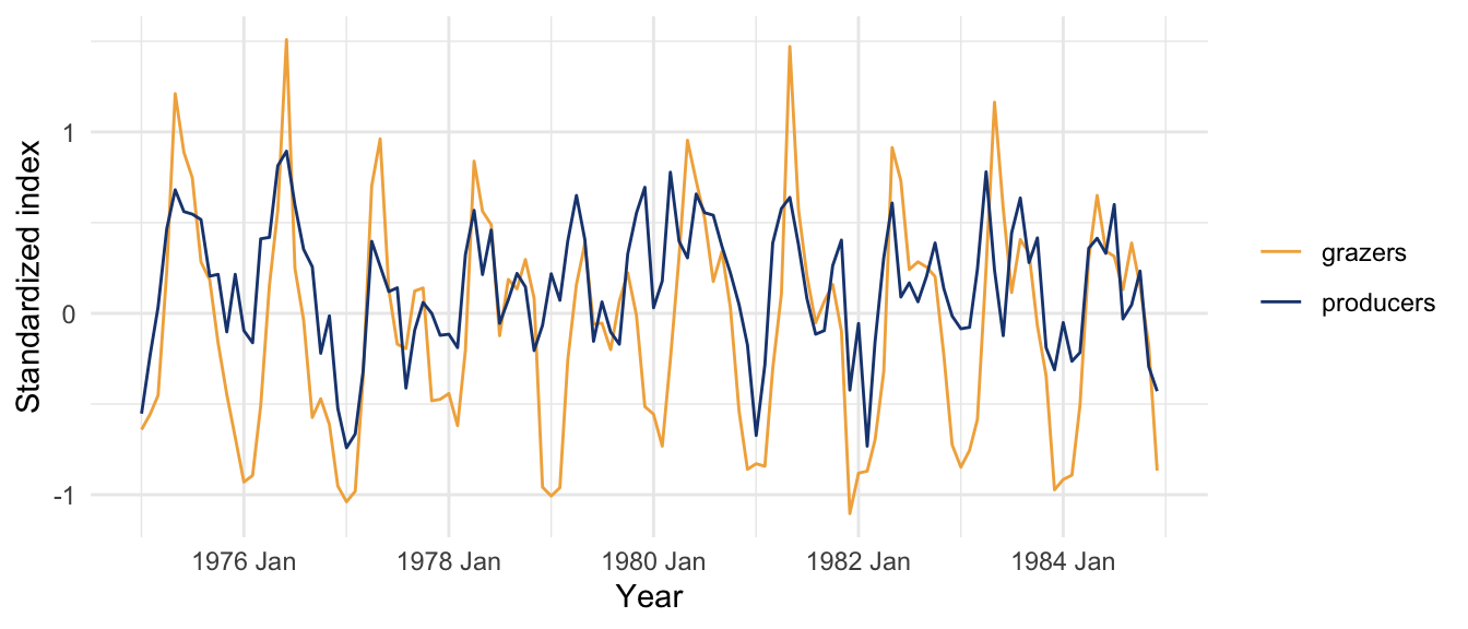
Both series ride the same annual rhythm, climbing in spring and falling toward winter, and the grazers seem to follow the algae by a beat. The story you would expect is the food chain: the algae bloom, the grazers have something to eat and multiply, the grazers graze the algae down, and the algae crash. So we expect the producers to lead. Cross-correlation can check it.
ggCcf(planktonData$producers, planktonData$grazers, lag.max = 24) +
  labs(title = "Producers and grazers, raw cross-correlation") +
  theme_minimal()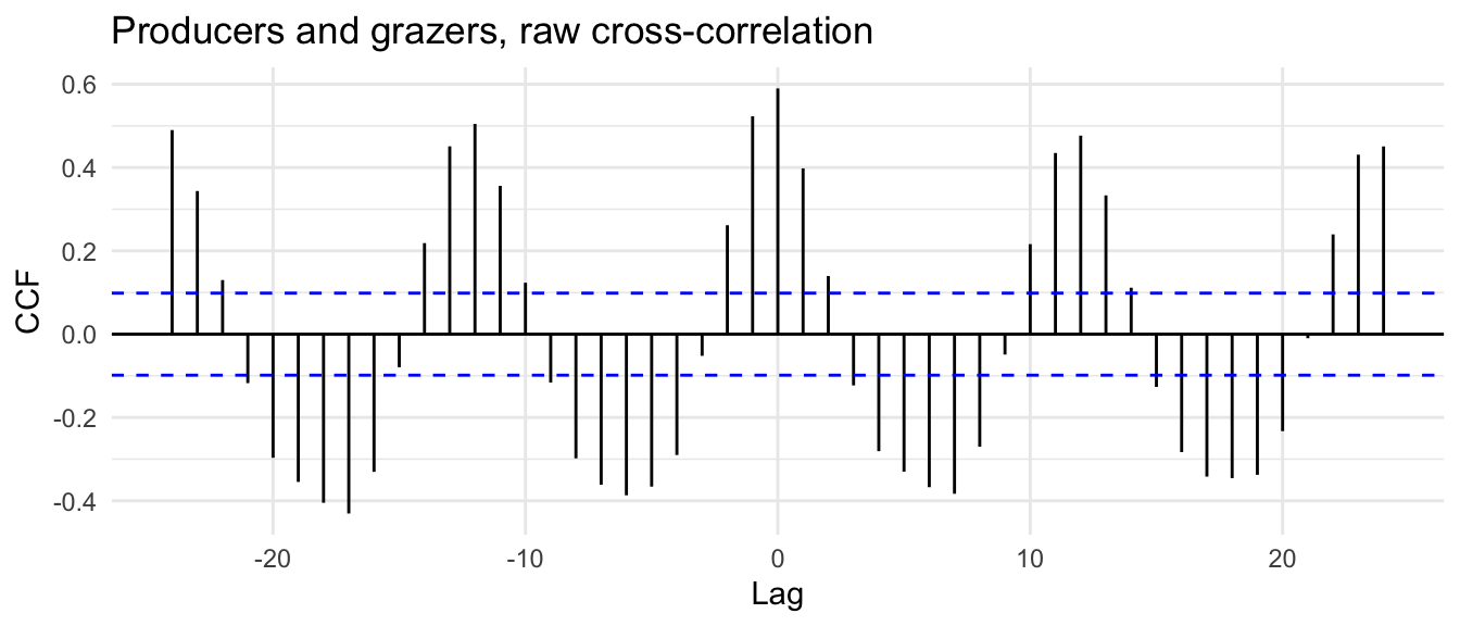
The strongest correlation is right at lag zero, the two series moving together within the month, which makes sense for organisms that respond to each other on a scale of weeks when you are only sampling monthly. But the plot is not symmetric. The bars just left of zero, where the producers lead, stand taller than the matching bars on the right, where they would trail. The algae running a month ahead of the grazers correlates better than the algae running a month behind, and that asymmetry is the food chain showing through. It is a weaker signal than the planted spike, and that is the difference between a simulation and a lake. Plankton respond to each other faster than a monthly sample can resolve, so the lead gets squashed toward lag zero instead of standing off at a clean offset.
And look at the rest of the plot. The correlation does not drop to nothing away from the peak; it rides a slow wave, positive for a stretch of lags and then sliding negative, because both series carry the same strong annual cycle and the cross-correlation picks up every overlap between the two seasons, not just the food-chain lead we care about. Reading a single lag off a plot like this is asking for trouble, which brings us to the part of the chapter that keeps you out of it.
But there is a wrinkle. Take two random walks, each one nothing but a cumulative sum of independent noise, built so that they have absolutely nothing to do with each other.
set.seed(70)
randomWalk1 <- cumsum(rnorm(200))
randomWalk2 <- cumsum(rnorm(200))
cor(randomWalk1, randomWalk2)
[1] 0.8875043Why is a cumulative sum a random walk? Because that is the definition of one. Start at zero and at each step add a fresh independent shock to wherever you already are, \(y_t = y_{t-1} + \epsilon_t\). Unwind that recursion and \(y_t\) is nothing but the running total of every shock so far, \(\epsilon_1 + \epsilon_2 + \cdots + \epsilon_t\), which is exactly what cumsum(rnorm(n)) computes: draw the shocks, then accumulate them. Each value carries the whole history of the series inside it, so there is no mean to pull it back and it wanders wherever the accumulated shocks have taken it.Let’s look at two walks.
tibble(time = 1:200, randomWalk1, randomWalk2) |>
  pivot_longer(c(randomWalk1, randomWalk2)) |>
  ggplot(aes(time, value, color = name)) +
  geom_line() +
  scale_color_manual(values = c(randomWalk1 = bookPal[1], randomWalk2 = bookPal[5])) +
  labs(x = "Time", y = NULL, color = NULL) +
  theme_minimal()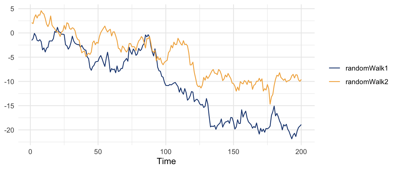
Each one drifts in long smooth excursions, and over this particular stretch they happen to drift the same way. The correlation puts a number on that coincidence: 0.89, between two series that share no mechanism whatsoever. The cross-correlation is worse, because it gets to go looking across lags for the best apparent match.
ggCcf(randomWalk1, randomWalk2, lag.max = 20) +
  labs(title = "Two independent random walks") +
  theme_minimal()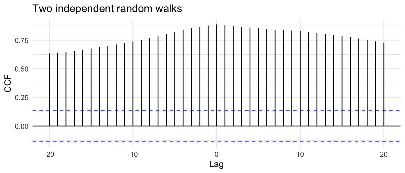
Bars towering over the dashed band at nearly every lag, all of it noise. Neither series knows the other exists. What fools the cross-correlation is that each series wanders slowly and smoothly, so any two long smooth wanders will drift in and out of step and look related over a stretch. This is the saboteur of dependence again: the autocorrelation inside each series, the thing that makes it smooth, is exactly what makes the fake relationship between them.
The fix has a name, prewhitening. Before you ask how two series relate, take the predictable structure out of each one and reduce it to white noise, so that what remains is only the part the series could not have produced on its own. For a random walk, the structure is the unit root, and the way to remove it is the way we removed it back in the stationarity chapter: difference it. Difference both series and the wandering is gone, leaving the independent shocks that drove each walk.
d1 <- diff(randomWalk1)
d2 <- diff(randomWalk2)
ggCcf(d1, d2, lag.max = 20) +
  labs(title = "After differencing both series") +
  theme_minimal()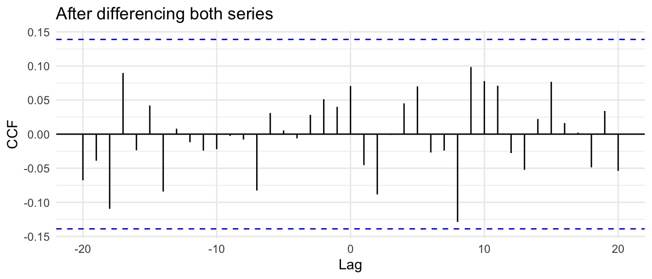
The correlation collapses. Every bar is back inside the band, which is the correct answer: there was never anything between these two series, and once you stop letting their private wandering do the talking, the cross-correlation says so.
Now turn the same tool on the producers and grazers, where we believe there is something but the annual cycle is burying it. The recipe for a series that is not a simple random walk is to fit it a model, take the residuals as the whitened version, and apply that same filter to the other series before comparing. Fit an autoregressive model to the producers, whiten the producers with its residuals, run the grazers through the producers’ filter, and cross-correlate what is left.
arProd <- ar(planktonData$producers)           # model the producers' own structure
arProd$order
[1] 23prodWhite <- arProd$resid # whitened producers
grazFilt <- stats::filter(planktonData$grazers, c(1, -arProd$ar),
sides = 1, method = "convolution") # same filter on grazers
ok <- is.finite(prodWhite) & is.finite(grazFilt) # drop the leading NAs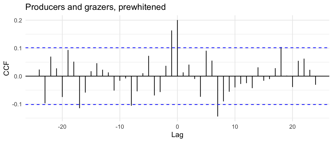
The order ar chose reached back two years to model the producers, stacking up lags to rebuild the annual cycle the same blunt way the algorithm rebuilt the river’s season in the forecasting chapter. With that cycle stripped out of both series, the slow wave is gone. What is left is small, near the dashed band, but it is not symmetric. The bars on the producer-leads side, at lag zero and one month back, clear the band; the bars on the trailing side do not. Prewhitening took away the season’s gift of correlation at every lag and left only the part that runs one direction in time: the algae lead the grazers, never the reverse. That is the difference between the random walks and the plankton. When the relationship was fake, prewhitening erased it. When the relationship was there, prewhitening cleared away the seasonal clutter and left the direction standing. The lead of the algae over the grazers is faint, but it is the food chain.
Cross-correlation extends the autocorrelation function to two series and reports the lag at which one tracks the other. Read correctly, that lag is a clue to mechanism: which series moves first, and by how long. We planted a lead of three and recovered it, found the algae of Lake Washington running a step ahead of the grazers that eat them, and then spent the back half of the chapter on the reason you cannot take a raw cross-correlation at face value. Two series that each carry a trend, a cycle, or strong memory of their own will correlate with each other for reasons that have nothing to do with one influencing the other, and prewhitening, stripping each series down to white noise before comparing, is how you tell the difference between a relationship and a coincidence.
That sets up the next chapter. Suppose the cross-correlation convinces you that \(x\) leads \(y\) and you want to act on it, to actually fit \(y\) as a function of \(x\) and read the slope. The moment you write that regression down you are back in the trap from the first chapters: the errors will be autocorrelated, ordinary least squares will believe them too much, and the standard error it reports will off. The regression chapter is about fitting a model between two series and trusting the answer, which means dealing with the dependence in the errors.
Split the Lake Washington record in two: train on the years through 1984 and hold out 1985 onward. Using the lead you found, with the producers about a month ahead, fit a linear model of grazers on producers lagged one month over the training years, then predict the held-out grazers from the held-out producers. Plot the prediction against what actually happened and compute the correlation. How much of the grazers’ month-to-month variation can a one-month-lagged algae index explain, and does that square with the cross-correlation peak sitting so close to lag zero? Think about what the prewhitening section implies about trusting the slope and its standard error when both series carry the same season.
Simulate two independent random walks of length 200, each a cumulative sum of rnorm, and compute the cross-correlation. Do it a dozen times with different seeds and look at how big the spurious peaks get. Then prewhiten by differencing both series and watch the towering peaks shrink back down to the size you would expect from noise. Roughly what fraction of your dozen raw runs would have fooled you into reporting a relationship if you had not known the two walks were independent?