Code
library(tidyverse)
library(dplR)
library(hydroTSM)
library(zoo)
library(tsibble)
library(PNWColors)

bookPal <- pnw_palette("Sunset2", n = 5, type = "discrete")Every chapter so far has treated a time series as a sequence of dependent observations. This chapter mostly asks something more visual. If you could turn a dial that traded away noise for pattern, where would you set it? A filter is that dial. It’s a set of weights slid along the series that produce a smoother version of it, one that keeps the slow-moving part and drops the jittery part (or, less often, the other way around).
Everyone who works with time series smooths something eventually, if only to draw a trend line through a scatter of points, and there are a lot of ways to do it that all produce a curve that looks equally trustworthy. The trouble is that a smoother has to decide, at every point, how much of the wiggle is signal and how much is noise, and it has the least evidence to make that decision at the two ends of the record, exactly where you’re most tempted to ask “so is it still going up?” We’ll build a signal with the truth planted on purpose, so that for once we can catch a filter misbehaving at the edges instead of just suspecting it.
Beyond the visual aid, filters solve practical problems: collapsing fine-grained data to a coarser resolution, pulling a slow trend out of a series so a faster signal is easier to see, and filling the gaps that inherited data always seem to have. This chapter also opens the book’s frequency-domain section, which might seem odd, since nothing below looks like frequency yet. Every filter in this chapter is choosing which frequencies survive and which get thrown out. We just don’t have the words for it. Those words, and the reason a filter can fail badly at exactly the frequency you care about, are what the next chapter is for.
You’ll want dplR (Bunn et al. 2026) (a subtle work of staggering genius), plus zoo (Zeileis et al. 2025) and hydroTSM (Mauricio Zambrano-Bigiarini 2026) for the aggregation and gap-filling work later in the chapter. We also need tidyverse (Wickham 2023) for wrangling, tsibble (Wang et al. 2020) to hold the aggregated data, and PNWColors (Lawlor 2020) for the figure colors.
library(tidyverse)
library(dplR)
library(hydroTSM)
library(zoo)
library(tsibble)
library(PNWColors)
bookPal <- pnw_palette("Sunset2", n = 5, type = "discrete")Recall stats::filter() from the decomposition chapter, where a hand-built set of weights pulled a trend out of a planted series? That was already a filter, we just didn’t call it one yet. People who work with time series are forever adding a smooth line to a plot to highlight the signal and play down the noise. It’s practically a compulsion, and everybody has a favorite way of doing it. Let’s look at a few of the common ones.
Simulated data are convenient because you get to write the answer key before you start, and that habit pays off later in this chapter. For now, though, let’s smooth something with an actual pattern worth keeping: a tree-ring chronology from near the arctic treeline in Canada, one of the datasets that comes onboard with dplR. I’ve pulled out the years for plotting.
data(cana157)
treeDat <- tibble(yrs = as.numeric(time(cana157)), Z = as.numeric(scale(cana157[, 1])))
nyrs <- nrow(treeDat)

pTree <- ggplot() +
  geom_hline(yintercept = 0) +
  geom_line(data = treeDat, aes(x = yrs, y = Z), color = "grey60") +
  labs(x = "Year", y = "Tree growth (z-score)",
    title = "Twisted Tree Heartrot Hill tree-ring chronology") +
  theme_minimal()
pTree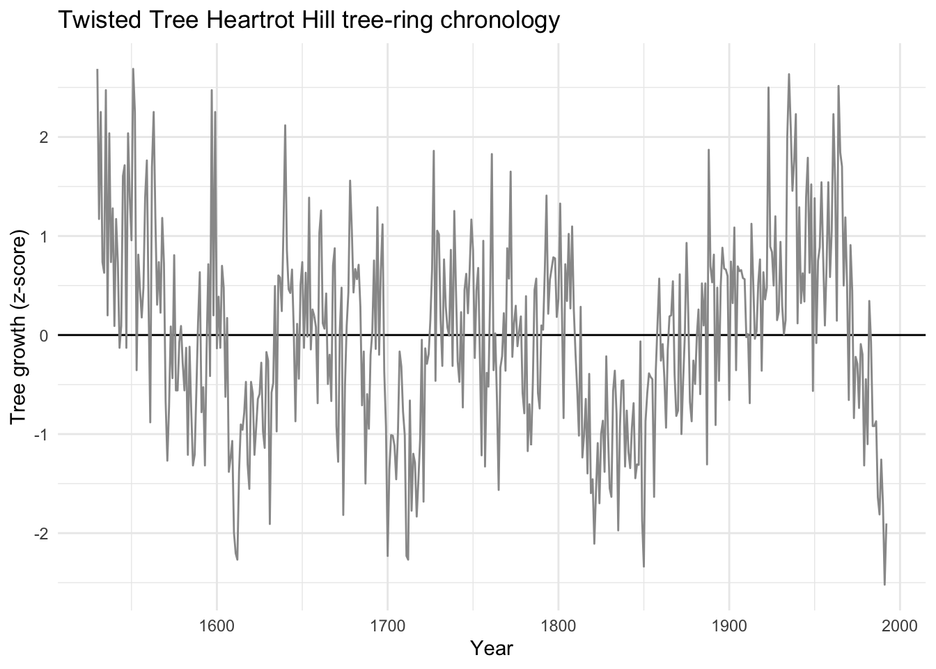
We already met the moving average in the decomposition chapter’s by-hand trend loop. It’s about as simple as a filter gets: average a window of neighboring points and slide it along. Below we smooth the chronology at three widths, 20, 50, and 100 years. All three emphasize the slow wiggle, but even the 100-year version keeps some jaggedness.
treeDat <- treeDat |>
  mutate(ma20  = c(stats::filter(Z, rep(1 / 20, 20),  sides = 2)),
    ma50  = c(stats::filter(Z, rep(1 / 50, 50),  sides = 2)),
    ma100 = c(stats::filter(Z, rep(1 / 100, 100), sides = 2)))

maLong <- treeDat |>
  select(yrs, ma20, ma50, ma100) |>
  pivot_longer(-yrs, names_to = "width", values_to = "value") |>
  mutate(width = factor(width, levels = c("ma20", "ma50", "ma100"),
    labels = c("20 years", "50 years", "100 years")))

pTree +
  labs(subtitle = "Moving average filters") +
  geom_line(data = maLong, aes(yrs, value, color = width, linetype = width), linewidth = 1) +
  scale_color_manual(values = c("20 years" = bookPal[1], "50 years" = bookPal[3], "100 years" = bookPal[5]), name = NULL) +
  scale_linetype_manual(values = c("20 years" = "solid", "50 years" = "dashed", "100 years" = "dotted"), name = NULL)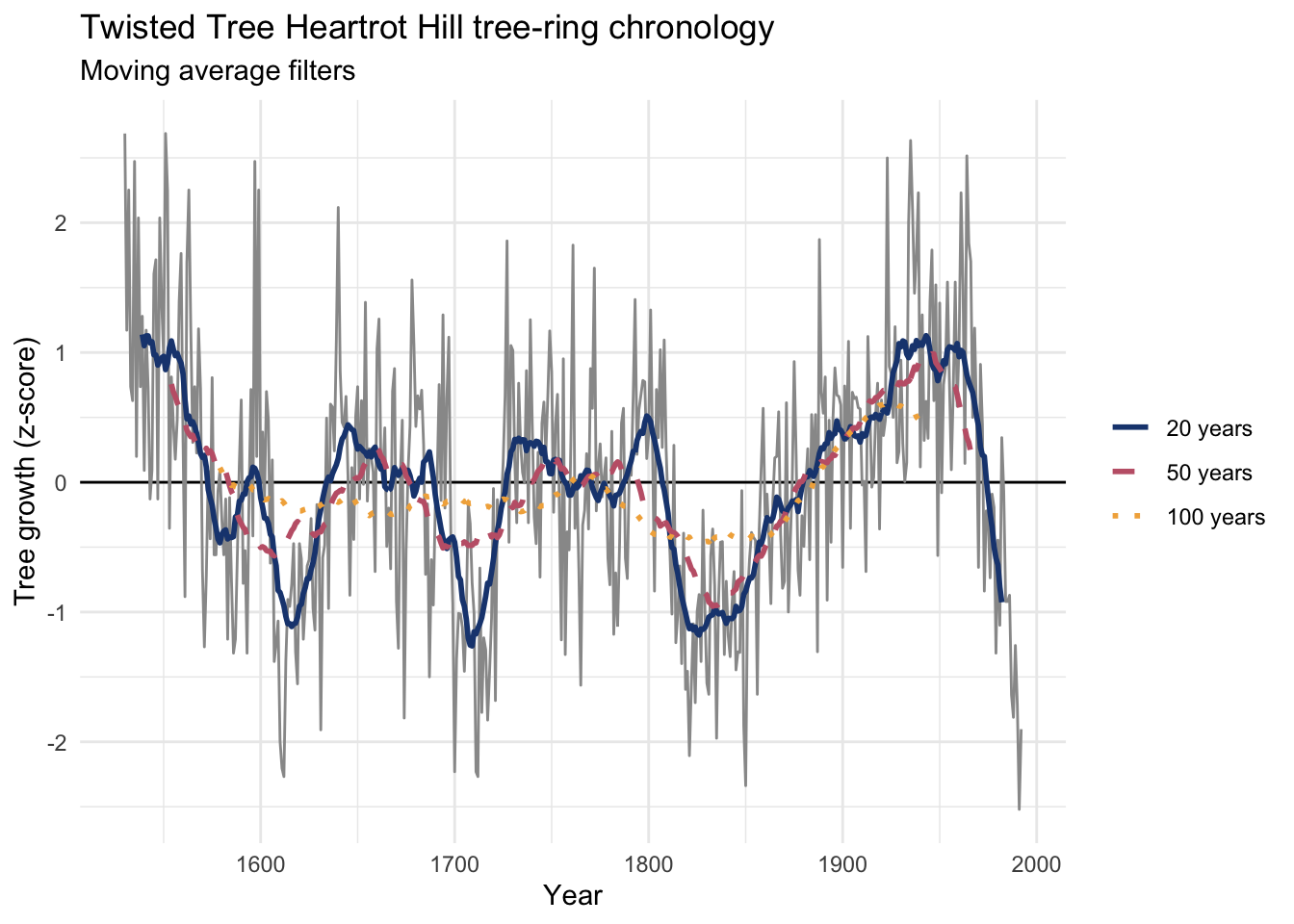
The Hanning filter is a cousin of the moving average. It also emphasizes the low-frequency wiggle, but it tapers its weights toward the ends of the window instead of treating every point the same, which is why the curve loses more of the jaggedness than a plain moving average of the same width. Look at the code (type hanning at the console) and you’ll see it’s still just a weighted average, only not a flat one. It belongs to a family of window functions, weights that taper to zero outside some interval you choose, and it’s a nice first step toward thinking in the frequency domain, the same domain the next chapter finally puts into words. It’s implemented in dplR as hanning().
treeDat <- treeDat |>
  mutate(han20  = hanning(Z, n = 20),
    han50  = hanning(Z, n = 50),
    han100 = hanning(Z, n = 100))

hanLong <- treeDat |>
  select(yrs, han20, han50, han100) |>
  pivot_longer(-yrs, names_to = "width", values_to = "value") |>
  mutate(width = factor(width, levels = c("han20", "han50", "han100"),
    labels = c("20 years", "50 years", "100 years")))

pTree +
  labs(subtitle = "Hanning filters") +
  geom_line(data = hanLong, aes(yrs, value, color = width, linetype = width), linewidth = 1) +
  scale_color_manual(values = c("20 years" = bookPal[1], "50 years" = bookPal[3], "100 years" = bookPal[5]), name = NULL) +
  scale_linetype_manual(values = c("20 years" = "solid", "50 years" = "dashed", "100 years" = "dotted"), name = NULL)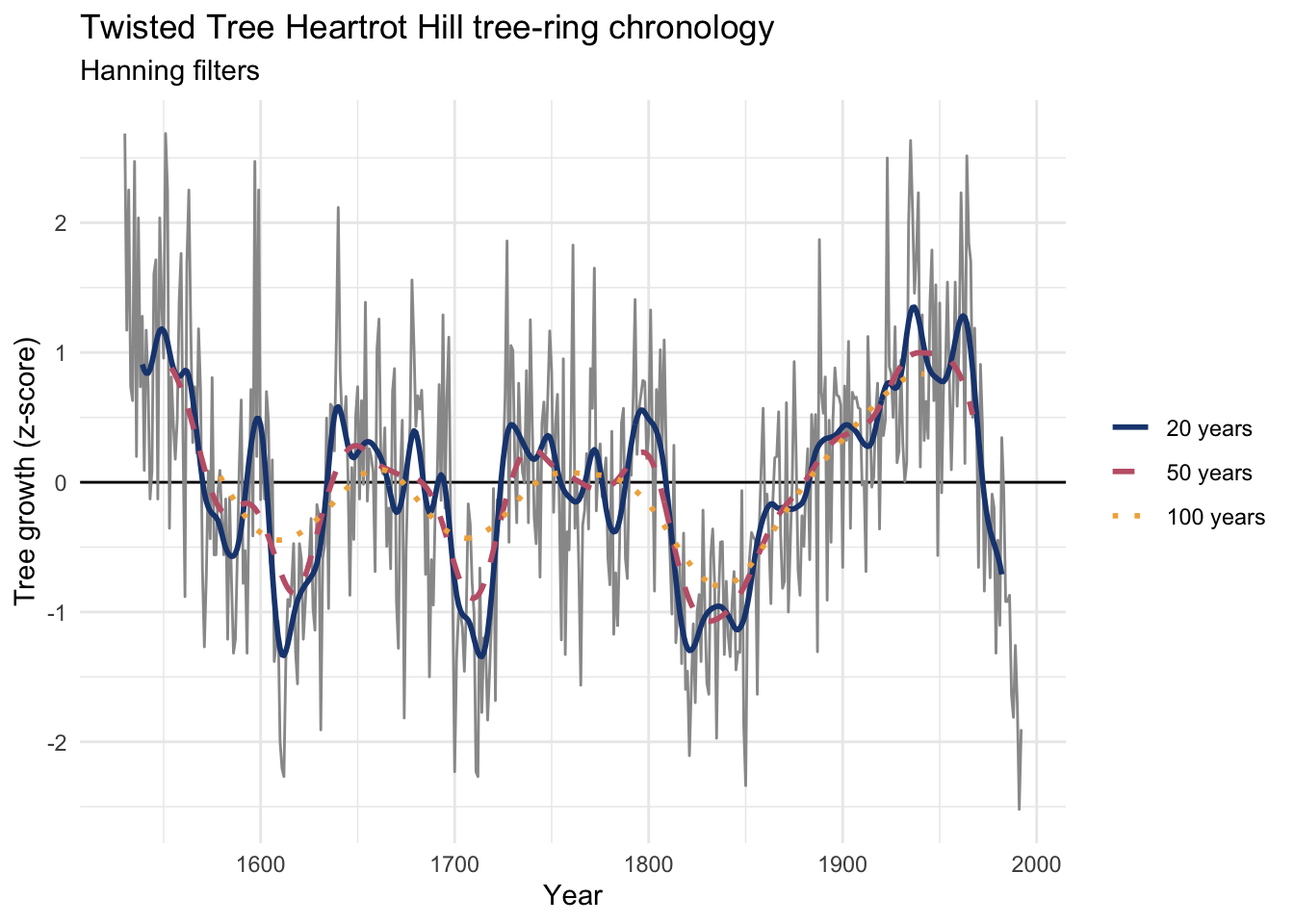
Like the moving average, the Hanning-smoothed curve is shorter than the input: both lose half a window’s worth of points on each end. That’s the price of refusing to answer where the window doesn’t fully fit, and it’s a price worth measuring exactly, which we’ll do in a few pages.
smooth.spline() fits a curve to a set of observations using piecewise polynomials, a common choice in time-series work for both smoothing and interpolating (more on interpolating later in the chapter). The knob to turn is spar: bigger values smooth more heavily. Unfortunately spar doesn’t translate into a number of years the way a moving-average width does, so tuning it is more trial and error.
treeDat <- treeDat |>
  mutate(ss0.2 = smooth.spline(Z, spar = 0.2)$y,
    ss0.4 = smooth.spline(Z, spar = 0.4)$y,
    ss0.6 = smooth.spline(Z, spar = 0.6)$y)

ssLong <- treeDat |>
  select(yrs, ss0.2, ss0.4, ss0.6) |>
  pivot_longer(-yrs, names_to = "spar", values_to = "value") |>
  mutate(spar = factor(spar, levels = c("ss0.2", "ss0.4", "ss0.6"),
    labels = c("spar = 0.2", "spar = 0.4", "spar = 0.6")))

pTree +
  labs(subtitle = "Smoothing spline filters") +
  geom_line(data = ssLong, aes(yrs, value, color = spar, linetype = spar), linewidth = 1) +
  scale_color_manual(values = c("spar = 0.2" = bookPal[1], "spar = 0.4" = bookPal[3], "spar = 0.6" = bookPal[5]), name = NULL) +
  scale_linetype_manual(values = c("spar = 0.2" = "solid", "spar = 0.4" = "dashed", "spar = 0.6" = "dotted"), name = NULL)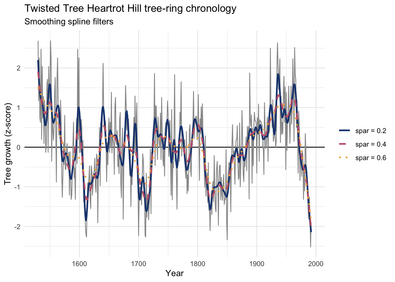
I’ve become increasingly fond of the loess smoother, which fits a local, linear polynomial to smooth data. The knob here is span: because span is the proportion of points used at each fit, a smaller number means a stiffer curve. A span of 0.05 uses 5% of the points, so we can match the moving-average widths above with a little division.
treeDat <- treeDat |>
  mutate(lo20  = loess(Z ~ yrs, span = 20  / nyrs)$fitted,
    lo50  = loess(Z ~ yrs, span = 50  / nyrs)$fitted,
    lo100 = loess(Z ~ yrs, span = 100 / nyrs)$fitted)

loLong <- treeDat |>
  select(yrs, lo20, lo50, lo100) |>
  pivot_longer(-yrs, names_to = "width", values_to = "value") |>
  mutate(width = factor(width, levels = c("lo20", "lo50", "lo100"),
    labels = c("20 years", "50 years", "100 years")))

pTree +
  labs(subtitle = "Loess filters") +
  geom_line(data = loLong, aes(yrs, value, color = width, linetype = width), linewidth = 1) +
  scale_color_manual(values = c("20 years" = bookPal[1], "50 years" = bookPal[3], "100 years" = bookPal[5]), name = NULL) +
  scale_linetype_manual(values = c("20 years" = "solid", "50 years" = "dashed", "100 years" = "dotted"), name = NULL)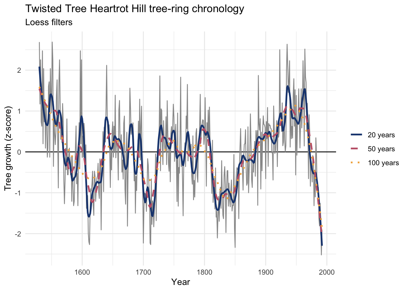
Unlike the moving average and Hanning filters, loess (and the smoothing spline) hand you a fitted value at every single point, including the very first and the very last. That sounds like a strict improvement, and it’s tempting to treat it as one. It isn’t quite. Let’s find out why.
Every comparison so far has been a little unfair: I showed four smoothers and let you eyeball which curve looked nicest, but there was no way to check any of them against an actual answer, because nobody knows the noise-free growth signal of a 463-year-old tree-ring chronology. Let’s fix that the same way this book has since the decomposition chapter: plant a signal, bury it in noise, and see who finds it. Here’s the concrete question: across the same four smoother families and the same three widths (20, 50, 100) we just tried on real tree rings, which one lands closest to the truth once it’s buried in noise?
We’ll build 500 points of autocorrelated noise (an ARIMA(2,0,1) process, so it isn’t just white noise) and add two sine waves on top, one with a period of 100 and one with a period of 200. The two sine waves together are the truth, the answer key. The AR and MA noise is what a smoother has to see past to find it.
set.seed(872)
n <- 500
x <- 1:n
noise <- arima.sim(model = list(order = c(2, 0, 1), ar = c(0.7, -0.2), ma = -0.4), n = n)
truth <- 0.3 * sin(2 * pi / 100 * x) + 0.5 * sin(2 * pi / 200 * x)

planted <- tibble(x = x, y = as.numeric(noise) + truth, truth = truth)

ggplot(planted, aes(x)) +
  geom_line(aes(y = y), color = "grey60") +
  geom_line(aes(y = truth), color = bookPal[5], linewidth = 1) +
  labs(x = "Time", y = "Value", title = "A signal with a known low-frequency truth",
    subtitle = "Grey is the noisy series; the colored line is the truth buried inside it") +
  theme_minimal()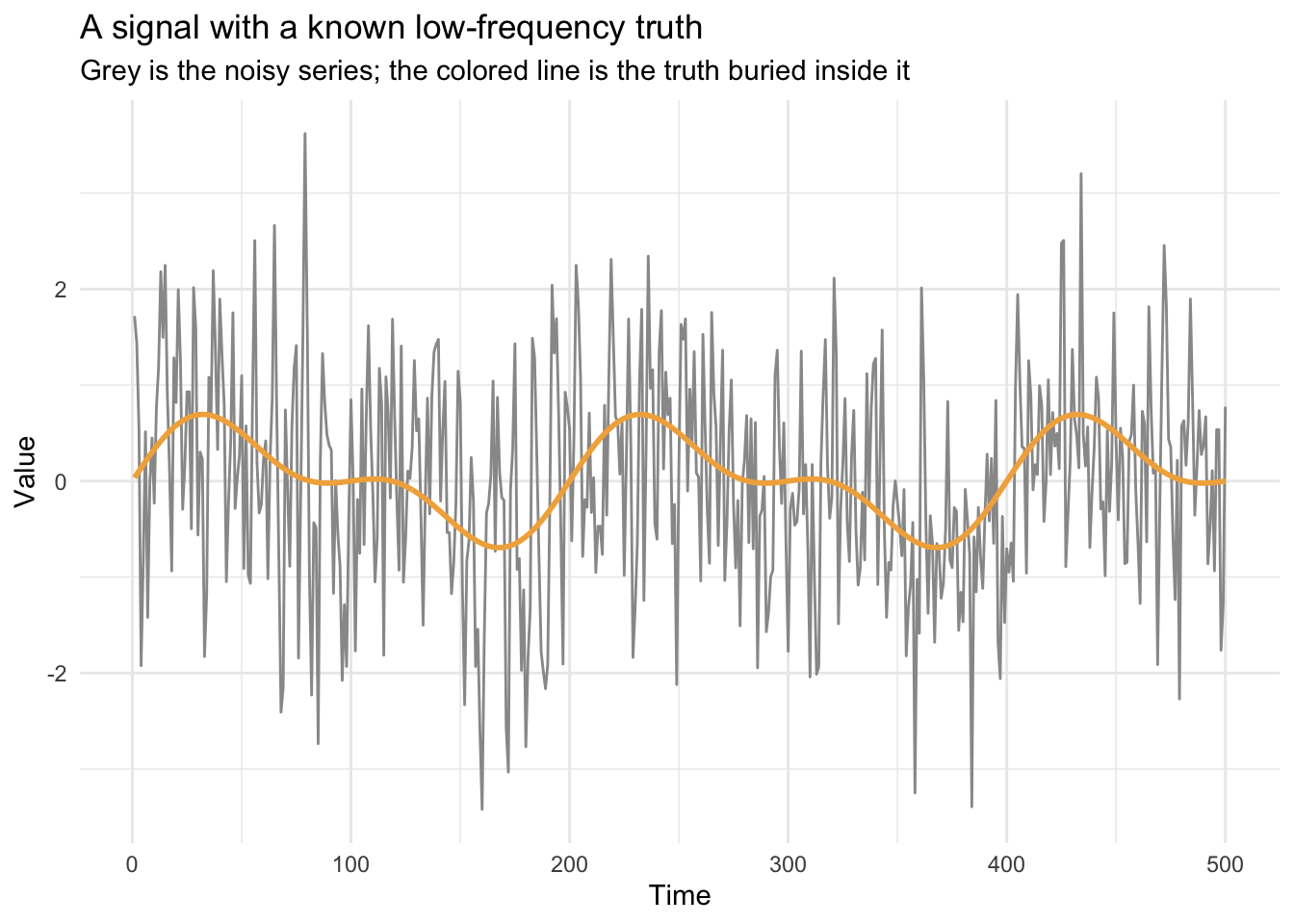
That colored line is the truth every smoother below is chasing. None of them get to see it, only the grey squiggle it’s buried in. Let’s ask all four smoothers, at the same three widths used above, to find their way back to it.
planted <- planted |>
  mutate(
    ma20   = c(stats::filter(y, rep(1 / 20, 20),   sides = 2)),
    ma50   = c(stats::filter(y, rep(1 / 50, 50),   sides = 2)),
    ma100  = c(stats::filter(y, rep(1 / 100, 100), sides = 2)),
    han20  = hanning(y, n = 20),
    han50  = hanning(y, n = 50),
    han100 = hanning(y, n = 100),
    ss0.2  = smooth.spline(y, spar = 0.2)$y,
    ss0.4  = smooth.spline(y, spar = 0.4)$y,
    ss0.6  = smooth.spline(y, spar = 0.6)$y,
    lo20   = loess(y ~ x, span = 20  / n)$fitted,
    lo50   = loess(y ~ x, span = 50  / n)$fitted,
    lo100  = loess(y ~ x, span = 100 / n)$fitted
  )
Now we can do something you can never do with actual data: score each smoother against the truth.
recovery <- planted |>
  pivot_longer(cols = -c(x, y, truth), names_to = "method", values_to = "fit") |>
  group_by(method) |>
  summarise(rmse = sqrt(mean((fit - truth)^2, na.rm = TRUE))) |>
  arrange(rmse)
recovery
# A tibble: 12 × 2
method rmse
<chr> <dbl>
1 ma50 0.165
2 lo100 0.168
3 han100 0.172
4 han50 0.185
5 ss0.6 0.185
6 ma20 0.237
7 lo50 0.242
8 ss0.4 0.281
9 ma100 0.289
10 han20 0.300
11 lo20 0.413
12 ss0.2 0.479A 50-point moving average and a 100-point loess come out on top (RMSE around 0.17), with the 100-point Hanning filter, the 50-point Hanning filter, and the loosest spline (spar = 0.6) close behind. Every 20-point smoother trails the pack, too short a window to see past the noise, and the tightest spline (spar = 0.2) is the worst of the twelve, barely smoothing at all.
Four of those twelve are worth actually looking at rather than reading off a table: the moving average’s best case and its oddest failure, and loess at its best and its worst.
showcase <- planted |>
  select(x, truth, ma50, ma100, lo100, ss0.2) |>
  pivot_longer(cols = -c(x, truth), names_to = "method", values_to = "fit") |>
  mutate(method = factor(
    recode(method,
      ma50  = "Moving average, W = 50 (best MA)",
      ma100 = "Moving average, W = 100 (erased)",
      lo100 = "Loess, span = 100 (best loess)",
      ss0.2 = "Spline, spar = 0.2 (worst)"),
    levels = c("Moving average, W = 50 (best MA)", "Moving average, W = 100 (erased)",
      "Loess, span = 100 (best loess)", "Spline, spar = 0.2 (worst)")))

ggplot(showcase, aes(x, fit)) +
  geom_line(aes(x, truth), data = planted, inherit.aes = FALSE, color = "grey60") +
  geom_line(color = bookPal[5], linewidth = 0.8) +
  facet_wrap(~method, ncol = 2) +
  labs(x = "Time", y = "Value",
    title = "Four smooths against the truth they were chasing",
    subtitle = "Grey is the planted truth, color is what each smoother recovered") +
  theme_minimal()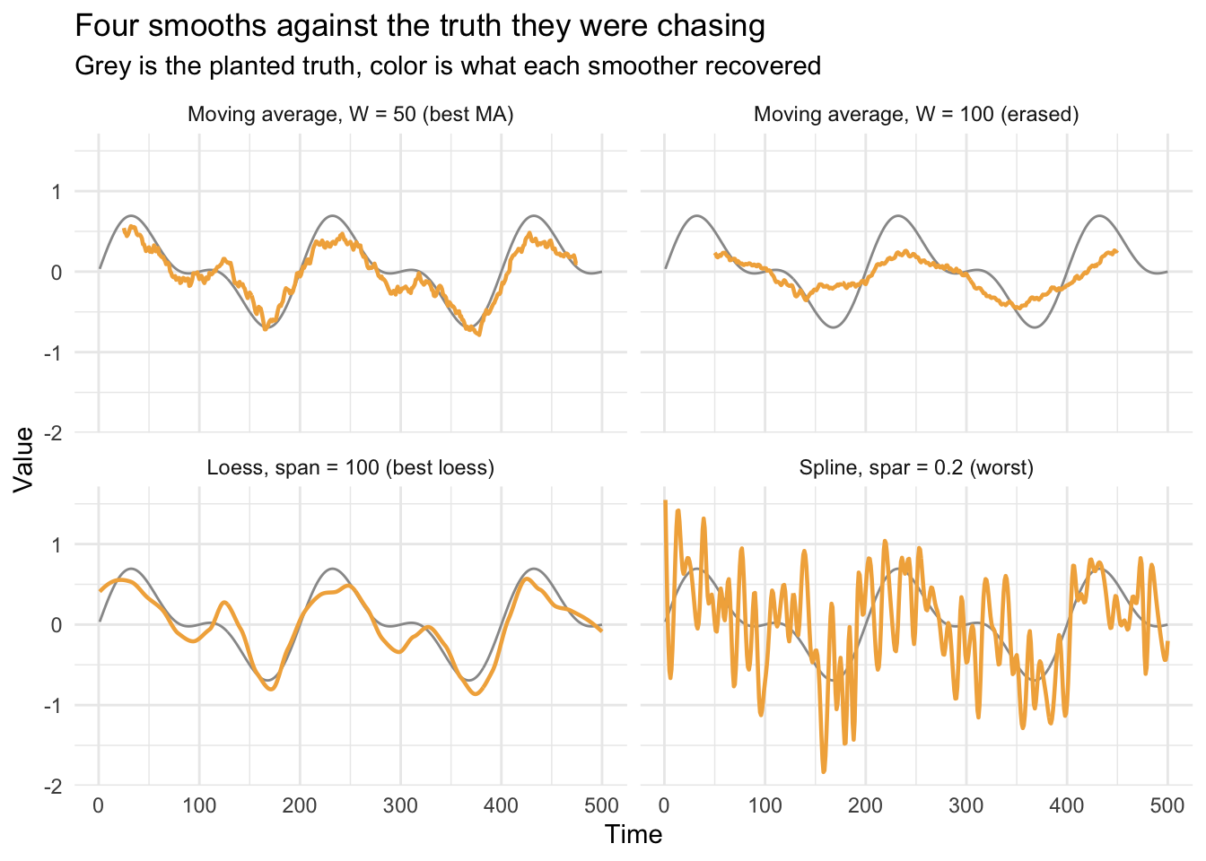
Notice the moving average at 100 points (top right) does worse than the one at 50 (top left), not better, even though it’s the wider window: the colored line goes nearly flat, missing the cycle almost entirely. That’s the filter erasing exactly the cycle we planted, not noise. Loess doesn’t share the problem. Its 100-point version (bottom left) tracks the truth about as well as anything in this chapter, while the tightest spline (bottom right, spar = 0.2) barely smooths at all, following the noise almost as faithfully as it follows the truth.
A moving average of width \(W\) is a box of equal weights, and a box that wide is blind to a cycle whose period is also \(W\): the positive and negative halves of that cycle average to zero inside the window, every time the window slides. Watch it happen to a lone 100-period sine wave.
pure100 <- tibble(x = 1:1000, wave = sin(2 * pi / 100 * (1:1000)))
pure100 <- pure100 |>
  mutate(ma100 = c(stats::filter(wave, rep(1 / 100, 100), sides = 2)))

ggplot(pure100, aes(x)) +
  geom_line(aes(y = wave), color = "grey60") +
  geom_line(aes(y = ma100), color = bookPal[5], linewidth = 1) +
  labs(x = "Time", y = "Value",
    title = "A 100-point moving average erases a 100-period cycle",
    subtitle = "Grey is the raw cycle, the flat line is what survives") +
  theme_minimal()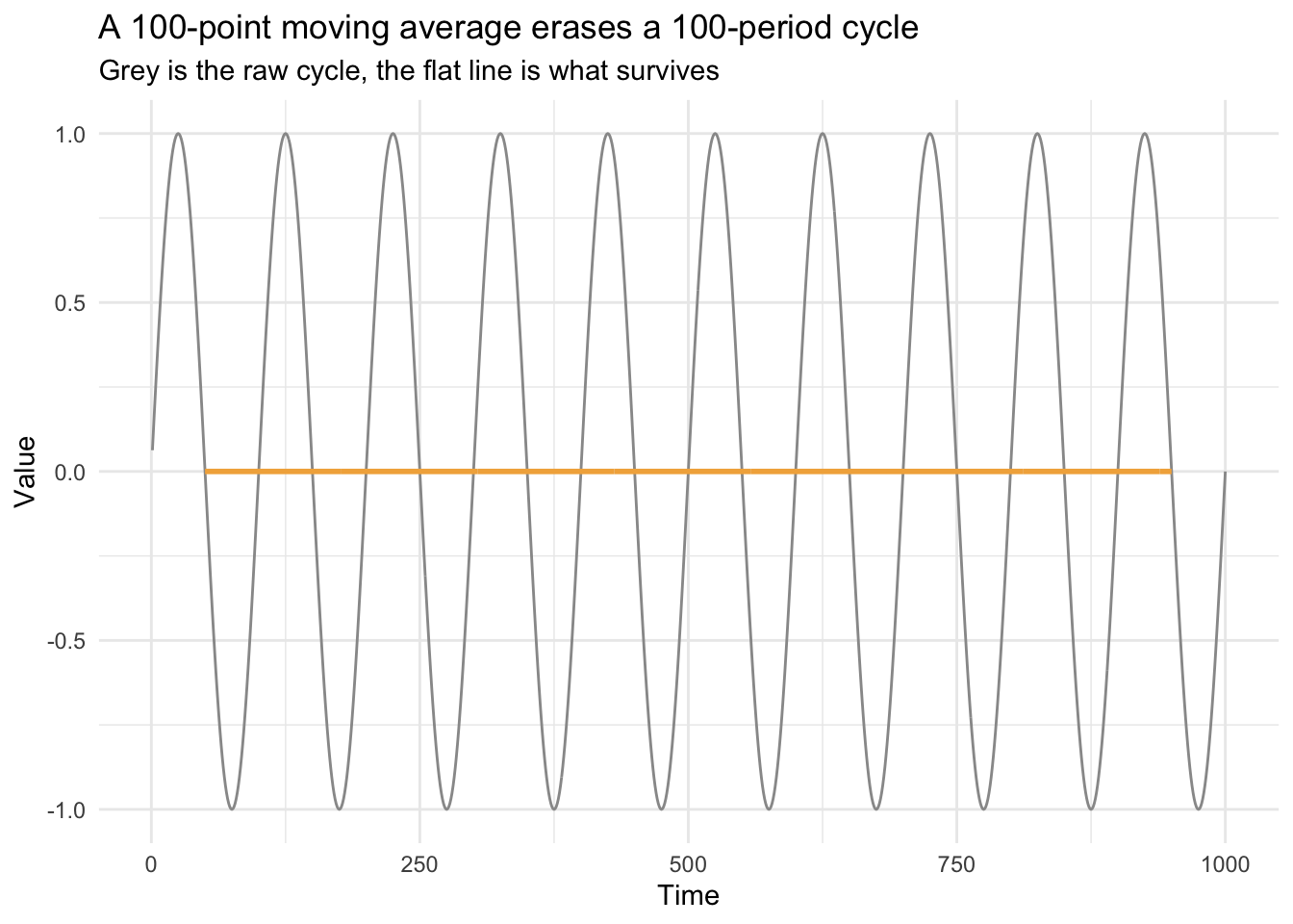
The flat line isn’t a rounding error, it’s exactly zero: a box filter has a blind spot at every frequency whose period divides evenly into its width, and a 100-point average sits right on top of our 100-year cycle. A wider window isn’t automatically a safer choice. Here it was actively the wrong one, because “smooth it more” happened to erase the thing we were trying to see.
That blind spot has a name and a formula, a frequency response, and the next chapter derives it. The same idea explains why a 100-point Hanning filter, built from the same window width, dodges the trap a moving average falls straight into.
Now for the end-member problem. Loess and the smoothing spline gave a fitted value at every point, including the very first and the very last, while the moving average and Hanning filter simply declined (NA for the first and last W/2 points of a width-W window). That refusal is doing you a favor. Run the fit 300 times, once per random draw of the ARMA noise, and compare the very first fitted point to one in the middle of the record.
set.seed(1)
edgeFits <- replicate(300, {
  noiseI <- as.numeric(arima.sim(model = list(order = c(2, 0, 1), ar = c(0.7, -0.2), ma = -0.4), n = n))
  loI <- loess((noiseI + truth) ~ x, span = 100 / n)$fitted
  c(first = loI[1], middle = loI[250])
})

c(sdFirst = sd(edgeFits["first", ]), sdMiddle = sd(edgeFits["middle", ]))
sdFirst sdMiddle
0.4225756 0.2215933 The standard deviation of the fitted value at the very first point is close to double what it is in the middle of the record (0.42 versus 0.22), even though both come from the same 100-point loess window. The middle of the window has fifty points on each side; the first point has zero on the left and has to lean on the fifty to its right alone. The curve doesn’t look any less confident there. It draws just as smoothly. But it’s built on half the evidence.
So: the moving average and Hanning filter tell you, by going NA, exactly where they’ve run out of window. Loess and the smoothing spline never tell you, because they’ll always find some fit to hand back. The upshot for your own smoothed data: the most recent few points, the ones you’re usually most eager to interpret (“is it still rising?”), are exactly the ones a smoother is least equipped to answer with the confidence it shows in the middle of the record.
Sometimes you have data at one resolution and want it at a coarser one: hourly counts of fish passing a weir but you want the daily total, or fifteen-minute river stage but you want the daily mean. That’s itself a filter, just a blunt one (a simple average or sum over a fixed window), and it’s worth seeing done three different ways so the connections between ts, zoo, and the tidyverse aren’t a mystery.
Let’s go back to the Bellingham airport weather, this time as monthly mean temperature rather than the daily record from the intro. The file data/kbli_monthly.csv holds one row per month back to 1949, aggregated from the same GHCN-Daily station.
kbliMonthly <- read_csv("data/kbli_monthly.csv") |>
  mutate(DATE = yearmonth(DATE)) |>
  as_tsibble(index = DATE)
kbliMonthly
# A tsibble: 929 x 2 [1M]
DATE TAVG
<mth> <dbl>
1 1949 Jan -2.17
2 1949 Feb 1.23
3 1949 Mar 6.08
4 1949 Apr 8.88
5 1949 May 12.5
6 1949 Jun 14.1
7 1949 Jul 15.7
8 1949 Aug 15.9
9 1949 Sep 14.7
10 1949 Oct 8
# ℹ 919 more rowsA tsibble is where this record lives, but the functions we want next, filter(), rollmean(), and dm2seasonal(), speak ts and zoo, not tsibble. So we bridge, the same move as the intro.
kbliTs  <- ts(kbliMonthly$TAVG, start = c(1949, 1), frequency = 12)
kbliZoo <- zoo(kbliMonthly$TAVG, order.by = as.Date(kbliMonthly$DATE))
A quick look at a stretch of years, so we know what we’re working with.
kbliMonthly |>
  filter(year(DATE) %in% 1993:1999) |>
  ggplot(aes(x = DATE, y = TAVG)) +
  geom_line(color = bookPal[1]) +
  labs(x = "Month", y = expression(degree * C),
    title = "Bellingham, a station gap in the middle of the 1990s") +
  theme_minimal()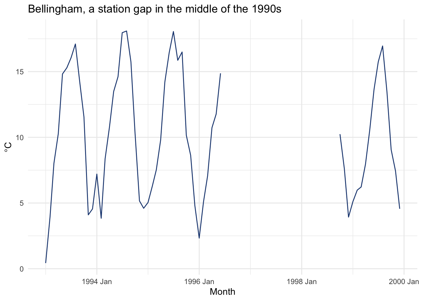
Notice the gap. The station stopped reporting for a couple of years in the mid-1990s, a hole in the actual record, not a bug in this book’s data pipeline, and it’s the kind of thing you have to see before you can plan around it.
Now, three ways to get mean summer (June-August) temperature out of a monthly series.
# 1. stats::filter on the ts object: a trailing 3-month average, then pull August
tmpFilter <- stats::filter(kbliTs, rep(1 / 3, 3), sides = 1)
summerV1 <- tmpFilter[seq(8, length(tmpFilter), by = 12)]

# 2. rollmean on the zoo object: the same trailing average, then pull August
tmpRoll <- rollmean(kbliZoo, k = 3, align = "right")
summerV2 <- tmpRoll[months(time(tmpRoll)) == "August"]

# 3. hydroTSM does the seasonal averaging directly
summerV3 <- dm2seasonal(kbliZoo, season = "JJA", FUN = mean)

head(summerV1)
[1] 15.22667 16.14333 16.39000 15.15667 15.59000 14.30000head(summerV2)1949-08-01 1950-08-01 1951-08-01 1952-08-01 1953-08-01 1954-08-01
15.22667 16.14333 16.39000 15.15667 15.59000 14.30000 head(summerV3) 1949 1950 1951 1952 1953 1954
15.22667 16.14333 16.39000 15.15667 15.59000 14.30000 All three agree, right down to the decimal. They just print their labels differently. Now plot the summers and see if Bellingham is warming.
summerYears <- as.numeric(time(summerV3))
summerVals  <- as.numeric(summerV3)
summerTrend  <- lm(summerVals ~ summerYears)

tibble(year = summerYears, tavg = summerVals) |>
  ggplot(aes(year, tavg)) +
  geom_line(color = bookPal[1]) +
  geom_smooth(method = "lm", se = FALSE, color = bookPal[5]) +
  labs(x = "Year", y = expression(degree * C),
    title = "Summer in Bellingham, 1949-2025") +
  theme_minimal()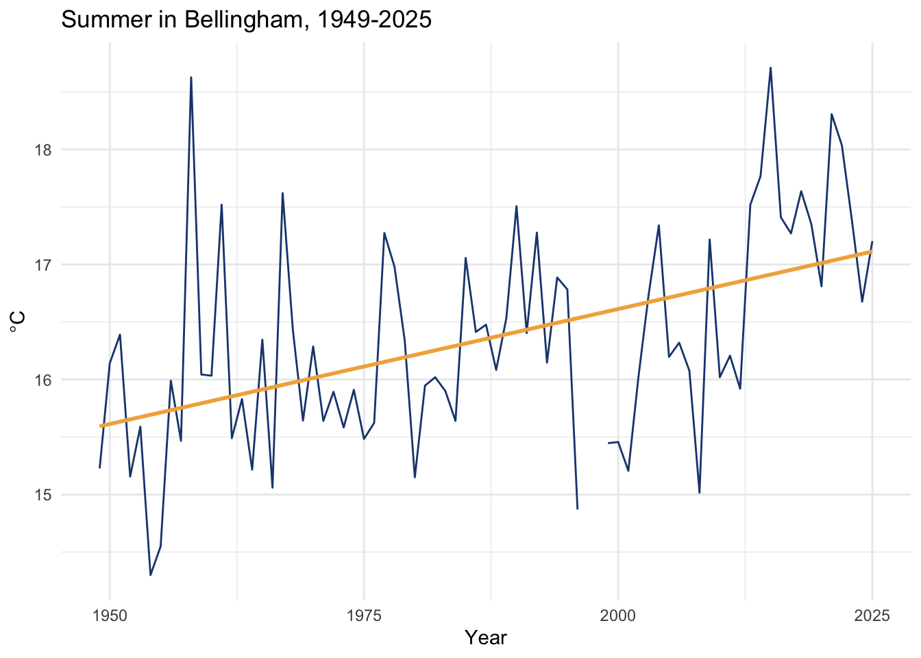
summary(summerTrend)
Call:
lm(formula = summerVals ~ summerYears)

Residuals:
     Min       1Q   Median       3Q      Max
-1.75600 -0.50322 -0.04324  0.44681  2.85337

Coefficients:
             Estimate Std. Error t value Pr(>|t|)
(Intercept) -23.36175    8.52363  -2.741   0.0077 **
summerYears   0.01999    0.00429   4.659 1.39e-05 ***
---
Signif. codes:  0 '***' 0.001 '**' 0.01 '*' 0.05 '.' 0.1 ' ' 1

Residual standard error: 0.8342 on 73 degrees of freedom
  (2 observations deleted due to missingness)
Multiple R-squared:  0.2292,    Adjusted R-squared:  0.2186
F-statistic: 21.71 on 1 and 73 DF,  p-value: 1.395e-05
Summer in Bellingham has warmed about 0.2 degrees C per decade over the 75 complete summers on record, and it isn’t chance (p < 0.0001, R² = 0.23). Modest, but not subtle. Go through the three-ways-to-get-summer code above and make sure you can follow every step. Being able to move between ts, zoo, and a plain aggregation is a skill that pays off the moment you inherit someone else’s script.
So far filters have pulled the low-frequency wiggle out and put it on display. Sometimes you want the opposite: get rid of the low-frequency part so the faster signal underneath is easier to see. Take the residuals from a filter, by subtraction, or by division when the process is multiplicative, and you’ve removed whatever the filter was tracking.
Tree-ring data are the case I know best. Every ring reflects the year’s growing conditions, but it also reflects simple geometry: a young, narrow trunk adds a thick ring for the same volume of wood that an old, wide trunk spreads over a thin one, so ring width declines as a tree ages even with the climate held perfectly constant. That decline has nothing to do with year-to-year climate, so dendrochronologists filter it out and call what’s left the ring-width index.
data(co021)
core1 <- tibble(yr = as.numeric(time(co021)), mm = co021$`641114`) |>
  drop_na()
nCore <- nrow(core1)

ggplot(core1, aes(yr, mm)) +
  geom_line(color = "grey60") +
  labs(x = "Year", y = "Ring width (mm)",
    subtitle = "Sample 641114, Schulman Old Tree No. 1, Mesa Verde") +
  theme_minimal()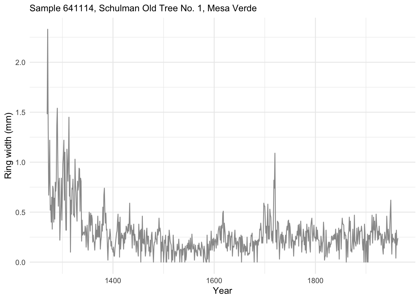
We’ll fit a loess model of ring width as a function of time. This one is a first-order polynomial (degree = 1); the loess default is second-order. span is again the proportion of points used, and with 694 rings, a span of 0.05 works out to about 34 years at each fit.
loessModel <- loess(mm ~ yr, data = core1, degree = 1, span = 0.05)
loessFit   <- broom::augment(loessModel)
The raw model object is not fun to look at, so augment() from broom puts the fit into a tidy tibble.
ggplot(loessFit, aes(yr)) +
  geom_line(aes(y = mm), color = "grey60") +
  geom_line(aes(y = .fitted), color = "black") +
  labs(x = "Year", y = "Ring width (mm)", caption = "5% loess smooth",
    subtitle = "Sample 641114, Schulman Old Tree No. 1, Mesa Verde") +
  theme_minimal()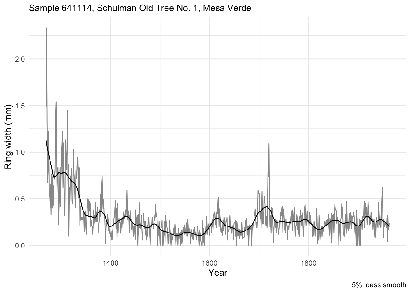
You can specify a number of points instead of a proportion, the same way we did with the moving averages earlier. Is 100 years the right choice? Nobody can say for certain, but it targets this relatively low-frequency signal (a 100-year period is a frequency of 0.01).
loessModel100 <- loess(mm ~ yr, data = core1, degree = 1, span = 100 / nCore)
loessFit100   <- broom::augment(loessModel100)

ggplot(loessFit100, aes(yr)) +
  geom_line(aes(y = mm), color = "grey60") +
  geom_line(aes(y = .fitted), color = "black") +
  labs(x = "Year", y = "Ring width (mm)", caption = "100-year loess smooth",
    subtitle = "Sample 641114, Schulman Old Tree No. 1, Mesa Verde") +
  theme_minimal()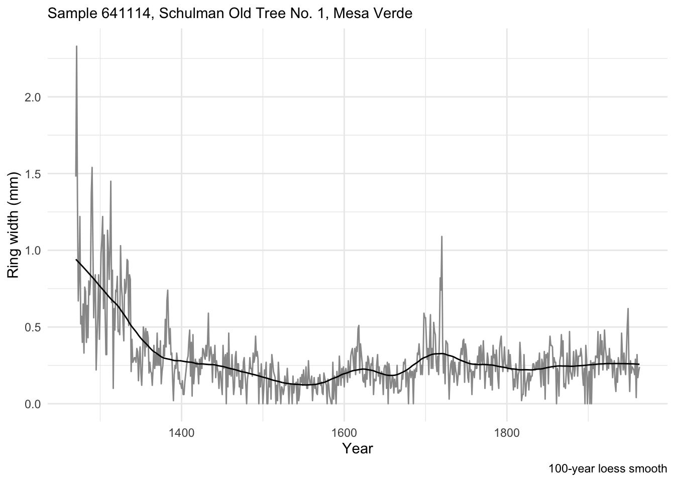
Divide the measured ring widths by this 100-year fit and what’s left is the ring-width index, the year-to-year variability with the geometric growth trend filtered out.
core1 <- core1 |>
  mutate(rwi = mm / loessFit100$.fitted)

core1 |>
  rename(`Ring width (mm)` = mm, `Ring-width index` = rwi) |>
  pivot_longer(cols = -yr, names_to = "series", values_to = "value") |>
  ggplot(aes(yr, value)) +
  geom_line(color = "grey60") +
  labs(x = "Year", y = NULL,
    subtitle = "Sample 641114, Schulman Old Tree No. 1, Mesa Verde") +
  facet_wrap(~series, ncol = 1, scales = "free_y") +
  theme_minimal()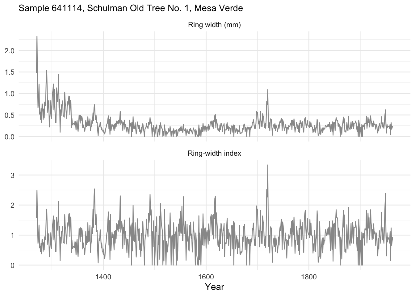
Here’s another use for filters: cleaning up after someone else’s fieldwork. Say you inherit a temperature logger and a radiation sensor from a summer of data collection, and your thesis, tenure packet, and general peace of mind depend on getting the analysis right. As is common with inherited data, you don’t get to control what went into it. Picture this: the loggers were supposed to run hourly over the summer of 2014, launched together at midnight on June 1. Whoever set them up in the field didn’t read the manual and didn’t have anyone double-check the setup. The temperature logger started three minutes late and only records every other hour. The radiation sensor’s cable worked loose at some point, leaving chunks of missing data through the summer.
Load the two records and take a look.
rad <- read_csv("data/rad.csv")
tmp <- read_csv("data/tmp.csv")
summary(tmp$tmp)
Min. 1st Qu. Median Mean 3rd Qu. Max.
-5.818 7.889 10.490 10.537 13.432 21.640 summary(rad$rad) Min. 1st Qu. Median Mean 3rd Qu. Max. NA's
0.0 0.0 49.5 280.0 530.0 1239.0 220 pTmp <- ggplot(tmp, aes(DateTime, tmp)) +
geom_line(color = "grey60") +
labs(x = "Date", y = expression(degree * C), subtitle = "Air temperature") +
theme_minimal()
pRad <- ggplot(rad, aes(DateTime, rad)) +
geom_line(color = "grey60") +
labs(x = "Date", y = expression(W ~ m^-2), subtitle = "Radiation") +
theme_minimal()
gridExtra::grid.arrange(pTmp, pRad)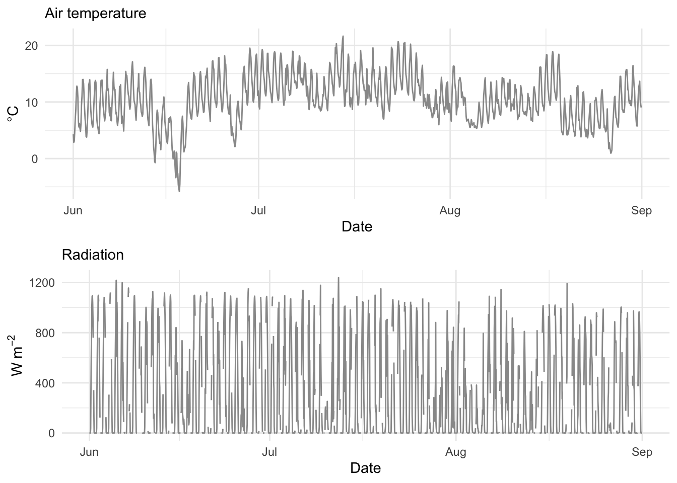
Here’s a closer look at the timestamps themselves:
head(tmp$DateTime)[1] "2014-06-01 00:03:00 UTC" "2014-06-01 02:03:00 UTC"
[3] "2014-06-01 04:03:00 UTC" "2014-06-01 06:03:00 UTC"
[5] "2014-06-01 08:03:00 UTC" "2014-06-01 10:03:00 UTC"head(rad$DateTime)[1] "2014-06-01 00:00:00 UTC" "2014-06-01 01:00:00 UTC"
[3] "2014-06-01 02:00:00 UTC" "2014-06-01 03:00:00 UTC"
[5] "2014-06-01 04:00:00 UTC" "2014-06-01 05:00:00 UTC"The times on the temperature data are easy to fix: they’re three minutes off from what we wanted, so subtract three minutes (180 seconds) from every timestamp. DateTime is a POSIXct, which under the hood is a count of seconds since an origin (January 1, 1970 by default), so subtracting seconds is exactly what you’d expect.
tmp <- tmp |> mutate(DateTime = DateTime - 180)
head(tmp$DateTime)
[1] "2014-06-01 00:00:00 UTC" "2014-06-01 02:00:00 UTC"
[3] "2014-06-01 04:00:00 UTC" "2014-06-01 06:00:00 UTC"
[5] "2014-06-01 08:00:00 UTC" "2014-06-01 10:00:00 UTC"Fixed.
About 10% of the radiation record is missing. Filters can patch that too. First, make it a zoo object, the natural home for a gappy series, and look at the first 100 observations to see the damage.
zooRad <- zoo(rad$rad, rad$DateTime)
plot(zooRad[1:100], type = "b", pch = 20, ylab = expression(W ~ m^-2))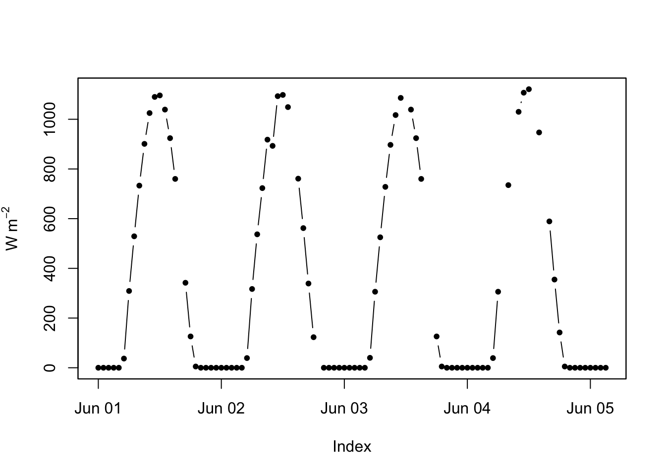
zoo has several ways to fill NA values. Try a linear interpolation and a cubic smoothing spline. Here the two land almost on top of each other, because a radiation curve is about as well-behaved as a time series gets: the sun comes up, the sun goes down, every single day.
zooRadApprox <- na.approx(zooRad)
zooRadSpline <- na.spline(zooRad)

plot(zooRadApprox[1:100], type = "b", pch = 20, ylab = expression(W ~ m^-2), col = bookPal[1], lwd = 2)
lines(zooRadSpline[1:100], lwd = 2, col = bookPal[5], lty = "dotted")
lines(zooRad[1:100], col = "grey", lwd = 1)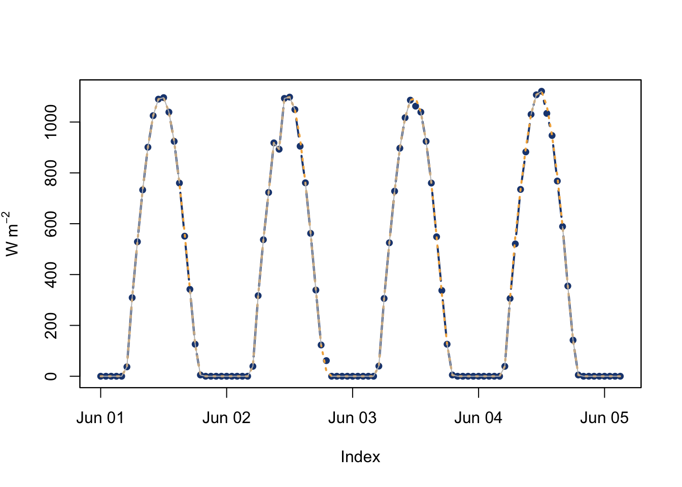
That’s the whole trick. na.locf (last observation carried forward) is worth a look too, though it’s a poor choice for a curve that swings this much within a day. Whatever gap-filling method you reach for, it’s still a filter, a rule for turning an NA into a number using its neighbors, no different in spirit from a moving average deciding what belongs in a smoothed value.
All of that works because the gap is short enough that a series’ own neighbors still know something about it. Stretch the gap to two years and that stops being true; there is no straight line or spline across two years that has any business standing in for two years of actual winters and summers. When the gap is that long, the aside on filling a gap with a neighboring station shows the fix people actually reach for: borrow a correlated series from somewhere else instead.
A filter is a small, plain idea: average your neighbors one way or another. And it does an enormous amount of work in this book’s toolkit, drawing a trend line to look at, aggregating to a coarser resolution, stripping a growth curve out of a tree ring, patching a hole in a radiation record. Every one of those is the same operation underneath, deciding how much weight each neighboring point gets.
The catch, worth carrying forward, is that a filter is most confident exactly where it has the most neighbors to lean on, the middle of the record, and least confident at the two ends, usually the part you care about most. We could measure that only because we planted the truth ourselves; on an actual dataset you won’t get to check your smoother’s homework, so treat the last few points of any smoothed curve as a rough sketch, not a number.
Everything in this chapter looked like time-domain work, a filter reshaping the wiggle in a plot. But the moving average’s blind spot already gave the game away: a filter is always making a frequency-domain decision whether it says so or not. The next chapter names that decision properly. Instead of asking what a series looks like over time, it asks what frequencies the series is built from, and it gives you a much sharper tool for finding them than eyeballing three window widths.
Go back to the planted low-frequency demo. We tried three preset widths (20, 50, 100) for each of the four smoothers, but there’s no reason to stop there. Sweep the moving-average window from 5 to 150 points, one point at a time, and plot RMSE-to-truth as a function of width. Where does it bottom out? Then do the same sweep for the loess span. You should also see the moving average do something odd around a width of 100. Can you explain it from what a 100-point average does to a 100-period cycle?
In the poorly-launched-sensors story, the radiation record was spotty but still hourly (2208 observations). The temperature record was collecting every other hour (1104 observations), and three minutes off besides. We fixed the time offset but not the resolution mismatch. Align the two: get tmp up to hourly resolution so it lines up one-to-one with rad, which has 2208 observations. There’s more than one reasonable way to do this, and I’m curious which one you land on.