Code
library(tidyverse)
library(tsibble)
library(forecast)
library(gridExtra)
library(tseries)
library(PNWColors)

bookPal <- pnw_palette("Sunset2", n = 5, type = "discrete")Last chapter we found dependence in the values of a series. Today’s value was a regression on yesterday’s, and we called that autoregression. That is one place dependence shows itself, but it is not the only one. There is a second place, and it is the one ordinary statistics assumes away: the noise. A regression hands you a residual at each step and asks you to treat those residuals as independent, one fresh unrelated draw after another. In a time series they often are not. A shock does not always land and vanish; it can linger, folded into the next few observations, so the disturbances carry structure of their own. The moving-average model is what you write down when they do. Put the two together and you have ARMA, which says a stationary series is built from two kinds of memory: memory in where the series has been, the AR part, and memory in the shocks that have lately hit it, the MA part. Most of the persistence in environmental data is some mix of the two.
One condition rides along with all of this: ARMA describes a stationary series, the assumption we spent the last chapter earning rather than waving at. If the series isn’t stationary we will address that with ARIMA. See below.
We stay in the tsibble (Wang et al. 2020) framework from the earlier chapters, with tidyverse (Wickham 2023) and PNWColors (Lawlor 2020) as usual. forecast (Hyndman et al. 2026) gives us the ggplot-ready ACF and PACF and the Arima fitting function, gridExtra (Auguie 2017) lays a few plots out together, and tseries (Trapletti and Hornik 2026) carries the ADF and KPSS tests we met last chapter.
library(tidyverse)
library(tsibble)
library(forecast)
library(gridExtra)
library(tseries)
library(PNWColors)
bookPal <- pnw_palette("Sunset2", n = 5, type = "discrete")The AR(p) model from last chapter lets the current value lean on its own recent values:
\[ y_t = \sum_{i=1}^p \phi_i y_{t-i} + \epsilon_t \]
The moving-average model is a close cousin, but the coefficient acts on the shocks instead of on \(y\) itself. Where AR carries forward the past values of the series, MA carries forward the past errors. The first-order moving average, MA(1), is
\[ y_t = \theta \epsilon_{t-1} + \epsilon_t \]
where \(\theta\) is a coefficient between -1 and 1 and \(\epsilon_t\) is the fresh shock at time \(t\). The value today is this period’s shock plus a weighted echo of last period’s shock. Here is the wrinkle that makes MA models feel strange the first time: we never observe the \(\epsilon_t\) directly. They are the errors, and the series is built out of them. So an MA model is not a regression on anything you can see, which is part of why fitting one takes maximum likelihood rather than the least squares you would use on observable predictors.
A moving-average model is built entirely out of shocks, so it is worth recalling the word from the autocorrelation chapter. A shock is the disturbance \(\epsilon_t\), the unpredictable input that hits the system at time \(t\). If you would rather not borrow the econometrics word, read it as a disturbance or a forcing, the flood or the fire the past did not see coming.
Let’s build an MA(1) by hand with a loop, the same way we built the AR(1) last chapter. Watching the machinery is worth more than calling a function. I’ll plot the series, its ACF, and its PACF in one figure, a layout we will reuse all chapter.
n <- 200
theta <- 0.8
epsilon <- rnorm(n)
y <- numeric(n)
for (i in 2:n) {
  y[i] <- theta * epsilon[i - 1] + epsilon[i]
}

layoutMat <- matrix(c(1, 1, 2, 3), nrow = 2, byrow = TRUE)
p1 <- ggplot(tibble(t = 1:n, y), aes(t, y)) +
  geom_line() + labs(x = "Time", y = expression(y[t])) + theme_minimal()
p2 <- ggAcf(y) + labs(title = NULL) + theme_minimal()
p3 <- ggPacf(y) + labs(title = NULL) + theme_minimal()
grid.arrange(p1, p2, p3, layout_matrix = layoutMat)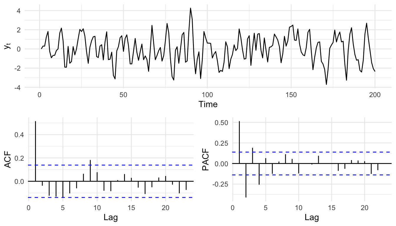
This is the MA(1) signature, and it is the mirror image of the AR(1). The ACF has a single strong bar at lag 1 and then cuts off, because \(y_t\) and \(y_{t-1}\) share the term \(\epsilon_{t-1}\) but \(y_t\) and \(y_{t-2}\) share nothing. There is no geometric decay the way there was for an autoregressive process. The PACF, meanwhile, does not cut off; it decays and oscillates, sometimes dipping negative at lag 2. The reasons that the partial autocorrelation behaves this way take a little work to see, and they are laid out in the aside on MA(1) ACF and PACF shapes.
As with AR, we can reach further back. An MA(q) model sums over \(q\) lagged shocks:
\[ y_t = \sum_{i=1}^q \theta_i \epsilon_{t-i} + \epsilon_t \]
You can probably guess what comes next. The ARMA(p,q) model is the two halves bolted together: a value depends on its own past and on the recent shocks. The order is written in parentheses, with \(p\) the autoregressive order and \(q\) the moving-average order. The workhorse is the ARMA(1,1):
\[ y_t = \phi_1 y_{t-1} + \theta_1 \epsilon_{t-1} + \epsilon_t \]
and the general form extends both sums:
\[ y_t = \sum_{i=1}^p \phi_i y_{t-i} + \sum_{i=1}^q \theta_i \epsilon_{t-i} + \epsilon_t \]
Let’s simulate one. We’ve seen arima.sim, the function that builds these series in a single line instead of a hand-written loop. This is a good place to use it. We ask for an AR coefficient of 0.5 and an MA coefficient of 0.8. The syntax of arima.sim takes some getting used to. Read the help page carefully to parse it.
n <- 200
y <- arima.sim(model = list(ar = 0.5, ma = 0.8), n = n)

p1 <- ggplot(tibble(t = 1:n, y = as.numeric(y)), aes(t, y)) +
  geom_line() + labs(x = "Time", y = expression(y[t])) + theme_minimal()
p2 <- ggAcf(y) + labs(title = NULL) + theme_minimal()
p3 <- ggPacf(y) + labs(title = NULL) + theme_minimal()
grid.arrange(p1, p2, p3, layout_matrix = layoutMat)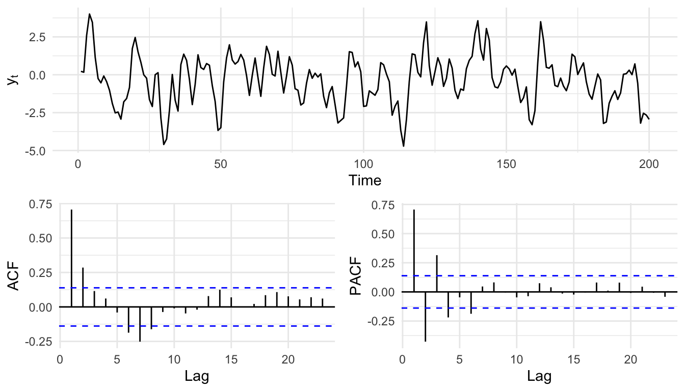
The ACF and PACF now carry features of both parents, which is exactly why mixed models are harder to read off a plot by eye than a pure AR or pure MA. That is fine. We are about to stop guessing the order from the plot and start selecting it with a criterion.
The reason to bother with a model like this is never the model for its own sake. It is what the model tells you about the system that made the data. With an ARMA(1,1) you can picture a process with an internal dynamic that creates the AR part and an external one that creates the MA part. Say you are measuring the annual growth of a perennial plant. The plant needs a long, warm growing season in year \(t\) to grow well, and it also leans on energy it stored last year, \(t-1\), to start the new season. That stored-energy dependence is an internal autoregression. Now suppose the growing-degree-days that drive growth are themselves autocorrelated, because atmospheric patterns persist from one year to the next. That external persistence enters through the climate forcing rather than through the plant’s biology, and it can show up as a moving-average term. Those are two different mechanisms combined in a time series.
As the orders climb, that kind of story gets harder to tell, which is a warning. A long series will happily fit a high-order model, but a good fit is not a reason to believe an AR(20) unless you can point to a mechanism that would produce twenty years of memory. Box said it best: all models are wrong, but some are useful.
Let’s run the recurring experiment. We will plant an ARMA(1,1) with coefficients we choose, fit a grid of candidate models, let a criterion pick among them, and check the winner against the truth we planted. I’ll set a local seed here so the recovery is reproducible.
set.seed(42)
n <- 500
y <- arima.sim(list(ar = 0.7, ma = 0.5), n = n)

p1 <- ggplot(tibble(t = 1:n, y = as.numeric(y)), aes(t, y)) +
  geom_line() + labs(x = "Time", y = expression(y[t])) + theme_minimal()
p2 <- ggAcf(y) + labs(title = NULL) + theme_minimal()
p3 <- ggPacf(y) + labs(title = NULL) + theme_minimal()
grid.arrange(p1, p2, p3, layout_matrix = layoutMat)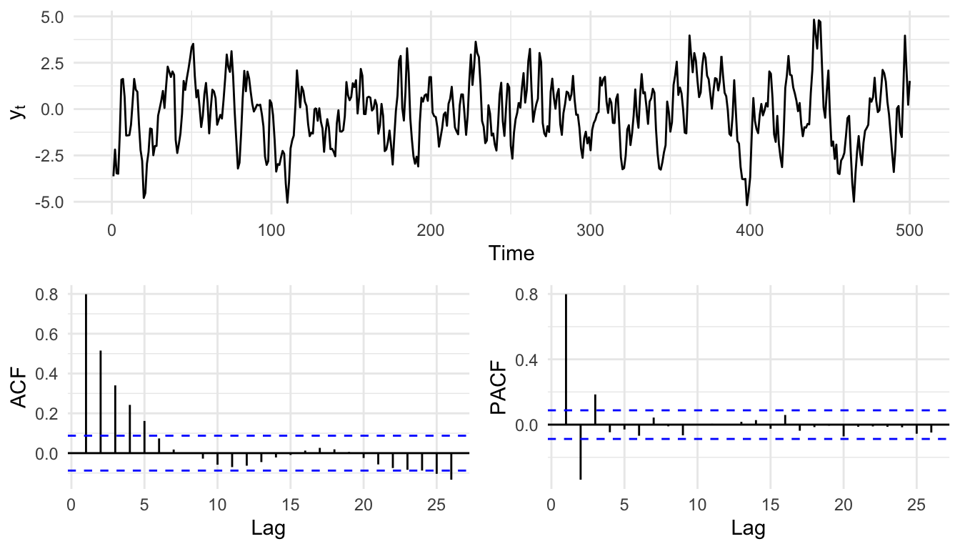
Now fit a grid of ARMA(p,q) models with \(p\) and \(q\) each running from zero to two. We use the Arima function from forecast, a slightly friendlier version of base R’s arima. The middle number in order is the differencing term, and we leave it at zero because we built y to be stationary and there is nothing to difference. Each fit gets its own name so we can look at it later.
arma00 <- Arima(y, order = c(0, 0, 0))
arma10 <- Arima(y, order = c(1, 0, 0))
arma20 <- Arima(y, order = c(2, 0, 0))
arma01 <- Arima(y, order = c(0, 0, 1))
arma02 <- Arima(y, order = c(0, 0, 2))
arma11 <- Arima(y, order = c(1, 0, 1))
arma21 <- Arima(y, order = c(2, 0, 1))
arma12 <- Arima(y, order = c(1, 0, 2))
arma22 <- Arima(y, order = c(2, 0, 2))
Here is what one of those fits, the AR(1), prints.
arma10Series: y
ARIMA(1,0,0) with non-zero mean
Coefficients:
ar1 mean
0.8044 -0.2143
s.e. 0.0267 0.2397
sigma^2 = 1.122: log likelihood = -737.67
AIC=1481.34 AICc=1481.38 BIC=1493.98You get the coefficient estimates and their standard errors, and three numbers for comparing models: the log likelihood and the two information criteria built from it, AIC and BIC. The log likelihood measures how well the model fits, but fit alone is a trap, because a more complex model can always fit a little better. The information criteria add a penalty for complexity. AIC is \(-2\ell + 2k\), where \(\ell\) is the log likelihood and \(k\) is the number of parameters; BIC is \(-2\ell + \ln(n)\,k\), which leans harder on parsimony by folding in the sample size. I think of AIC as saying “find me a model that fits well but doesn’t get fancy just because I gave it lots of parameters,” and BIC as saying the same thing while also being suspicious of a big sample. Lower is better for both. When you have a small sample relative to the number of parameters, AICc adds a correction and is the safer choice; with the 500 points we have here, AIC and BIC are on firm ground. We’ll go with BIC.
armaBIC <- BIC(arma00, arma10, arma20, arma01, arma02,
  arma11, arma21, arma12, arma22)
armaBIC
df BIC
arma00 2 2002.511
arma10 3 1493.979
arma20 4 1434.743
arma01 3 1585.013
arma02 4 1464.093
arma11 4 1410.058
arma21 5 1416.198
arma12 5 1416.171
arma22 6 1422.129The lowest BIC belongs to the ARMA(1,1), which is the order we planted. Let’s look at its coefficients.
arma11Series: y
ARIMA(1,0,1) with non-zero mean
Coefficients:
ar1 ma1 mean
0.6513 0.5254 -0.2092
s.e. 0.0388 0.0429 0.1880
sigma^2 = 0.9376: log likelihood = -692.6
AIC=1393.2 AICc=1393.28 BIC=1410.06The AR coefficient comes back near 0.7 and the MA coefficient near 0.5, the two values we handed arima.sim. We recovered the model from nothing but the data. That is the answer key working as intended, and it is why we trust the procedure when we turn it loose on a series whose true order we do not know.
Before we celebrate, the more important check. If the model has captured the temporal structure, its residuals should be free of it: what is left over should look like white noise. Look at the ACF and PACF of the residuals.
resid11 <- residuals(arma11)
p1 <- ggplot(tibble(t = 1:n, e = as.numeric(resid11)), aes(t, e)) +
  geom_line() + labs(x = "Time", y = "Residual") + theme_minimal()
p2 <- ggAcf(resid11) + labs(title = NULL) + theme_minimal()
p3 <- ggPacf(resid11) + labs(title = NULL) + theme_minimal()
grid.arrange(p1, p2, p3, layout_matrix = layoutMat)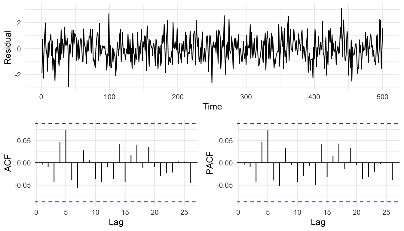
Clean. No bar pokes meaningfully past the band, so the model has soaked up the dependence and left noise behind.
Now a word about a temptation. It is natural to want to overlay the model’s fitted values on the observed series and admire how close they sit.
tibble(t = 1:n, observed = as.numeric(y), fitted = as.numeric(fitted(arma11))) |>
  pivot_longer(c(observed, fitted)) |>
  ggplot(aes(t, value, color = name)) +
  geom_line() +
  labs(x = "Time", y = NULL, color = NULL) +
  theme_minimal()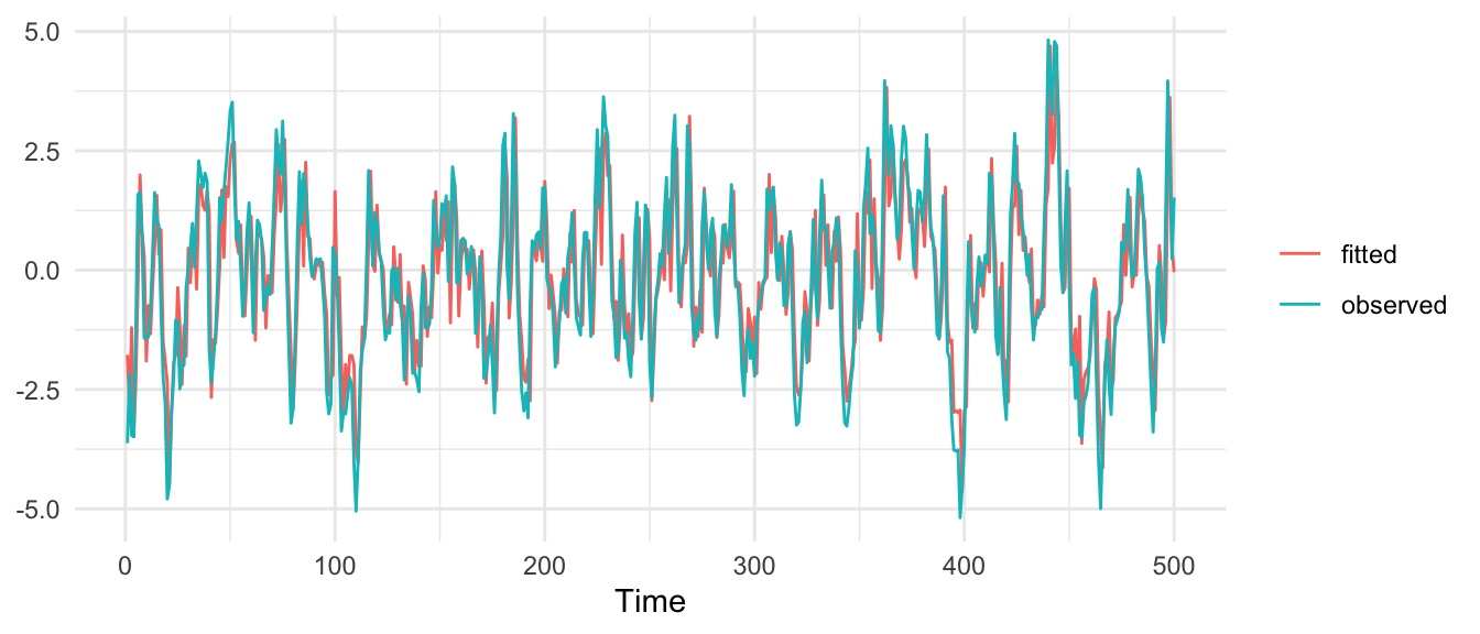
The fit looks spectacular, and the fitted-versus-observed \(R^2\) is about 0.7. Do not be impressed. The one-step-ahead fitted value of an AR model is essentially \(\phi\) times yesterday’s value, so of course it tracks the series closely: yesterday’s value is the best single clue to today’s, and the plot is mostly showing you that today’s number is near yesterday’s. A high fitted-versus-observed \(R^2\) is close to automatic for any autoregressive fit and tells you almost nothing about whether you picked the right model. The residual diagnostics above are the test that actually helps This is the first conviction of the book in small: R prints a number whether or not you have learned anything.
One more note before we leave the simulated data. BIC pointed at the ARMA(1,1), but look back at the table and you’ll see a few neighbors are not far behind. There is often no single right model, only a least-wrong one, and reasonable people will read a BIC table differently. The tie-breakers are clean residuals and, above all, a mechanism you can defend. Simpler beats more complex when the fit is comparable.
You have seen the acronym ARIMA now for ahwile, and it is worth knowing what the extra letter buys. The “I” stands for integrated, and it is the differencing step from the last chapter wearing a different hat. Everything we just did assumes the series is stationary, because the AR and MA coefficients only describe a fixed relationship if that relationship holds throughout the series. Fit a stationary model to a series whose mean is wandering off, and the coefficients are an average of conditions that never actually held. So when a series is not stationary, you difference it first, fit ARMA to what is left, and the whole procedure is called ARIMA(p,d,q): difference \(d\) times, then fit an ARMA(p,q). That is all the “I” means. ARIMA is ARMA applied to differenced data.
The decision about whether and how to difference is the one we built the stationarity chapter to answer, so I won’t repeat it here. The short version: a deterministic trend gets detrended, a stochastic trend gets differenced, the two look alike on a plot, and you tell them apart with ADF and KPSS read against what you know about the mechanism. If any of that is hazy, go back to the stationarity chapter.
I do want to make one point here that the stationarity chapter sets up but this is the place to feel it. Differencing is not free, and reaching for it by reflex is exactly the habit the last chapter was meant to break. Here is a series that looks like it is trending.
set.seed(123)
n <- 200
drift <- 0.8
phi <- 0.9
epsilon <- rnorm(n)
climber <- numeric(n)
for (i in 2:n) {
  climber[i] <- drift + phi * climber[i - 1] + epsilon[i]
}

ggplot(tibble(t = 1:n, climber), aes(t, climber)) +
  geom_line() +
  labs(x = "Time", y = expression(y[t]),
    title = "Looks like a trend") +
  theme_minimal()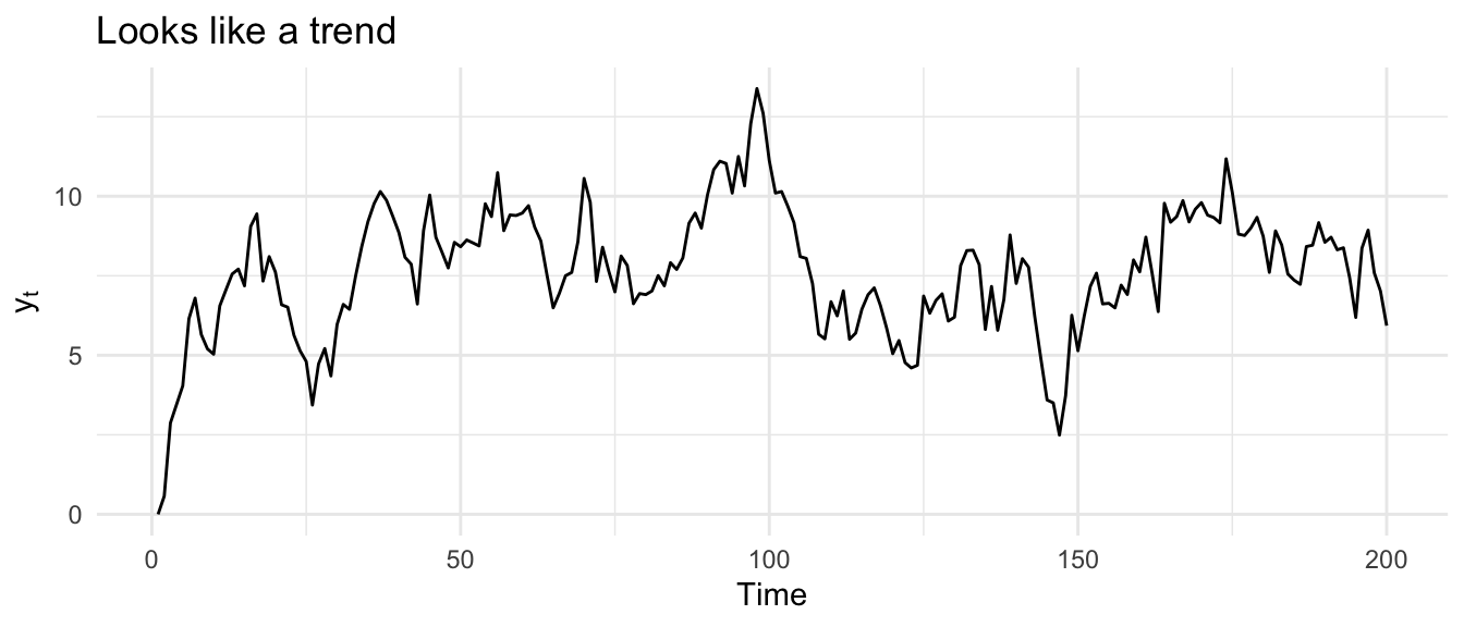
It climbs early and then levels off. The eye wants to call that a trend and difference it. But this is a stationary AR(1) with \(\phi = 0.9\), and the climb is not a trend at all; it is the transient settling of the process toward its mean, which sits at \(\delta / (1 - \phi) = 0.8 / 0.1 = 8\). Once it arrives, it stays. Ask the tests.
adf.test(climber)
    Augmented Dickey-Fuller Test

data:  climber
Dickey-Fuller = -3.3534, Lag order = 5, p-value = 0.06389
alternative hypothesis: stationarykpss.test(climber)
    KPSS Test for Level Stationarity

data:  climber
KPSS Level = 0.26861, Truncation lag parameter = 4, p-value = 0.1
KPSS does not reject stationarity, which is correct. ADF is a near miss: it cannot quite reject the unit root, and the reason is the low power we ran into with Lake Huron. ADF struggles to tell a true unit root from a stationary series with a coefficient close to one, and 0.9 is close to one. We happen to know the truth because we built it. If you had differenced this series on the strength of the climb alone, you would have overdifferenced, injecting a spurious moving-average wobble into a series that was stationary to begin with. The stationarity chapter’s exercise on overdifferencing walks through that cost in detail. Important: let the tests and the mechanism decide, not the slope your eye draws.
Simulated data cooperates. Measured data does not. Catherine Pfister and colleagues wrote a lovely paper in the Journal of Ecology on spatial and temporal autocorrelation in Salish Sea kelp, linking kelp abundance to oceanic drivers like sea surface temperature. From their archived data I pulled the sea surface temperature record at Race Rocks, off the southern tip of Vancouver Island, which runs back to 1921. It is a long, local series, which is exactly what we want.
sst <- readRDS("data/RaceRocksSST.rds")

p1 <- as_tsibble(sst) |>
  ggplot(aes(index, value)) +
  geom_line() +
  labs(x = "Year", y = expression(degree ~ C),
    title = "Sea surface temperature, Race Rocks") +
  theme_minimal()
p2 <- ggAcf(sst) + labs(title = NULL) + theme_minimal()
p3 <- ggPacf(sst) + labs(title = NULL) + theme_minimal()
grid.arrange(p1, p2, p3, layout_matrix = layoutMat)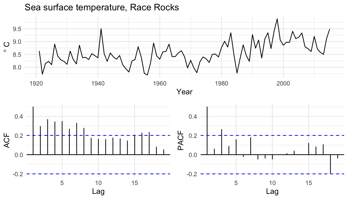
That is a more complicated picture than anything we simulated. The series drifts and the ACF tapers off slowly, the kind of pattern that can mean strong persistence or can mean a unit root. This is precisely the situation the stationarity chapter built the tests for, so rather than eyeball the slope and difference on a hunch, let’s ask ADF and KPSS.
adf.test(sst)
    Augmented Dickey-Fuller Test

data:  sst
Dickey-Fuller = -2.8659, Lag order = 4, p-value = 0.2188
alternative hypothesis: stationarykpss.test(sst)
    KPSS Test for Level Stationarity

data:  sst
KPSS Level = 1.3065, Truncation lag parameter = 3, p-value = 0.01
ADF cannot reject a unit root and KPSS rejects stationarity. Both point the same way: as it stands, this series is not stationary, so we difference it once and fit ARMA to the result. That combination, difference once then fit ARMA, is an ARIMA model.
sstDiff <- diff(sst)

p1 <- as_tsibble(sstDiff) |>
  ggplot(aes(index, value)) +
  geom_line() +
  labs(x = "Year", y = expression(degree ~ C ~ "anomaly"),
    title = "Differenced SST") +
  theme_minimal()
p2 <- ggAcf(sstDiff) + labs(title = NULL) + theme_minimal()
p3 <- ggPacf(sstDiff) + labs(title = NULL) + theme_minimal()
grid.arrange(p1, p2, p3, layout_matrix = layoutMat)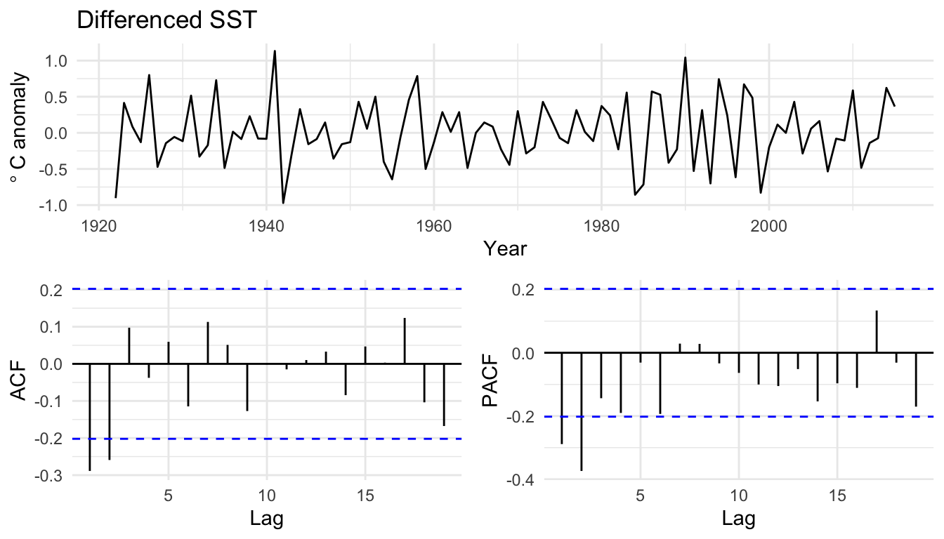
I differenced by hand and will fit ARMA models to sstDiff because keeping the two steps visible is clearer for teaching. You could instead let Arima do the differencing internally by setting the middle order to one, as in Arima(sst, order = c(1, 1, 0)). That is almost the same as differencing by hand and fitting Arima(sstDiff, order = c(1, 0, 0)), with one wrinkle worth knowing: when \(d > 0\), forecast::Arima drops the mean term unless you ask for it back with include.drift = TRUE. The two routes are not bit-for-bit identical, so I keep the differencing in plain sight.
Now fit the grid on the differenced series and compare by BIC.
arma00 <- Arima(sstDiff, order = c(0, 0, 0))
arma10 <- Arima(sstDiff, order = c(1, 0, 0))
arma20 <- Arima(sstDiff, order = c(2, 0, 0))
arma01 <- Arima(sstDiff, order = c(0, 0, 1))
arma02 <- Arima(sstDiff, order = c(0, 0, 2))
arma11 <- Arima(sstDiff, order = c(1, 0, 1))
arma21 <- Arima(sstDiff, order = c(2, 0, 1))
arma12 <- Arima(sstDiff, order = c(1, 0, 2))
arma22 <- Arima(sstDiff, order = c(2, 0, 2))

armaBIC <- BIC(arma00, arma10, arma20, arma01, arma02,
  arma11, arma21, arma12, arma22)
armaBIC |> arrange(BIC)
df BIC
arma02 4 94.13930
arma11 4 95.68852
arma01 3 96.01018
arma12 5 96.53865
arma21 5 99.32558
arma22 6 100.78066
arma20 4 104.65047
arma10 3 115.73152
arma00 2 119.76488The BIC favors the ARMA(0,2), with the ARMA(1,1) close behind. Unlike the planted series, there is no answer key here, so the choice is a judgment call. Look at the residuals of the ARMA(0,2) to see whether it has done its job.
resid01 <- residuals(arma01)
p1 <- as_tsibble(resid01) |>
  ggplot(aes(index, value)) +
  geom_line() + labs(x = "Year", y = "Residual") + theme_minimal()
p2 <- ggAcf(resid01) + labs(title = NULL) + theme_minimal()
p3 <- ggPacf(resid01) + labs(title = NULL) + theme_minimal()
grid.arrange(p1, p2, p3, layout_matrix = layoutMat)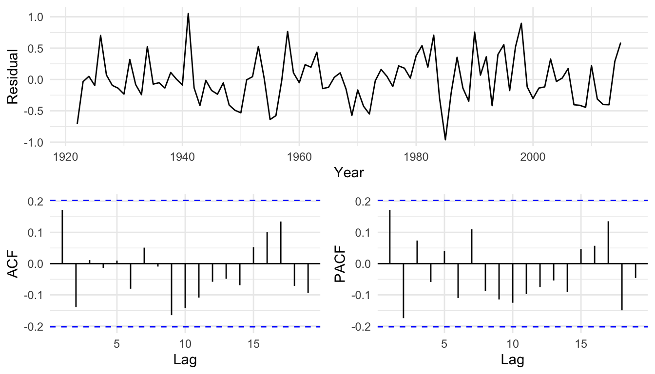
Those residuals are clean, so the ARMA(0,2) on the differenced series is a defensible model. So is the ARMA(1,1). With measured data you often end up holding two or three models that all fit about equally well, and no p-value settles it. What would settle it, or at least make the choice interesting, is knowing more about the physics and biology that drive sea surface temperature in this strait. Pattern is a clue. Process is the prize.
We added the moving-average half of the model, merged it with the autoregression into ARMA, and ran the full workflow: plant a process, fit a grid of orders, select one with BIC, and check the winner against both the planted truth and its own residuals. We saw that a stunning fitted-versus-observed \(R^2\) is nearly free for an autoregressive model and proves little, while the residual diagnostics are what actually test the fit. We saw that the “I” in ARIMA is just the differencing from the stationarity chapter, applied before the ARMA step, and that the decision to difference belongs to the tests and the mechanism, not the eye.
We now have a model for the dependence in a stationary series, and the chapters ahead ask what that buys you: whether a second series leans on this one, whether a slope or a trend can be trusted once the errors carry memory, and whether any of it predicts something you have not already seen. The next chapter starts with the first of those questions, asking whether a second series tracks this one, and by how much lag.
You met the lynx and the snowshoe hare in ecology, in the standard story about predator-prey cycles and the Lotka-Volterra equations. The data give the number of pelts, in thousands, traded with the Hudson’s Bay Company from 1845 to 1935. They come with the book in the data folder; read them with LynxHare <- readRDS("data/LynxHare.rds"), a ts object with a column for each animal.
LynxHare <- readRDS("data/LynxHare.rds")
tibble(year = as.numeric(time(LynxHare)),
  Hare = as.numeric(LynxHare[, "Hare"]),
  Lynx = as.numeric(LynxHare[, "Lynx"])) |>
  pivot_longer(c(Hare, Lynx)) |>
  ggplot(aes(year, value, color = name)) +
  geom_line() +
  scale_color_manual(values = c(Hare = bookPal[1], Lynx = bookPal[5])) +
  labs(x = "Year", y = "Pelts traded (thousands)", color = NULL) +
  theme_minimal()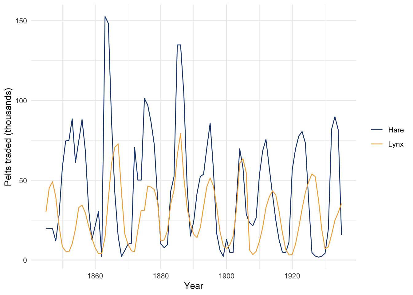
The hare is the lynx’s main food, and the two populations rise and fall together with a lag. Before you fit anything, write down how you expect that coupling to show up in the time-series properties of the lynx series. Would you expect an AR component, an MA component, or both, and why? Then look at the ACF and PACF of the lynx pelts and fit a grid of ARMA models, selecting one by BIC. Does the order you land on fit the predator-prey story you told yourself? Speculate, wildly and irresponsibly, about what the coefficients say about the population cycle.
The lynx series cycles, which is a different kind of structure from a trend, but it is worth asking the stationarity question anyway. Run ADF and KPSS on the lynx pelts. Do the tests agree? If they point toward differencing, difference the series and refit; if they do not, fit ARMA to the series as it stands. Write a sentence on whether a unit root is plausible for an animal population that is held in check by its food supply and its predators.