Code
library(tidyverse)
library(nlme)
library(forecast)
library(ggridges)
library(PNWColors)
library(gridExtra)

bookPal <- pnw_palette("Sunset2", n = 5, type = "discrete")The last chapter brought up the association between two series (\(x\) and \(y\)). Once a cross-correlation convinces you that one series tracks another, the natural next move is to fit a model and read the slope: how much does \(y\) change when \(x\) does? That is regression, and you have done it since intro stats. The wrinkle is that our data are ordered in time, and the errors of a time-series regression are almost never the tidy independent draws that ordinary least squares assumes. They carry memory. They are autocorrelated.
Autocorrelated errors (residuals) break the independence assumption that the standard errors, the \(t\)-statistics, and the \(p\)-values all rest on. The estimate of the slope can still be fine. What goes wrong is your sense of how sure you are. Worse, the trouble is sharpest in the single most common thing an environmental scientist asks of a time series: is there a trend? Fit a line against time with autocorrelated errors and R will hand you a slope and a tiny \(p\)-value whether or not anything is actually changing. This chapter is about spotting that, understanding why it happens, and fixing it with generalized least squares so that the number you report is one you can stand behind.
We use tidyverse (Wickham 2023) for wrangling and read example data from CSV. The new tool is gls from nlme (Pinheiro et al. 2026), which fits a linear model while letting the errors carry a correlation structure. We use forecast (Hyndman et al. 2026) for ggAcf/ggPacf, ggridges (Wilke 2025) for the simulation figure, gridExtra (Auguie 2017) to lay a few plots out together, and PNWColors (Lawlor 2020) for the book’s palette.
library(tidyverse)
library(nlme)
library(forecast)
library(ggridges)
library(PNWColors)
library(gridExtra)
bookPal <- pnw_palette("Sunset2", n = 5, type = "discrete")Before we fit anything, it is worth separating two questions that both get answered with the same straight line, because the rest of the chapter leans on the difference. The first is whether a single series is changing through time. Is the lake warming? Is a population sliding year over year? Here the predictor is time itself, and the slope you fit is the trend. The second question is whether one thing tracks another. Does tree growth increase with more precipitation? Or phosphorus? Does ozone climb with temperature? Does an algae bloom stem from nitrogen pollution? Here the predictor is some other measured variable, and the slope is the strength of the relationship between them. Mechanically the two are identical. You fit a line, read a slope, look at a \(p\)-value, and nothing in the arithmetic knows or cares whether the thing on the x-axis is a calendar or a rain gauge. You are not held to a single predictor either. The relationship question often arrives with several at once, tree growth on temperature and soil moisture together, which is multiple regression: the same line-fitting with more columns and one slope per predictor. You can even put time in alongside a covariate and ask whether a trend survives once the other driver is accounted for.
What the arithmetic does not know, you have to. The autocorrelation issue does not treat the two questions equally. Time is the most autocorrelated predictor imaginable, marching \(1, 2, 3, \dots\) in perfect order, so the trend question is where the issue is strongest, the place a flat and aimlessly wandering series most easily fakes a result that looks like change. The relationship question is exposed too, but only to the degree that the other variable carries its own memory through time. A rain gauge that is nearly independent from one year to the next is far safer to regress against than a slow-moving variable that drifts the way time does (e.g., temperature is insidious this way). We start with the trend question, because it is the most pernicious and the most common thing an environmental scientist asks of a time series, and the lesson there carries straight over to everything else.
Let’s start with a dangerous case. We will build a series with no trend at all: pure AR(1) noise, wandering around a flat mean of zero. Then we will fit a straight line against time and ask whether the slope is significant. We know the right answer in theory is “no.”
set.seed(22)
n <- 120
phi <- 0.85
y <- as.numeric(arima.sim(model = list(ar = phi), n = n))
time <- 1:n
Always look at what you built. An AR(1) series with a coefficient near one wanders. It sets off in some direction and stays there for a while before turning, because each value is mostly a function of the one before it. To the eye it can look exactly like a series that is trending.
tibble(time, y) |>
  ggplot(aes(time, y)) +
  geom_hline(yintercept = 0, linetype = "dashed") +
  geom_line(color = bookPal[1]) +
  geom_smooth(method = "lm", se = FALSE, color = bookPal[5], linewidth = 0.7) +
  labs(
    x = "Time", y = "y",
    title = "A series with no trend, and the line OLS fits to it"
  ) +
  theme_minimal()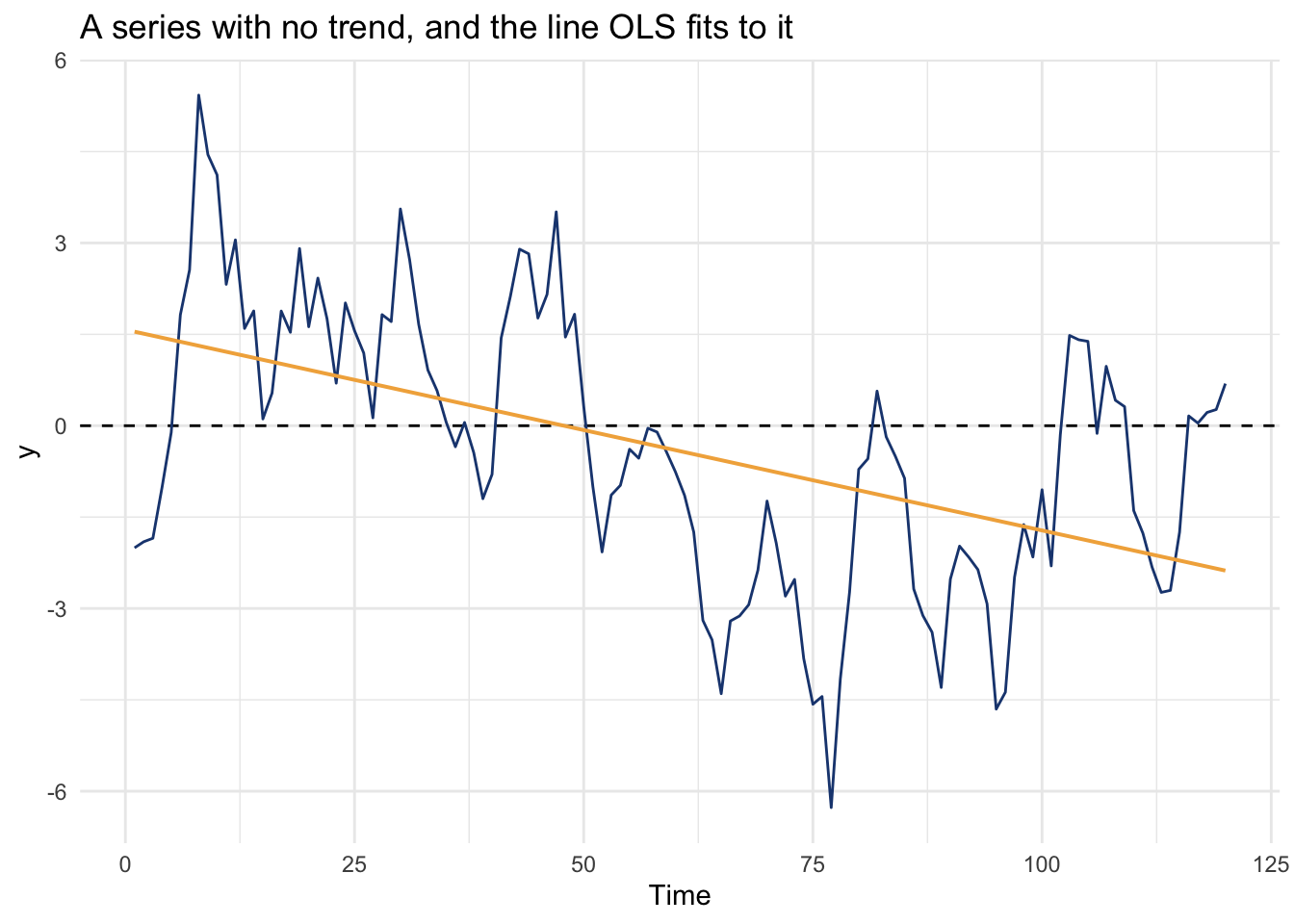
The gold line is what ordinary least squares draws through it. Is that trend significantly different from zero?
lm(y ~ time) fits the model \(y = \beta_0 + \beta_1 \cdot \text{time} + \epsilon\) by ordinary least squares. The formula y ~ time reads as “y as a function of time,” and the intercept is added for you. For more than one predictor, string them together with +, as in lm(y ~ x1 + x2), and you get one slope per predictor.
summary() prints the part you read. The Coefficients table has one row per term. Estimate holds the intercept and the slope(s), Std. Error is the uncertainty on each, t value is the estimate divided by its standard error, and Pr(>|t|) is the \(p\)-value for the test that the coefficient is zero. The slope you care about is the row named for your predictor. The intercept gets a row and a \(p\)-value too, but that test is usually silly: it asks whether \(y\) is zero when the predictor is zero, which for a time trend is the value back at time zero and for most covariates means nothing at all. Read the intercept estimate if you need it, but the test on it is rarely worth a second look. Down at the bottom, Multiple R-squared is the fraction of the variance the model explains, and the F-statistic with its \(p\)-value tests the model as a whole, whether the predictors taken together do better than nothing. With a single predictor that F test just restates the slope’s \(t\) test, but with several predictors it asks the joint question.
The important part here is that every standard error, \(t\) value, and \(p\)-value in that table is computed assuming the errors are independent. When they are not, those columns are wrong, and lm prints them with exactly the same confidence either way.
olsTrend <- lm(y ~ time)
summary(olsTrend)
Call:
lm(formula = y ~ time)

Residuals:
    Min      1Q  Median      3Q     Max
-5.3073 -1.1923  0.0746  1.2877  4.1143

Coefficients:
            Estimate Std. Error t value Pr(>|t|)
(Intercept)  1.57634    0.35904   4.390 2.48e-05 ***
time        -0.03296    0.00515  -6.399 3.29e-09 ***
---
Signif. codes:  0 '***' 0.001 '**' 0.01 '*' 0.05 '.' 0.1 ' ' 1

Residual standard error: 1.954 on 118 degrees of freedom
Multiple R-squared:  0.2576,    Adjusted R-squared:  0.2513
F-statistic: 40.95 on 1 and 118 DF,  p-value: 3.286e-09
The coefficient on time is -0.033 and the \(p\)-value on the slope is around three in a billion. Recall what that number means: if the true slope were zero, you would see an estimate this far from zero only about three times in a billion tries. By any conventional standard that is a screaming, unambiguous trend.
This is important so read this a few times. The coefficient is not an illusion. The line not flat, the series ends lower than it began, and over these 120 steps it did move. For real. That much is a description of the data in front of you. What is wrong is the next step, the inference that the series has a tendency to descend, some persistent pull that produced the fall and would go on producing it. There is no such pull. We built y from a stationary AR(1) process with mean zero and no drift, so the process has nowhere to trend toward. Autocorrelation lets a single realization wander off in one direction and hold there long enough to trace out a slope. If you ran that again with the same seed but a larger \(n\) (say n <- n*3) the slope would trend weakly positive. Run it again under a different seed and it might lean the other way, or hardly lean at all. Try it and you’ll agree.
This is a question about inference. The OLS \(p\)-value answers one thing: if the errors were independent, how often would chance alone produce a slope this steep? Almost never, it says, which is the three in a billion. But the errors are not independent, so it is answering a question we did not ask. Under the process that actually made this series, a slope this steep is unremarkable. The movement is a feature of this one sample. The trend, as a property of the process, is not there, and the \(p\)-value is certain about the wrong one of the two. We will return to this gap between what a model fits and what it lets you conclude.
And! This is not a fluke of one unlucky seed. Let’s prove it the way I love proving these things: turn the loose claim into an experiment and run it thousands of times. For a range of AR(1) strengths, we generate a trend-free series, fit the line, and record whether the slope came back significant at the usual 5% level, our significance threshold \(\alpha\), then repeat that a thousand times over. Replaying the same setup under a known baseline and tallying how often the method gets it wrong is a Monte Carlo simulation, and it is one of my favorite tools in the whole book. If the test were behaving, that significant-slope rate would sit near 5% no matter how much memory the errors carry.
The name comes from a casino, by way of a sick day. Stanislaw Ulam, a mathematician on the Manhattan Project, was recovering from an illness in 1946 and passed the time playing solitaire. He wanted to know his odds of winning a given hand, found the combinatorics too tangled to work out on paper, and tried something simpler instead: deal out the cards a few hundred times and count how many hands won. Replace a hard probability question with a pile of random trials and a tally, that’s the whole method, right there in a sickbed.
Ulam saw that the same trick could crack a much harder problem he and John von Neumann were stuck on at Los Alamos, the diffusion of neutrons through fissile material. The work was classified and needed a code name, so Ulam’s colleague Nicholas Metropolis proposed Monte Carlo, after the casino where Ulam’s uncle liked to borrow money and gamble. The joke stuck, and now the name labels any method that answers a hard question by generating a large enough pile of random trials and counting up what happens.
falsePositiveRate <- function(phi, n = 100, sims = 1000) {
  hits <- replicate(sims, {
    # phi = 0 is white noise; build it directly so arima.sim is not handed a
    # zero coefficient (which throws a harmless but noisy warning)
    y <- if (phi == 0) rnorm(n) else as.numeric(arima.sim(list(ar = phi), n = n))
    p <- summary(lm(y ~ seq_len(n)))$coefficients[2, 4]
    p < 0.05
  })
  mean(hits)
}

phis <- c(0, 0.3, 0.5, 0.7, 0.9)
fp <- tibble(
  phi = phis,
  rate = map_dbl(phis, falsePositiveRate)
)
fp
# A tibble: 5 × 2
phi rate
<dbl> <dbl>
1 0 0.053
2 0.3 0.14
3 0.5 0.255
4 0.7 0.414
5 0.9 0.673ggplot(fp, aes(factor(phi), rate)) +
geom_col(fill = bookPal[5], width = 0.6) +
geom_hline(yintercept = 0.05, linetype = "dashed") +
scale_y_continuous(labels = scales::percent) +
labs(
x = expression("AR(1) coefficient of the errors " * (phi)),
y = "Trends declared significant",
title = "OLS finds a trend in trend-free data (length = 100)",
subtitle = "Each bar: share of 1000 flat AR(1) series where OLS calls the slope significant"
) +
theme_minimal()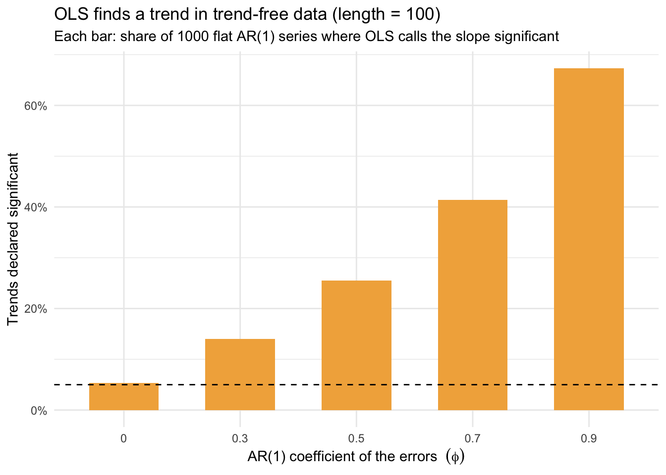
At \(\phi = 0\), when the errors are independent, OLS behaves: it cries trend about 5% of the time (dashed line), exactly the false-positive rate we signed up for. But as the memory in the errors climbs, so do the problems. By \(\phi = 0.9\), ordinary least squares declares a significant trend in roughly two of every three series drawn from a process with no trend at all.
That was the trend question. Now the second kind, the relationship question, and the same issue is waiting. This time we build two series that have nothing to do with each other. Call them a and b. Each is its own AR(1) series, drawn separately, so by construction neither has any pull on the other. Then we regress one on the other and ask whether the slope is significant. The answer we should get is no.
set.seed(17)
n <- 120
phi <- 0.85
a <- as.numeric(arima.sim(model = list(ar = phi), n = n))
b <- as.numeric(arima.sim(model = list(ar = phi), n = n))
Always look at what you built. Two separate series. Any stretch where they happen to drift together is luck, because nothing connects them.
tibble(t = 1:n, a, b) |>
  pivot_longer(c(a, b)) |>
  ggplot(aes(t, value, color = name)) +
  geom_line() +
  scale_color_manual(values = c(a = bookPal[1], b = bookPal[5])) +
  labs(x = "Time", y = NULL, color = NULL, title = "Two independent series") +
  theme_minimal()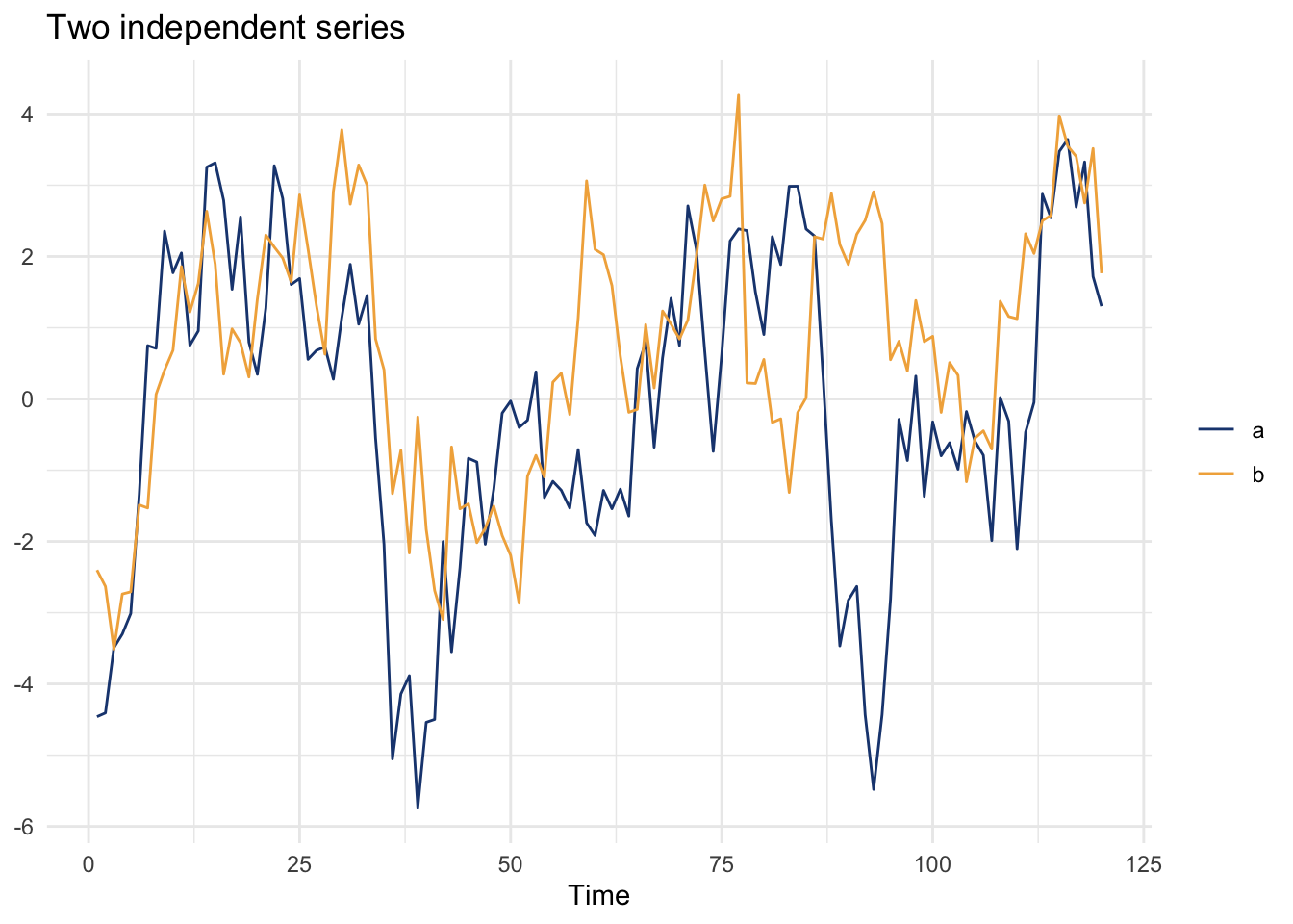
Now regress b on a.
olsSpurious <- lm(b ~ a)
summary(olsSpurious)
Call:
lm(formula = b ~ a)

Residuals:
    Min      1Q  Median      3Q     Max
-3.5101 -1.1522  0.0806  1.1001  4.0884

Coefficients:
            Estimate Std. Error t value Pr(>|t|)
(Intercept)  0.78671    0.14694   5.354 4.30e-07 ***
a            0.35873    0.06514   5.507 2.16e-07 ***
---
Signif. codes:  0 '***' 0.001 '**' 0.01 '*' 0.05 '.' 0.1 ' ' 1

Residual standard error: 1.605 on 118 degrees of freedom
Multiple R-squared:  0.2045,    Adjusted R-squared:  0.1977
F-statistic: 30.33 on 1 and 118 DF,  p-value: 2.165e-07
The slope comes back significant at a \(p\)-value around two in ten million, and the model claims to explain a fifth of the variation in b. If a and b were two variables you had measured in the field, you would think you had found something. Imagine a is some water quality measurement and b is some species abundance if you like. But this relationship is a mirage. We built the two series independently, so there is no association to find. This is the regression cousin of the spurious cross-correlation from the last chapter, where two independent random walks lined up into a correlation near 0.9. Same idea, fit with a straight line here instead of read off a cross-correlation plot.
The tell is the same as it was for the trend. The residuals carry the memory the two series brought with them.
ggAcf(residuals(olsSpurious)) + labs(title = "ACF of OLS residuals") +
  theme_minimal()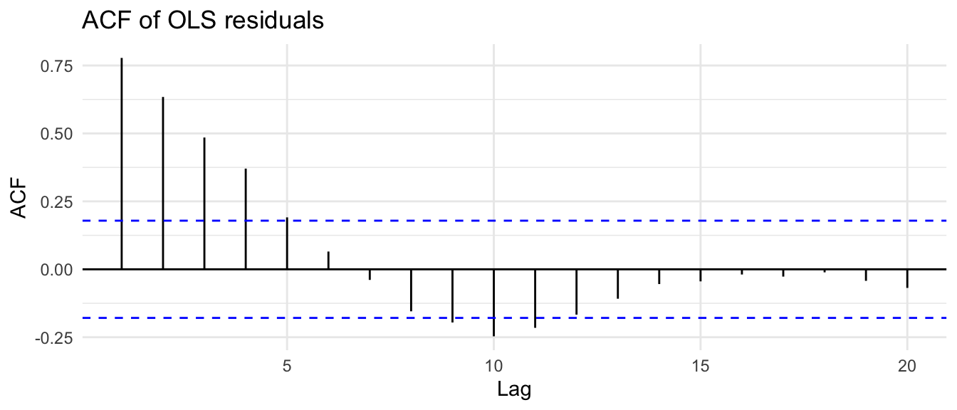
And it is no more a fluke than the trend was. Pair up independent AR(1) series over and over and count how often OLS calls them significantly related, and the false-positive rate climbs with the autocorrelation just the way it did before.
# draw one AR(1) series; when phi = 0 that is just white noise, and we make it
# directly so arima.sim is not handed a zero coefficient to complain about
ar1Series <- function(phi, n) {
  if (phi == 0) rnorm(n) else as.numeric(arima.sim(list(ar = phi), n = n))
}

# How often does OLS call two INDEPENDENT AR(1) series significantly related?
spuriousRate <- function(phi, n = 120, sims = 1000) {
  # run the experiment `sims` times; each run returns TRUE/FALSE, and the mean
  # of a TRUE/FALSE vector is just the fraction that came back TRUE
  mean(replicate(sims, {
    a <- ar1Series(phi, n) # one series
    b <- ar1Series(phi, n) # a second, unrelated one
    # fit b ~ a and grab the slope's p-value: [2, 4] is row 2 (the slope) and
    # column 4 (its Pr(>|t|)). Flag the run if that p-value clears 0.05.
    summary(lm(b ~ a))$coefficients[2, 4] < 0.05
  }))
}

# compare white-noise series (phi = 0) against strongly autocorrelated ones
c(whiteNoise = spuriousRate(0), phi_0.85 = spuriousRate(0.85))
whiteNoise phi_0.85
0.053 0.419 When the two series are white noise, OLS is fooled the 5% of the time it is supposed to be. By \(\phi = 0.85\) it is fooled more than 40% of the time.
The mechanism is worth getting straight, because it tells you exactly when to worry. The OLS slope estimate is still unbiased in both cases. The true slope is zero in each, and across many runs the OLS estimate averages right back to zero. What breaks is the standard error. OLS computes the uncertainty on the slope under the assumption that every observation is an independent piece of evidence. When the errors are autocorrelated, consecutive points are partly copies of each other, so you have less independent information than the sample size suggests. OLS does not know this. It counts all \(n\) points as full evidence, the standard error comes out too small, the \(t\)-statistic too big, and the \(p\)-value too optimistic.
There is a clean way to see. The bias in the OLS standard error is, to a good approximation, proportional to the sum over lags of the error autocorrelation times the predictor autocorrelation:
\[\text{SE bias} \;\propto\; \sum_k \rho_\epsilon(k)\,\rho_x(k)\]
If the predictor has no time structure of its own, every \(\rho_x(k)\) is zero, that sum collapses, and the OLS standard error is about right even when the errors are autocorrelated. There is nothing for the memory in the errors to align with. But the moment the predictor carries its own autocorrelation, both terms are positive, the sum grows, and the standard error shrinks below where it should be. And the predictor with the most autocorrelation imaginable is time itself: \(1, 2, 3, \dots\) climbs as smoothly as a variable can. That is why fitting a trend is the worst case, and why it is the one to be most skeptical of. The spurious regression is the same rule a notch down the scale. The predictor there is not time, but an AR(1) series with strong memory of its own, so \(\rho_x(k)\) stays large at the low lags, the products pile up, and the standard error shrinks. Time is the far end of that scale, and any predictor that carries memory sits somewhere along it.
So the diagnosis is always the same. Fit your model, then look at the residuals the way we have looked at every series in this book. The ACF and PACF of the OLS residuals from our initial example tell the story immediately.
ggAcf(residuals(olsTrend)) + labs(title = "ACF of OLS residuals") +
  theme_minimal()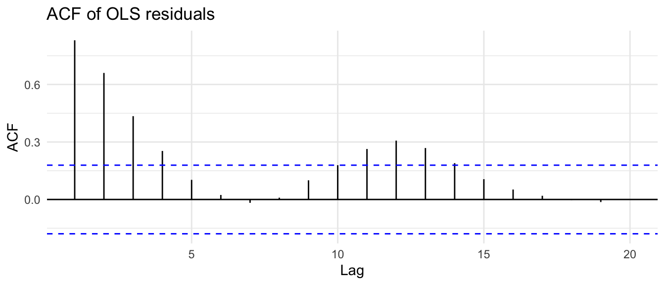
The slow decay is the AR(1) signature. The residuals are not independent, the independence assumption is broken, and any \(p\)-value from that fit is not to be trusted. Now we fix it.
We have all been taught OLS. It estimates the unknown parameters of a linear model, the intercept (\(\beta_0\)) and slope (\(\beta_1\)) of \(y = \beta_0 + \beta_1 x\), by finding the values that minimize the sum of squared errors. When the assumptions are met, errors that are independent, of equal variance, and normal, the OLS estimators are optimal, often called BLUE: Best Linear Unbiased Estimators. OLS has the nice property that it can be taught without matrix algebra and connects naturally to ideas like correlation.
Here is the problem with autocorrelated errors, and it is the same one behind both. OLS treats every observation as carrying the same amount of independent information. But when the errors are autocorrelated, observations close together in time share information: they are not fully independent. A positive residual at one step tends to sit next to positive residuals at the steps around it, not because of anything \(x\) is doing, but because of the memory in the series. OLS ignores this and effectively overcounts the information in the data. The practical consequence is that standard errors on the coefficients are underestimated when residuals are positively autocorrelated at short lags, which means t-statistics get inflated and p-values get too small. The coefficients themselves (\(\hat\beta_0\), \(\hat\beta_1\)) may still be unbiased, but they are inefficiently estimated and any inference from the standard errors is suspect.
Generalized least squares fixes this by explicitly accounting for the correlation structure of the errors. Instead of weighting every observation equally, GLS down-weights observations that are strongly correlated with their neighbors in time, because those observations carry less new information than they would if they were independent. In matrix form the two estimators sit side by side:
\[\hat{\boldsymbol{\beta}}_{OLS} = (\mathbf{X}^T \mathbf{X})^{-1} \mathbf{X}^T \mathbf{y}\] \[\hat{\boldsymbol{\beta}}_{GLS} = (\mathbf{X}^T \boldsymbol{\Sigma}^{-1} \mathbf{X})^{-1} \mathbf{X}^T \boldsymbol{\Sigma}^{-1} \mathbf{y}\]
where \(\mathbf{X}\) is the design matrix (one row per observation, one column per predictor, plus a column of ones for the intercept), \(\mathbf{y}\) is the vector of responses, and \(\boldsymbol{\Sigma}\) is the covariance matrix of the errors. Think of \(\boldsymbol{\Sigma}\) as an \(n \times n\) table whose diagonal holds the variance of each observation and whose off-diagonal entry \(\boldsymbol{\Sigma}_{ij}\) records the covariance between observations \(i\) and \(j\), a function of how far apart in time they are. GLS is OLS with \(\boldsymbol{\Sigma}^{-1}\) inserted in both places as a weighting matrix. When \(\boldsymbol{\Sigma} = \sigma^2 \mathbf{I}\), equal variances and no correlation, the \(\boldsymbol{\Sigma}^{-1}\) terms cancel and the GLS estimator collapses exactly to OLS. OLS is a special case of GLS. The OLS via Algebra and Matrices aside works through where both formulas come from.
In practice you do not know \(\boldsymbol{\Sigma}\) ahead of time. With gls() from nlme you specify the structure of the errors, for example that they follow an AR(1) process with corAR1(), and gls estimates the parameters of that structure from the data along with the regression coefficients, by default using restricted maximum likelihood (REML). The \(\hat{\boldsymbol{\beta}}_{GLS}\) formula still applies; it just uses the estimated \(\hat{\boldsymbol{\Sigma}}\) in place of the true one. The practical upshot follows the KISS principle: use OLS when its assumptions are met, try GLS when they are not. And because GLS asks you to specify the correlation structure, getting that structure wrong can do more harm than good.
Let’s fix the trend regression. We fit the same model, \(y\) against time, but tell gls that the errors follow an AR(1) process with corAR1().
glsTrend <- gls(y ~ time, correlation = corAR1())
summary(glsTrend)
Generalized least squares fit by REML
Model: y ~ time
Data: NULL
AIC BIC logLik
357.69 368.7727 -174.845
Correlation Structure: AR(1)
Formula: ~1
Parameter estimate(s):
Phi
0.9055328
Coefficients:
Value Std.Error t-value p-value
(Intercept) 0.3423155 1.6606062 0.2061389 0.8370
time -0.0131036 0.0228765 -0.5727991 0.5679
Correlation:
(Intr)
time -0.833
Standardized residuals:
Min Q1 Med Q3 Max
-2.3240786655 -0.6233958534 0.0003377918 0.6857914817 2.1529869400
Residual standard error: 2.410372
Degrees of freedom: 120 total; 118 residualThe slope estimate shrinks toward zero, and the standard error more than quadruples. The \(p\)-value climbs from three-in-a-billion to about 0.6. GLS has accounted for the memory in the errors, recognized that 120 autocorrelated points are worth far fewer than 120 independent ones, and reported the uncertainty correctly. The trend that OLS was certain of has evaporated, which is exactly what should happen, because we built a series with no trend.
gls summary
The coefficients table is the part you already know: an estimate, a standard error, a t-value, and a p-value for each term, tested the same way lm tests them. Everything around it is dressed differently.
The header says “Generalized least squares fit by REML” where lm would say “Call,” telling you the estimation method. Just under it gls prints AIC, BIC, and the log-likelihood by default, because a model fit by likelihood hands those to you for free. With lm you would call AIC() yourself.
Two things from the lm summary are gone on purpose: there is no \(R^2\) and no overall F-statistic. Both are built on splitting the total sum of squares into an explained part and a residual part, and that split only behaves once you assume ~iid errors. Weight the observations by a covariance structure and the tidy decomposition falls apart, so nlme declines to print a number that would mislead you. Use AIC to compare models instead.
A few smaller shifts. The coefficient columns are spelled Value, Std.Error, t-value, and p-value. The residual summary is labeled Standardized residuals, since these are normalized by the fitted covariance. And gls prints a Correlation: block that lm hides; watch out, because that block is the correlation among the coefficient estimates, not the autocorrelation of the residuals. The block that does report the error structure is Correlation Structure: AR(1), which gives the estimated Phi, the lag-one autocorrelation gls fit to the errors. Here it landed near 0.9, close to the 0.85 we built in.
GLS does the same favor for the spurious relationship. We refit the two independent series, now telling gls the errors follow an AR(1) process.
glsSpurious <- gls(b ~ a, correlation = corAR1())
summary(glsSpurious)$tTable
Value Std.Error t-value p-value
(Intercept) 0.6702749 0.53482565 1.253259 0.2125892
a 0.1115119 0.07760548 1.436908 0.1533904The slope that looked so convincing, significant at two in ten million, now carries a \(p\)-value around 0.15. Gone. Once GLS stops treating the autocorrelated wobbles of a and b as independent evidence, two series wandering on their own no longer look related. Both the false trend and the false relationship fall to the same fix.
So far GLS has played the skeptic (all scientists are skeptics!), dissolving a trend and a relationship that were never there. But it is not only a tool for tearing down false findings. When there is an effect to find, GLS recovers it more reliably than OLS does once the errors are autocorrelated. Let’s build a case where there is a true slope and check who gets closer to it.
We will make x ordinary white noise and build y as a function of x plus AR(1) noise. We know the true slope, so we can check who recovers it.
set.seed(47)
n <- 100
phi <- 0.8
x <- rnorm(n)
epsilon <- as.numeric(arima.sim(model = list(ar = phi), n = n))
epsilon <- epsilon - mean(epsilon)
B0 <- 0
B1 <- 0.5
y <- B0 + B1 * x + epsilon
Notice that here the predictor x is white noise, so by the rule from a moment ago the OLS standard errors will be roughly right. What suffers instead is efficiency: the autocorrelated errors make the OLS slope estimate noisy, and on this particular draw it lands well off the truth.
olsPlant <- lm(y ~ x)
coef(olsPlant)[2]
x
0.1857508 The true slope is 0.5 and OLS returned something nearer 0.2. The residuals, predictably, are autocorrelated.
ggAcf(residuals(olsPlant)) + labs(title = "ACF of OLS residuals") +
  theme_minimal()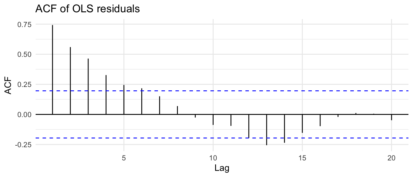
Before we hand this to gls, it is worth seeing what GLS does under the hood. Prewhitening. If we knew the AR(1) coefficient of the errors, we could transform both y and x to strip the memory out, then run an ordinary regression on the cleaned series. Estimate the coefficient from the OLS residuals, then subtract its lagged contribution from each variable.
ar1 <- ar(residuals(olsPlant))$ar[1]
yLag1 <- dplyr::lag(y)
xLag1 <- dplyr::lag(x)
yWhite <- y - ar1 * yLag1
xWhite <- x - ar1 * xLag1

olsWhite <- lm(yWhite ~ xWhite)
coef(olsWhite)[2]
xWhite
0.4411215 That slope is much closer to the true 0.5, and the residuals of olsWhite are clean. This hand transform is the old Cochrane-Orcutt idea, and it is essentially what GLS automates, except GLS estimates the correlation structure and the regression coefficients together rather than in two passes. Here is the gls version.
glsPlant <- gls(y ~ x, correlation = corARMA(p = 1))
coef(glsPlant)[2]
x
0.4496653 summary(glsPlant)$tTable Value Std.Error t-value p-value
(Intercept) -0.06975389 0.50353161 -0.1385293 8.901064e-01
x 0.44966531 0.09482844 4.7418824 7.190827e-06We ask for corARMA(p = 1), which is an AR(1) error structure. Had the residuals looked like an ARMA(1,1) we could try corARMA(p = 1, q = 1), and gls would estimate those parameters by numerical optimization, which can (and does!) fail when the model is too complex. The GLS slope lands near 0.5, the value we built in, and its standard error reflects the true uncertainty. When you inspect GLS residuals for autocorrelation, ask for the normalized ones, which are the residuals transformed by the estimated correlation structure and so are what should look like white noise if the structure was right.
ggAcf(residuals(glsPlant, type = "normalized")) +
  labs(title = "ACF of normalized GLS residuals") +
  theme_minimal()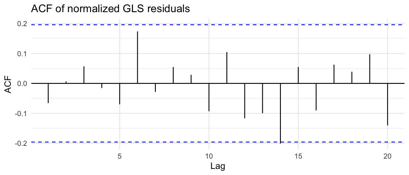
Clean.
A single simulation proves nothing. OLS got unlucky on that seed, and you could fairly object that another draw might flip it. So let’s run the whole thing thousands of times across a grid of sample sizes and error strengths, fit both OLS and GLS to each, and look at the distribution of the slope estimates. The truth is always 0.5.
simOne <- function(n, phi) {
  x <- rnorm(n)
  epsilon <- as.numeric(arima.sim(model = list(ar = phi), n = n))
  epsilon <- epsilon - mean(epsilon)
  y <- 0.5 * x + epsilon
  ols <- lm(y ~ x)
  glsFit <- tryCatch(gls(y ~ x, correlation = corARMA(p = 1)),
    error = function(e) NULL
  )
  if (is.null(glsFit)) {
    return(NULL)
  }
  tibble(OLS = coef(ols)[2], GLS = coef(glsFit)[2])
}

set.seed(872)
grid <- expand_grid(
  n = c(50, 100, 150, 200),
  phi = c(0.3, 0.5, 0.7, 0.9),
  rep = 1:225
)

sim <- grid |>
  mutate(out = map2(n, phi, simOne)) |>
unnest(out)sim |>
pivot_longer(c(OLS, GLS), names_to = "model", values_to = "B1hat") |>
filter(between(B1hat, 0, 1)) |>
mutate(
model = factor(model, levels = c("OLS", "GLS")),
phiLab = factor(phi, labels = paste0("phi == ", c(0.3, 0.5, 0.7, 0.9))),
nLab = factor(n)
) |>
ggplot(aes(x = B1hat, y = nLab, fill = model)) +
geom_density_ridges(alpha = 0.7, scale = 1.1) +
geom_vline(xintercept = 0.5, linetype = "dashed") +
facet_grid(
rows = vars(model), cols = vars(phiLab),
labeller = labeller(phiLab = label_parsed)
) +
scale_fill_manual(values = c(OLS = bookPal[5], GLS = bookPal[1]), guide = "none") +
labs(
x = expression(hat(beta)[1]), y = "Sample size",
title = "GLS recovers the true slope more tightly than OLS",
subtitle = expression(y[t] == 0.5 * x[t] + epsilon[t] *
" with " * epsilon * " an AR(1) process; dashed line is the truth"),
caption = "3600 simulations"
) +
theme_minimal() +
theme(legend.position = "none")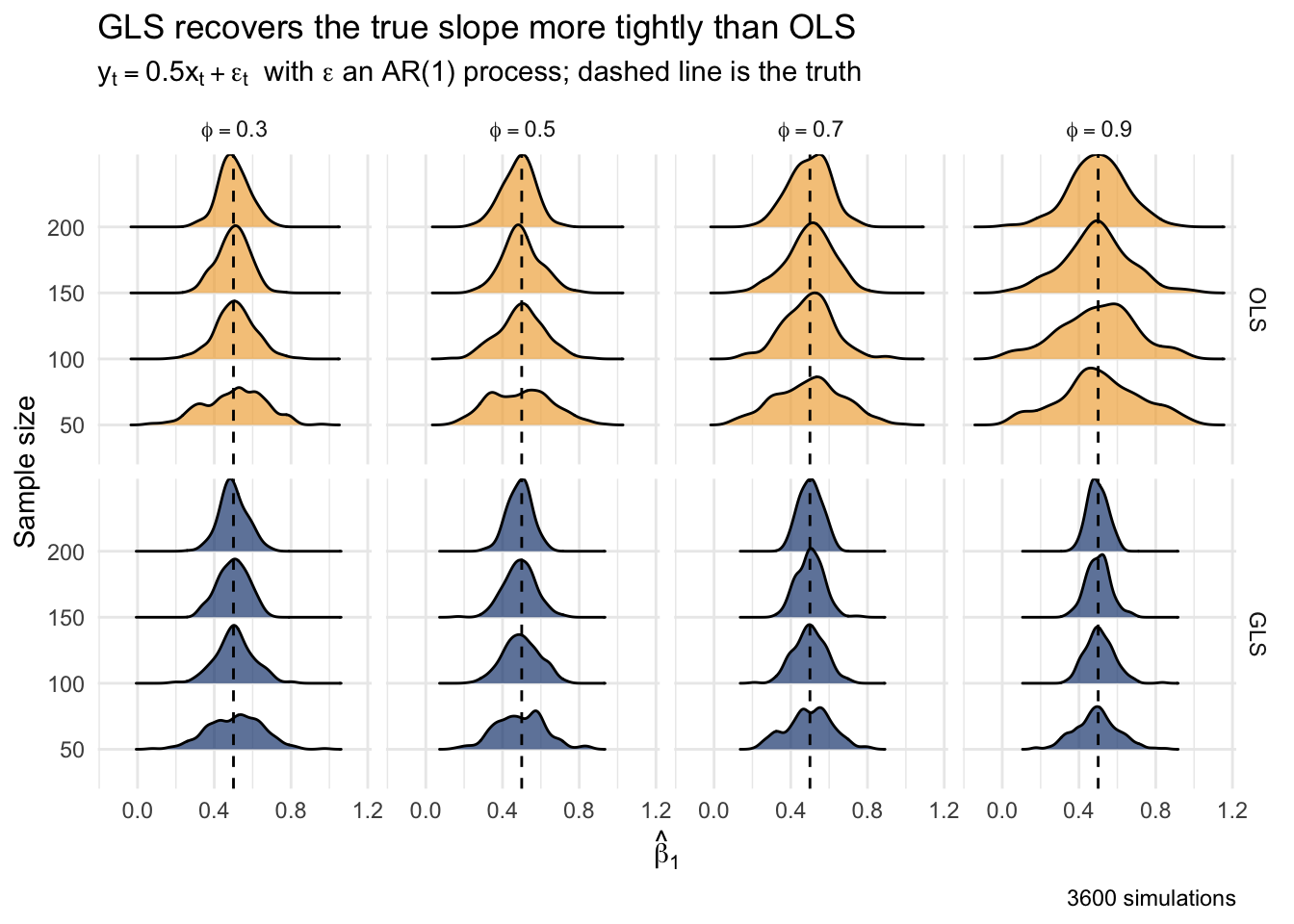
Read down the columns as the error memory strengthens from left to right. Both methods are centered on the truth, so neither is biased. But the GLS distributions are tighter, and the gap widens as \(\phi\) grows and as the sample size shrinks. At \(\phi = 0.9\) with only 50 points, the OLS estimate is all over the place while GLS stays comparatively concentrated on 0.5. That is the efficiency gain. Even in this friendly case, where the white-noise predictor keeps the OLS standard errors roughly right, you still get a better estimate by modeling the structure in the errors. And in the unfriendly case, the trend, modeling the structure was the difference between a true result and a false one. Either way the lesson is the same one the whole book keeps arriving at: the dependence is there whether you account for it or not, so embrace it.
A short and excellent paper by Connie Woodhouse and colleagues (Woodhouse et al. 2016) looks at how annual flow on the Colorado River responds to precipitation, soil moisture, and temperature. The river is the water supply for forty million people, so whether its flow is predictable from climate, and whether warming is bending that relationship, is important. I have put their data in data/woodhouse.csv.
flow <- read_csv("data/woodhouse.csv") |>
  mutate(MAF = LeesWYflow / 1e6)

ggplot(flow, aes(Year, MAF)) +
  geom_line(color = bookPal[1]) +
  labs(
    y = "Flow (millions of acre feet)", x = "Water year",
    title = "Colorado River at Lees Ferry"
  ) +
  theme_minimal()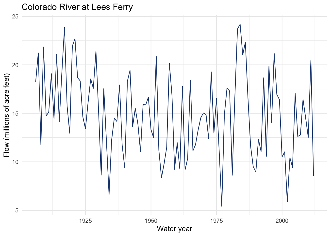
The flow record is the annual total at Lees Ferry, where the river is measured before the big downstream diversions. We will model it as a function of October-to-April precipitation, the cool-season moisture that feeds the spring runoff. Start with OLS, then look at the residuals.
olsFlow <- lm(LeesWYflow ~ OctAprP, data = flow)
summary(olsFlow)
Call:
lm(formula = LeesWYflow ~ OctAprP, data = flow)

Residuals:
     Min       1Q   Median       3Q      Max
-5239145 -1691189  -301282  1702819  7394534

Coefficients:
            Estimate Std. Error t value Pr(>|t|)
(Intercept) -3037032    1274631  -2.383    0.019 *
OctAprP        81921       5719  14.324   <2e-16 ***
---
Signif. codes:  0 '***' 0.001 '**' 0.01 '*' 0.05 '.' 0.1 ' ' 1

Residual standard error: 2514000 on 105 degrees of freedom
Multiple R-squared:  0.6615,    Adjusted R-squared:  0.6583
F-statistic: 205.2 on 1 and 105 DF,  p-value: < 2.2e-16
Precipitation explains about two thirds of the variance in annual flow, which is a strong relationship and makes physical sense: more cool-season precipitation, more water in the river. But this is a time series, so the slope and its standard error are only trustworthy if the residuals are independent.
ggAcf(residuals(olsFlow)) + labs(title = "ACF of OLS residuals, flow on precipitation") +
  theme_minimal()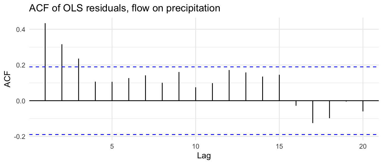
They are not. The lag-1 autocorrelation is around 0.4 and clears the significance band, so consecutive years’ residuals are related. A wet year tends to follow a wet year, soil moisture and snowpack carry over, and whatever the precipitation predictor misses persists from one year to the next. The independence assumption is broken, and the OLS standard errors are suspect. We will refit with an AR(1) error structure.
glsFlow <- gls(LeesWYflow ~ OctAprP,
  data = flow,
  correlation = corAR1()
)
summary(glsFlow)
Generalized least squares fit by REML
Model: LeesWYflow ~ OctAprP
Data: flow
AIC BIC logLik
3393.404 3404.019 -1692.702
Correlation Structure: AR(1)
Formula: ~1
Parameter estimate(s):
Phi
0.4643182
Coefficients:
Value Std.Error t-value p-value
(Intercept) -1902931.7 1076429.6 -1.767818 0.08
OctAprP 76616.7 4562.8 16.791726 0.00
Correlation:
(Intr)
OctAprP -0.927
Standardized residuals:
Min Q1 Med Q3 Max
-2.0597839 -0.7152264 -0.1221678 0.6774445 2.9347824
Residual standard error: 2537929
Degrees of freedom: 107 total; 105 residualThe slope stays large and overwhelmingly significant, so the headline finding survives: precipitation is a strong driver of flow. But the coefficient is different. Now think back to the rule from “Why Spurious Results Appear.” The residuals here are strongly autocorrelated, but the predictor is not. Precipitation from one year to the next is close to independent, with a lag-1 autocorrelation near zero. That puts us in the efficiency regime, not the standard-error-deflation one, so the OLS standard error was not badly inflated to begin with, and GLS actually tightens it a little rather than widening it. Either way the effect is far too strong for the autocorrelation to change the verdict.
It would be easy to come away thinking every time-series regression needs GLS. It does not. The rule is to diagnose, not to assume. Here is a case that looks like it should be trouble and turns out fine. The data/ny_air_quality.csv file holds daily measurements of ground-level ozone in New York over a summer, along with the weather. Ozone is a photochemical pollutant: it cooks up on hot, sunny, stagnant days. So we expect temperature to predict it, and we expect the data to be autocorrelated, because weather comes in multi-day spells. Hot days cluster.
Let’s look at ozone and temperature before we make a model. First ozone.
air <- read_csv("data/ny_air_quality.csv")
layoutMat <- matrix(c(1, 1, 2, 3), nrow = 2, byrow = TRUE)
p1 <- ggplot(air, aes(Day, ozone)) +
  geom_line(color = bookPal[1]) +
  labs(
    x = "Day of summer", y = "Ozone (ppb)",
    title = "Daily ground-level ozone, New York, summer 1973"
  ) +
  theme_minimal()
p2 <- ggAcf(air$ozone) + labs(title = NULL) + theme_minimal()
p3 <- ggPacf(air$ozone) + labs(title = NULL) + theme_minimal()
grid.arrange(p1, p2, p3, layout_matrix = layoutMat)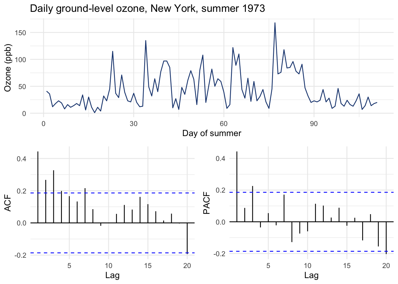
Definitely some structure there. Now what about temperature?
p1 <- ggplot(air, aes(Day, temperature)) +
  geom_line(color = bookPal[1]) +
  labs(
    x = "Day of summer", y = "Ozone (ppb)",
    title = "Daily temperature, New York, summer 1973"
  ) +
  theme_minimal()
p2 <- ggAcf(air$temperature) + labs(title = NULL) + theme_minimal()
p3 <- ggPacf(air$temperature) + labs(title = NULL) + theme_minimal()
grid.arrange(p1, p2, p3, layout_matrix = layoutMat)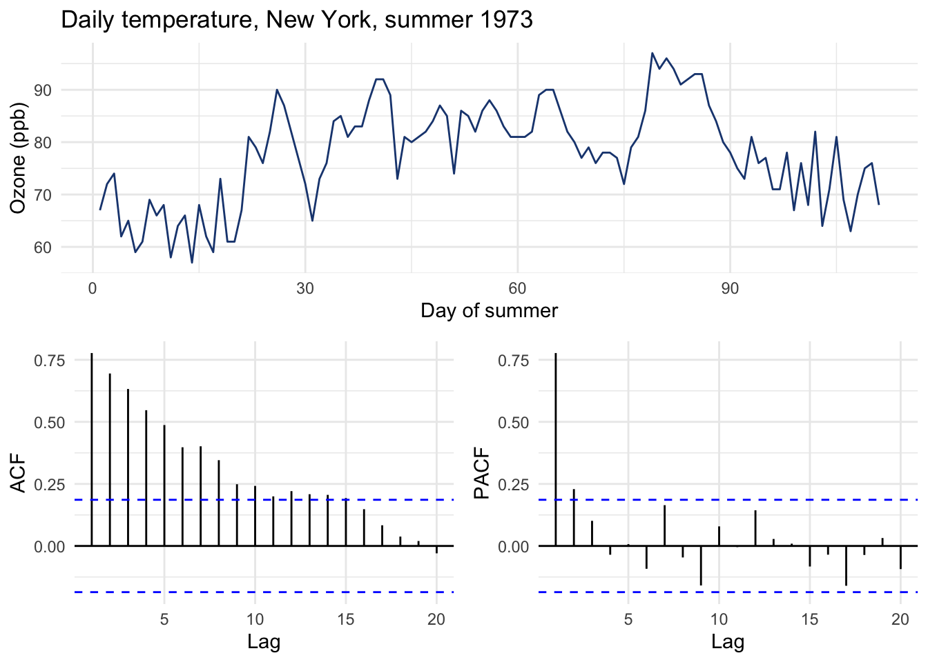
Now let’s make a model.
olsOzone <- lm(ozone ~ temperature, data = air)
summary(olsOzone)$coefficients
Estimate Std. Error t value Pr(>|t|)
(Intercept) -147.64607 18.7552518 -7.872252 2.762133e-12
temperature 2.43911 0.2393194 10.191861 1.552677e-17Temperature is a strong predictor, as expected. The day-to-day persistence of the weather means temperature itself is autocorrelated. By the instinct we have built, that should set off alarms. So check the residuals.
ggAcf(residuals(olsOzone)) + labs(title = "ACF of OLS residuals, ozone on temperature") +
  theme_minimal()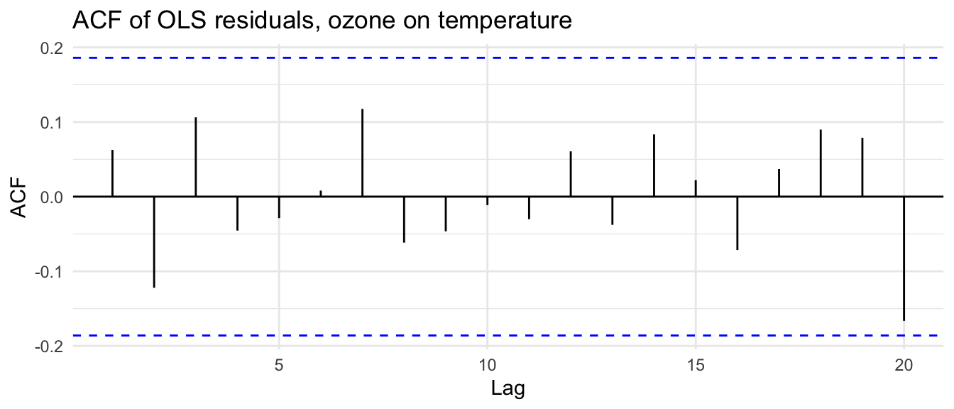
Nothing. The residual autocorrelation is negligible and stays inside the band. Here is the resolution of the apparent paradox: it is fine for the predictor x or the response y to be autocorrelated. What has to be independent is the residuals. Temperature soaked up the persistence. Because the hot spells that drive ozone are themselves carried by temperature, once temperature is in the model there is no leftover day-to-day memory for the errors to inherit. The independence assumption holds, and OLS stands. You did not need GLS, and the only way you could know that was to look. The plot is what earns you the right to keep the simpler model.
Time-series regression is the boogieman we worried about from the opening chapters. The slope estimate usually survives autocorrelated errors, but the uncertainty around it does not, and the damage can be worst when testing for a trend against time, where the predictor’s own structure aligns with the memory in the errors and OLS will conjure a significant trend out of a series that only wanders because of its own memory. The discipline is the same one the book has asked for throughout. Fit the model, then look at the residuals. If they are clean, as with the ozone, OLS is doing its job and you leave it alone. If they carry memory, as with the flow and the false trend, GLS lets you specify that structure and get a trustworthy answer back.
There is a non-parametric version of this same story, and it is the next chapter. When people test environmental series for a trend they often reach for the Mann-Kendall test and the Theil-Sen slope precisely because those methods avoid the straight-line assumption. But Mann-Kendall assumes independence too, and on autocorrelated data it over-rejects in exactly the way OLS just did, printing trends that are not there. The fix is the same idea we used here, a careful count of how many independent observations you actually have.
Go back to the slope-recovery simulation and change B1, phi, and n by hand to get a feel for when OLS and GLS diverge. What happens to the gap between them when you make the true slope smaller relative to the noise? When does OLS get away with ignoring the autocorrelation, and when does it cost you? Then change the predictor from white noise to something with its own memory, for example x <- as.numeric(arima.sim(list(ar = 0.8), n = n)), refit both, and watch the OLS standard error start to lie the way it did in the trend example.
The Woodhouse paper’s actual contribution is about temperature. Their point is that warm years amplify drought: “Different combinations of temperature, precipitation, and soil moisture can result in flow deficits of similar magnitude, but recent droughts have been amplified by warmer temperatures.” Fit a multiple regression of flow on both October-to-April precipitation (OctAprP) and March-to-July temperature (MarJulT). Does adding temperature improve the model? Look at the residuals: are they still autocorrelated once temperature is in? Refit with GLS and compare the temperature coefficient and its standard error to the OLS version. Given your simulation work, do you think Woodhouse and colleagues are on safe footing reading a temperature effect from this record?
nlme package, written by its authors. It is the place to go for what the correlation structures are and how the fitting actually works.