Code
library(tidyverse)
library(PNWColors)

bookPal <- pnw_palette("Sunset2", n = 5, type = "discrete")The last chapter tested for a trend by fitting a straight line, and watched ordinary least squares conjure trends out of autocorrelated noise. There is another way to ask whether a series is going up or down over time, one that many environmental scientists reach for precisely because it asks less of the data. Instead of fitting a line and trusting its slope, you can rank the observations and ask a simpler question: as time goes on, do later values tend to land above earlier ones? That is the Mann-Kendall test, and its companion the Theil-Sen slope gives you a rate of change that shrugs off outliers. Neither assumes a straight line, neither assumes normal errors, and that is why they are everywhere in climate and hydrology.
But there is a catch, and by now you can probably guess it. Dropping the straight-line and normality assumptions does not drop the independence assumption. Mann-Kendall still treats your observations as independent draws, so on autocorrelated data it falls into the same trap ordinary least squares did: it finds trends in series that have none. This chapter builds both tools from scratch, walks them into the trap on purpose, and then climbs out the same way the regression chapter did, by recognizing that autocorrelated points are not worth a full point each.
We hand-build everything in this chapter, so there are no new packages to install. We stay in the tidyverse (Wickham 2023) for wrangling and plotting, read the example data from CSV, and use PNWColors (Lawlor 2020) for the palette.
library(tidyverse)
library(PNWColors)
bookPal <- pnw_palette("Sunset2", n = 5, type = "discrete")The OLS line is ubiquitous (in part because every Excel user sees the option to add it when they right click on a plot). But OLS assumes the trend is straight and the errors are normal, and environmental series routinely break both: a flood might be a wild outlier, things like streamflow and pollutant concentrations are right-skewed. A lot of environmental changes are monotonic (always increasing or always decreasing) but not linear. A rank-based test sidesteps all of that. It does not care how big the changes are, only which direction they go.
The Mann-Kendall statistic is almost embarrassingly simple. Walk through every pair of observations. If the later one is larger, score \(+1\); if smaller, score \(-1\). Add up the scores. That sum is \(S\). A large positive \(S\) means later values mostly sit above earlier ones, which is an increasing trend. A large negative \(S\) is a decreasing trend. An \(S\) near zero means no consistent direction.
mannKendall <- function(x) {
  n <- length(x)
  # S: for every pair (i < j), +1 if x_j > x_i, -1 if x_j < x_i, 0 if tied
  S <- 0
  for (j in 2:n) {
    for (i in 1:(j - 1)) {
      S <- S + sign(x[j] - x[i])
    }
  }
  # variance of S under the no-trend null, with a correction for ties
  ties <- table(x)
  tieTerm <- sum(ties * (ties - 1) * (2 * ties + 5))
  varS <- (n * (n - 1) * (2 * n + 5) - tieTerm) / 18
  # standardized statistic (with a continuity correction) and two-sided p
  Z <- (S - sign(S)) / sqrt(varS)
  tau <- S / (n * (n - 1) / 2)
  p <- 2 * (1 - pnorm(abs(Z)))
  tibble(S = S, varS = varS, Z = Z, tau = tau, p = p)
}
A few lines in that function deserve a closer look. Under the null hypothesis of no trend, every ordering of the data is equally likely, and from that you can work out that \(S\) has mean zero and variance \(\frac{n(n-1)(2n+5)}{18}\). The tieTerm subtracts a correction when values repeat, since tied pairs carry no directional information. Dividing \(S\) by its standard deviation gives a \(Z\) score that is approximately normal for \(n\) bigger than about ten, which is where the \(p\)-value comes from. The last quantity, tau, is Kendall’s \(\tau\): the same \(S\) scaled to run from \(-1\) to \(1\), so it reads like a correlation between value and time.
Mann-Kendall tells you whether there is a trend while Theil-Sen says how steep the slope is. It’s just as direct: compute the slope between every pair of points and take the median.
theilSen <- function(x, t = seq_along(x)) {
  n <- length(x)
  slopes <- c()
  for (j in 2:n) {
    for (i in 1:(j - 1)) {
      slopes <- c(slopes, (x[j] - x[i]) / (t[j] - t[i]))
    }
  }
  median(slopes)
}
The median is what makes it robust. One wild observation corrupts a handful of the pairwise slopes, but the median ignores them. The OLS slope, by contrast, is a mean, and a single outlier drags a mean wherever it likes.
Let’s see how these work on a planted series. We build a clear upward trend of slope 0.3, add noise, and drop in two large outliers late in the record.
set.seed(40)
n <- 40
t <- 1:n
x <- 2 + 0.3 * t + rnorm(n, sd = 2)
x[32] <- x[32] + 25 # two wild years
x[37] <- x[37] + 21 # two wild years

olsPlanted <- lm(x ~ t)
summary(olsPlanted)
Call:
lm(formula = x ~ t)

Residuals:
    Min      1Q  Median      3Q     Max
-5.8910 -2.3361 -0.5255  0.8814 19.9971

Coefficients:
            Estimate Std. Error t value Pr(>|t|)
(Intercept)  0.34740    1.53267   0.227    0.822
t            0.42788    0.06515   6.568  9.5e-08 ***
---
Signif. codes:  0 '***' 0.001 '**' 0.01 '*' 0.05 '.' 0.1 ' ' 1

Residual standard error: 4.756 on 38 degrees of freedom
Multiple R-squared:  0.5317,    Adjusted R-squared:  0.5193
F-statistic: 43.14 on 1 and 38 DF, p-value: 9.505e-08tibble(t, x) |>
ggplot(aes(t, x)) +
geom_point(color = bookPal[1]) +
geom_smooth(method = "lm", se = FALSE, color = bookPal[5]) +
labs(x = "Time", y = "Some variable", title = "A trend with an outlier") +
theme_minimal()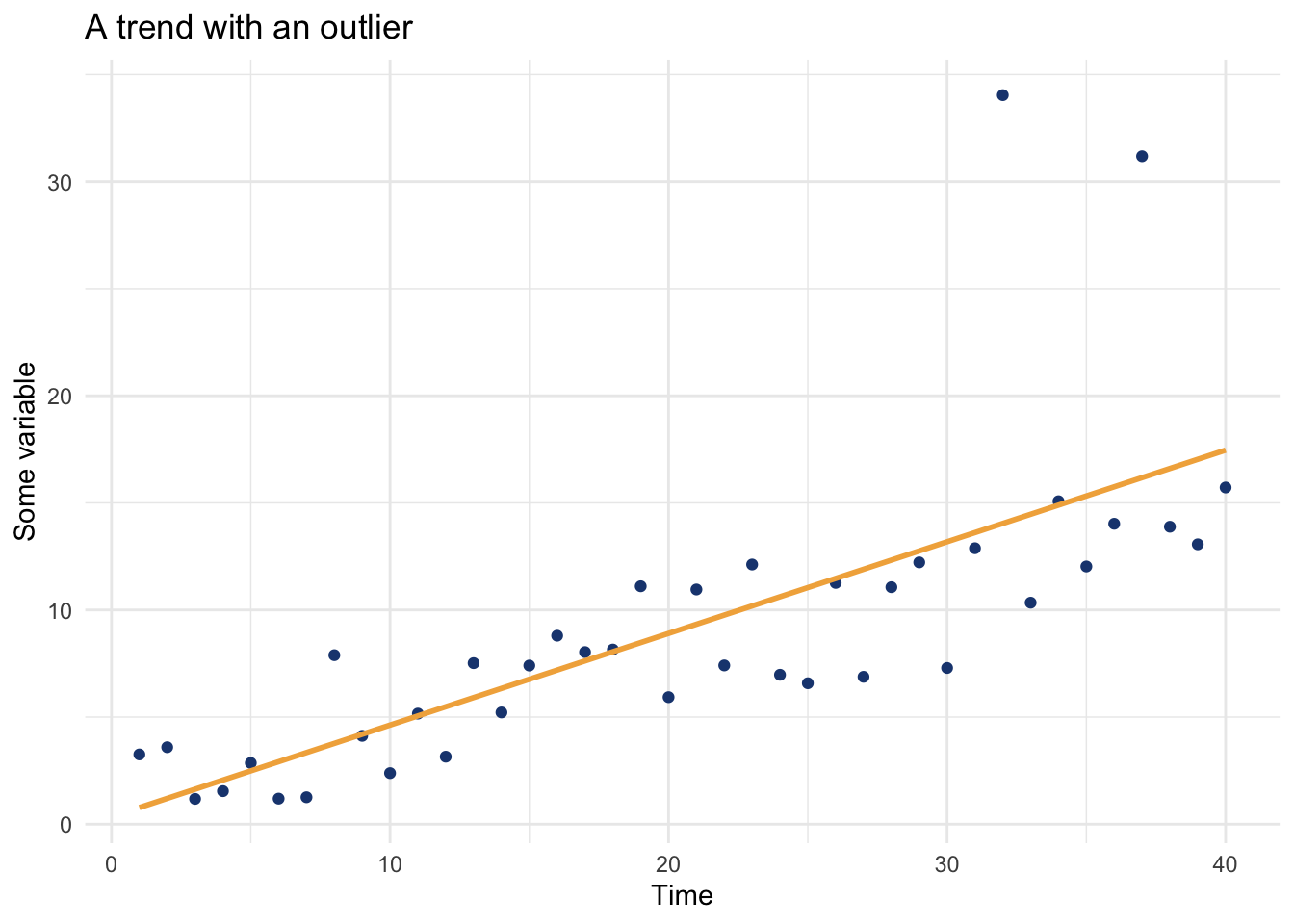
Look at the output from the OLS model and see that the slope is dragged up toward 0.43 by that one point. It’s also wildly significant. Let’s look at MK and TS output
mkPlanted <- mannKendall(x)
mkPlanted
# A tibble: 1 × 5
S varS Z tau p
<dbl> <dbl> <dbl> <dbl> <dbl>
1 528 7367. 6.14 0.677 8.25e-10Note that Mann-Kendall, meanwhile, sees the trend clearly, with \(\tau\) = 0.68 and a \(p\)-value of 8.2e-10.
tsPlanted <- theilSen(x)
tsPlanted
[1] 0.3480559And that Theil-Sen has the slope nearer the true 0.3 at 0.35.
Here are the two fits side by side.
tibble(t, x) |>
  ggplot(aes(t, x)) +
  geom_point(color = bookPal[1]) +
  geom_abline(
    data = tibble(
      slope = coef(olsPlanted)[2],
      intercept = coef(olsPlanted)[1],
      Line = "OLS"
    ),
    aes(slope = slope, intercept = intercept, color = Line, linetype = Line),
    linewidth = 0.7
  ) +
  geom_abline(
    data = tibble(
      slope = tsPlanted,
      intercept = median(x) - tsPlanted * median(t),
      Line = "Theil-Sen"
    ),
    aes(slope = slope, intercept = intercept, color = Line, linetype = Line),
    linewidth = 0.7
  ) +
  scale_color_manual(values = c("OLS" = bookPal[5], "Theil-Sen" = bookPal[3]), name = NULL) +
  scale_linetype_manual(values = c("OLS" = "solid", "Theil-Sen" = "dashed"), name = NULL) +
  labs(x = "Time", y = "Some variable", title = "One outlier, two slopes") +
  theme_minimal()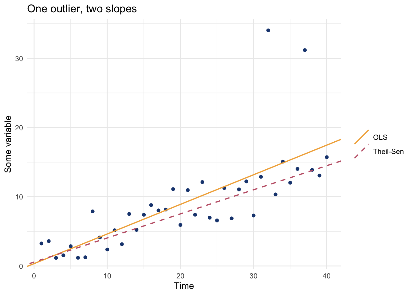
The OLS line tips up to chase the outlier. The Theil-Sen line stays with the bulk of the data. For environmental records, where the wild years are often the ones you most want to not overreact to, that robustness is the whole appeal.
GLS only fixes one of this chapter’s two problems. Correcting for autocorrelation, whether by inflating Mann-Kendall’s variance or by giving OLS a corAR1 structure, is the same idea applied to two different statistics, and once that correction is made neither test has an edge over the other. What GLS does not fix is the outlier you just watched drag the OLS line: it is still a least-squares fit, so a single wild value pulls its slope the same way no matter how well the dependence in time is modeled. Theil-Sen does not move, because it is a median, not a mean. Use Mann-Kendall and Theil-Sen when you don’t trust the trend to be a straight line, when the errors are skewed or outlier-prone, or when you just want a clean read on direction without committing to a parametric model. Stick with OLS or GLS when you need an actual model: a slope with a full uncertainty interval, more than one predictor, or a fitted line you plan to use later for forecasting or detrending. The two are not in competition. A common move is to run both: let the rank test confirm the direction and a slope that shrugs off outliers, and let OLS or GLS supply the rest of the inferential machinery.
The North Fork Nooksack drains the glaciers and snowfields of Mount Baker down into Bellingham Bay. A warming climate should leave a fingerprint on a river like this: more cool-season precipitation falling as rain instead of snow, which means higher winter flows, and less snowpack to melt through the summer, which means lower summer flows. Let’s test both with the tools we just built. We read the daily discharge record and collapse it to mean winter and mean summer flow for each year.
nooksack <- read_csv("data/nooksack.csv") |>
  mutate(year = year(DATE), month = month(DATE))

fullYears <- nooksack |>
  count(year) |>
  filter(n >= 350) |>
  pull(year)

annual <- nooksack |>
  filter(year %in% fullYears) |>
  group_by(year) |>
  summarise(
    winter = mean(FLOW[month %in% c(12, 1, 2)]),
    summer = mean(FLOW[month %in% 7:9]),
    .groups = "drop"
  )
Start with winter. Always look at the data first, with both slopes drawn through it.
tsWinter <- theilSen(annual$winter, annual$year)
olsWinter <- lm(winter ~ year, data = annual)

ggplot(annual, aes(year, winter)) +
  geom_line(color = bookPal[1]) +
  geom_abline(
    data = tibble(
      slope = coef(olsWinter)[2],
      intercept = coef(olsWinter)[1],
      Line = "OLS"
    ),
    aes(slope = slope, intercept = intercept, color = Line, linetype = Line),
    linewidth = 0.7
  ) +
  geom_abline(
    data = tibble(
      slope = tsWinter,
      intercept = median(annual$winter) - tsWinter * median(annual$year),
      Line = "Theil-Sen"
    ),
    aes(slope = slope, intercept = intercept, color = Line, linetype = Line),
    linewidth = 0.7
  ) +
  scale_color_manual(values = c(OLS = bookPal[5], "Theil-Sen" = bookPal[3]), name = NULL) +
  scale_linetype_manual(values = c(OLS = "solid", "Theil-Sen" = "dashed"), name = NULL) +
  labs(
    x = "Water year", y = expression("Mean winter flow (m"^3 * "/s)"),
    title = "North Fork Nooksack, December-February mean flow"
  ) +
  theme_minimal()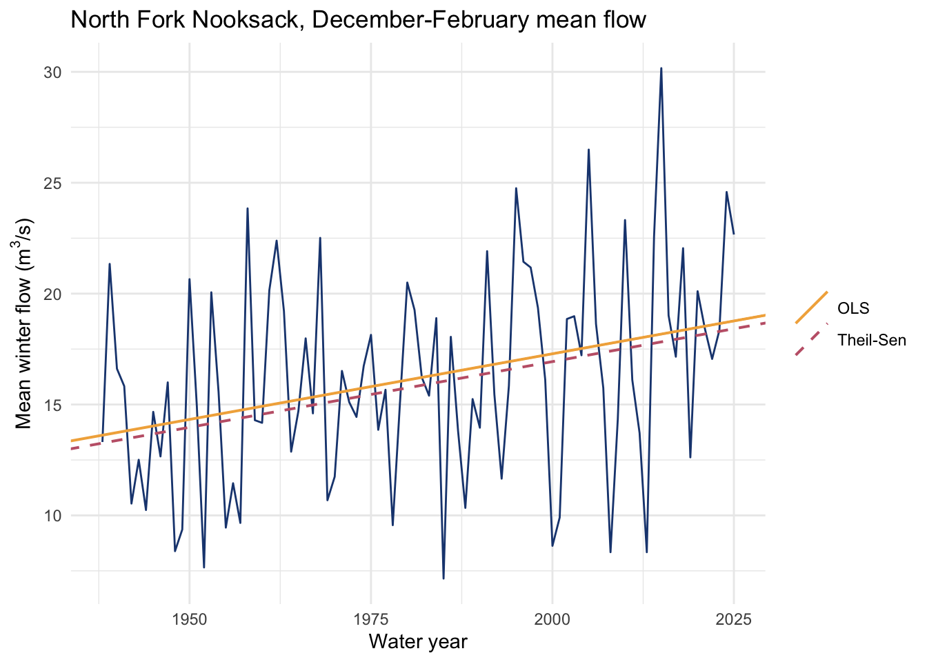
mkWinter <- mannKendall(annual$winter)
c(tau = mkWinter$tau, p = mkWinter$p, theilSenPerYr = tsWinter)
tau p theilSenPerYr
0.215256008 0.003015351 0.059258582 Winter flow is rising. Mann-Kendall returns \(\tau\) = 0.22 with a \(p\)-value of 0.003, and the Theil-Sen slope of 0.059 cubic meters per second per year works out to roughly 5 more over the length of the record. Maybe that is the rain-not-snow fingerprint showing up in the data? Now summer.
mkSummer <- mannKendall(annual$summer)
c(tau = mkSummer$tau, p = mkSummer$p, theilSenPerYr = theilSen(annual$summer, annual$year))
tau p theilSenPerYr
-0.07262278 0.31811753 -0.02705863 Summer flow is sliding the other way, with a negative slope, but Mann-Kendall returns a \(p\)-value of 0.32, nowhere near significant. The melt-season decline is the half of the fingerprint we would most expect, and on this single gauge it is buried in the noise.
So, the same physical story leaves one signal you can stand behind and one you cannot, at least not from a single record. Report the winter trend, flag the summer one as suggestive, and resist the urge to round it up.
There is a problem we have been stepping past. Mann-Kendall’s \(p\)-value, like every \(p\)-value, rests on a null hypothesis, and that null assumes the observations are independent. We have seen exactly what unmodeled autocorrelation does to a trend test. It should do it here too.
So let’s check, the same way we did in the regression chapter. Generate a flat series with no trend at all, just AR(1) noise, run Mann-Kendall, and count how often it cries trend. Do that across a range of autocorrelation strengths.
ar1Series <- function(phi, n) {
  if (phi == 0) rnorm(n) else as.numeric(arima.sim(list(ar = phi), n = n))
}

mkFalsePositive <- function(phi, n = 60, sims = 500) {
  mean(replicate(sims, mannKendall(ar1Series(phi, n))$p < 0.05))
}

set.seed(10)
phis <- c(0, 0.3, 0.5, 0.7, 0.9)
falsePositives <- tibble(phi = phis, rate = map_dbl(phis, mkFalsePositive))
falsePositives
# A tibble: 5 × 2
phi rate
<dbl> <dbl>
1 0 0.05
2 0.3 0.146
3 0.5 0.23
4 0.7 0.394
5 0.9 0.614ggplot(falsePositives, aes(factor(phi), rate)) +
geom_col(fill = bookPal[5], width = 0.6) +
geom_hline(yintercept = 0.05, linetype = "dashed") +
scale_y_continuous(labels = scales::percent) +
labs(
x = expression("AR(1) coefficient " * (phi)),
y = "Trends declared significant",
title = "Mann-Kendall finds a trend in trend-free data",
subtitle = "Share of 500 flat AR(1) series called significant at the 5% level"
) +
theme_minimal()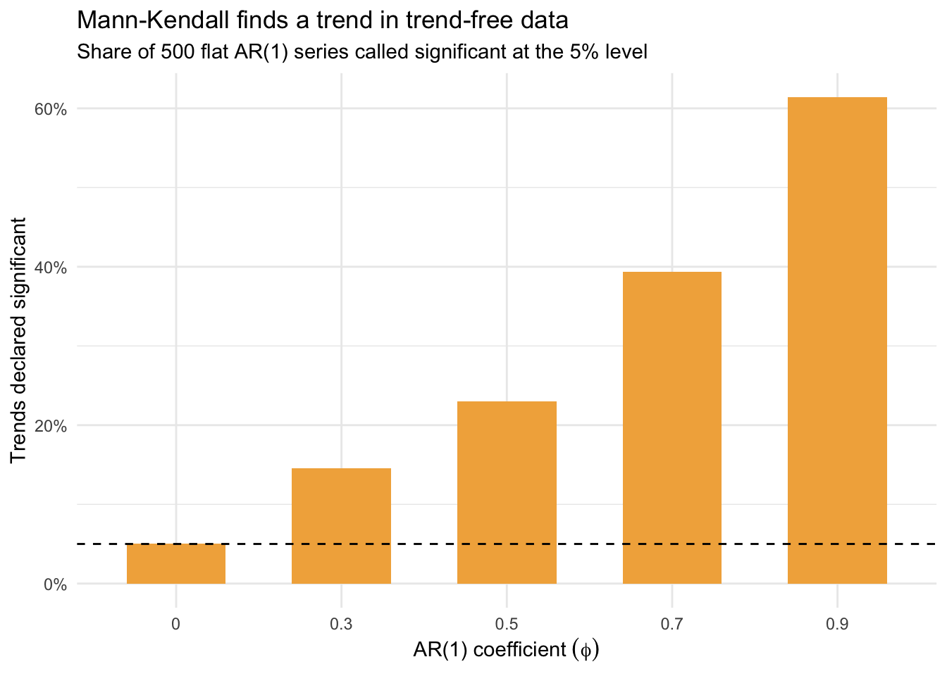
We’ve seen this before. When the series is white noise, Mann-Kendall behaves and cries trend about 5% of the time. As the autocorrelation climbs, so does the false-positive rate, until by \(\phi = 0.9\) it is declaring a significant trend in roughly two of every three series that have no trend at all. The rank test is no more immune than the regression was. Both treat dependent observations as if they were independent, no matter what shape the trend takes.
The fix is the same idea that powered generalized least squares in the last chapter, stated in plain terms: when your observations are autocorrelated, you do not have \(n\) independent pieces of information. You have fewer. A run of high-flow winters that come partly from one another is not as many independent votes for a trend as the same number of unrelated years would be. Mann-Kendall’s variance formula assumes all \(n\) count, so it reports a standard deviation that is too small, a \(Z\) that is too big, and a \(p\)-value that is too eager. We just need to tell it the truth about how many independent observations it has.
For an AR(1) process with lag-one correlation \(r_1\), the effective sample size is a standard result:
\[n_{\text{eff}} = n \,\frac{1 - r_1}{1 + r_1}\]
When \(r_1\) is zero the two are equal. As \(r_1\) climbs toward one, \(n_{\text{eff}}\) shrinks. We inflate the variance of \(S\) by the factor \(n / n_{\text{eff}} = (1 + r_1)/(1 - r_1)\) and recompute the test.
mannKendallESS <- function(x) {
  base <- mannKendall(x)
  r1 <- acf(x, plot = FALSE)$acf[2]
  inflation <- if (r1 > 0) (1 + r1) / (1 - r1) else 1
  varS <- base$varS * inflation
  Z <- (base$S - sign(base$S)) / sqrt(varS)
  tibble(r1 = r1, p = 2 * (1 - pnorm(abs(Z))))
}
Run the same Monte Carlo, this time with the corrected test.
mkFpCorrected <- function(phi, n = 60, sims = 500) {
  mean(replicate(sims, mannKendallESS(ar1Series(phi, n))$p < 0.05))
}

set.seed(10)
tibble(
  phi = phis,
  naive = falsePositives$rate,
  corrected = map_dbl(phis, mkFpCorrected)
)
# A tibble: 5 × 3
phi naive corrected
<dbl> <dbl> <dbl>
1 0 0.05 0.04
2 0.3 0.146 0.046
3 0.5 0.23 0.018
4 0.7 0.394 0.04
5 0.9 0.614 0.028The corrected false-positive rate drops back to where it belongs, near 5%, no matter how strong the autocorrelation. We have stopped the test from overcounting. Now turn it on the winter Nooksack, where the question actually matters.
mannKendallESS(annual$winter)# A tibble: 1 × 2
r1 p
<dbl> <dbl>
1 0.180 0.0134The lag-one correlation in winter flow is modest, around 0.18, so the correction is gentle. The \(p\)-value moves from 0.003 to 0.013. Still significant. That is the outcome you hope for: the warming signal in winter flow is strong enough to survive a careful accounting of the dependence in the record. Had it not survived, you would have learned that the trend you were about to report was partly an artifact of wet years clustering, which is exactly the thing this correction exists to catch.
A note on what we built. Inflating the variance with a single lag-one correlation is the readable core of an idea with a fuller form. The standard reference, Hamed and Rao (1998), sums the correction over the autocorrelation at all lags rather than just the first, which matters when a series carries memory beyond one step. There is also a second school of thought that fixes the problem by prewhitening, the same move we made in the cross-correlation and regression chapters: estimate the autocorrelation, filter it out of the series, then run the test on what remains (Yue et al. 2002). Both approaches are after the same thing we are, a fair count of the independent information in a dependent series.
Mann-Kendall and Theil-Sen are the right tools when you distrust the straight line, and you often should. They ask only about direction and they laugh off outliers. But robustness to the shape of the trend and the shape of the noise is not robustness to dependence, and on a time series the dependence is always there. The rank test ran into the same autocorrelation problem the regression chapter did, and the fix is the same: autocorrelated observations are worth less than independent ones, so the uncertainty has to account for that. It doesn’t matter whether you’re reading a slope off a line or a sign off a pair of ranks. Check the dependence in your data before you trust the p-value.
Everything in this chapter also assumes the change is gradual, a steady climb or slide from one end of the record to the other. Not every environmental change looks like that. A dam closes, a gauge moves, a policy flips, and a series jumps instead of drifting. The next aside builds a test for exactly that shape of change.
That’s the last question this part asks about whether an effect is there. What’s left is whether a model predicts anything at all, and that’s where we turn next.
Read the Bellingham weather data in data/kbli.csv, derive daily mean temperature as (TMAX + TMIN) / 2, and build two annual series: mean winter (December-February) temperature and mean summer (June-August) temperature. Test each for a trend with Mann-Kendall and estimate the rate with Theil-Sen. Then apply the effective-sample-size correction. Is one season warming faster than the other? Does the correction change either verdict, and what does the lag-one correlation in each series tell you about how much it should?
Take the summer Nooksack flow, the series that came back not significant. Run the effective-sample-size correction on it and confirm that a correction cannot rescue a trend that was never significant to begin with. Then build your own version of the Monte Carlo from this chapter, but vary the sample size instead of the autocorrelation. Hold \(\phi\) at 0.7 and sweep \(n\) from 30 to 200. Does a longer record make Mann-Kendall any more reliable on autocorrelated data, or just more confident in the wrong answer?