Code
library(tidyverse)
library(tsibble)
library(forecast)
library(gridExtra)The whole premise of this book is that the values in a time series depend on their neighbors. Autocorrelation is how we measure that dependence. It is the correlation of a series with delayed copies of itself, and it turns out to be one of the most informative things you can compute about a temporal process, because the shape of the autocorrelation is a fingerprint of the mechanism that made the data. A series where each value depends strongly on the one before looks different from a series where the dependence stretches back several steps, and both look different from noise. This chapter builds the two tools that read that fingerprint, the autocorrelation function and its partial cousin, and ties them to the simplest model of temporal dependence there is: the autoregressive process, where today is a regression on its own past.
We use the tidyverse (Wickham 2023) for wrangling and plotting and tsibble (Wang et al. 2020) to hold series as tidy tables, as in the earlier chapters. The forecast (Hyndman et al. 2026) package gives us ggplot-ready ACF and PACF functions, and gridExtra (Auguie 2017) helps lay a few plots out together.
library(tidyverse)
library(tsibble)
library(forecast)
library(gridExtra)Autocorrelation means that values in a series are correlated with each other as a function of how far apart they are in time. Tree-ring widths are the example I reach for first, because of my background and because the biology makes the dependence concrete. A wide ring in year \(t\) is related to the ring in year \(t-1\), and to \(t-2\), because the tree carries resources forward. Stored sugars from a good year prime growth the next year; a network of fine roots built in one season is still there working the next. The width this year is partly a regression on the width last year. The simplest way to write that down is a first-order autoregressive process:
\[ y_t = \phi y_{t-1} + \epsilon_t \]
Here \(y\) is the series, \(t\) indexes time, \(\phi\) (pronounced “fie,” or “fee” if you are in Greece) is a coefficient between -1 and 1, and \(\epsilon\) is a fresh disturbance at each step. That disturbance goes by several names: the error, the noise, the residual, and in time-series writing you will often see it called a shock, to stress that it is new information arriving at time \(t\) that the past could not have predicted. We call this an AR(1) model, first-order because \(y_t\) reaches back exactly one step. You will sometimes see it written \(y_t - \phi y_{t-1} = \epsilon_t\). I prefer keeping \(y_t\) alone on the left so it reads as the regression it is.
Of those names for \(\epsilon_t\), “shock” is the one to watch, because it is borrowed from econometrics and is not how most folks in environmental work talk. It means the disturbance just described: the new, unpredictable input that arrives at time \(t\) and knocks the series off whatever its history implied. If the word feels foreign, translate it to one you already use. An ecologist calls a disturbance a fire, a flood, a windthrow, something that hits the system from outside. A physical scientist might say a perturbation or a forcing. Same idea. I use “shock” because it is the standard term in time-series writing, but you can read it as “the disturbance at time \(t\)” every time it appears.
The arithmetic is cleaner when the series has a mean of zero, so by convention we subtract the mean first, \(y = Y - \bar Y\), and work with the centered series. We will stick to data centered at zero for now.
Let’s generate an AR(1) series by hand. Later we will meet arima.sim, which does this in one line, but building it with a loop shows you the machinery.
n <- 500
phi <- 0.7
epsilon <- rnorm(n)             # white noise shocks
y <- numeric(n)
for (i in 2:n) {
  y[i] <- phi * y[i - 1] + epsilon[i]
}

ggplot(tibble(t = 1:n, y), aes(t, y)) +
  geom_line() +
  labs(x = "Time", y = expression(y[t])) +
  theme_minimal()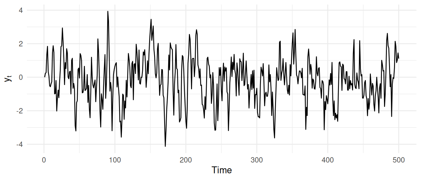
Look at how that was put together. We started with a vector of zeros and began building on the second value, because an AR(1) step needs the prior value and there is nothing before the first. We could have seeded y[1] with a random draw instead of a zero, but the zero washes out quickly. Run the loop and redraw the plot a half-dozen times to get a feel for the shape. Then compare it to a series with no memory at all (e.g., plot(rnorm(n), type = "l")). The autocorrelated series has a smoothness to it, a tendency to stay where it is for a while, that pure noise lacks.
Why “white” noise and “red” noise? It comes from physics. When the error term (shock) is drawn from a normal distribution we call it “white noise.” The name is borrowed from light, not statistics. White light carries every visible wavelength in roughly equal measure, no color dominates, and a white noise process spreads its variance around the same way, with no lean toward slow change or fast change. rnorm(n), the shocks alone with no memory built in, is white noise.
Give a series memory, the way \(\phi = 0.7\) just did, and the spread stops being even. A value that still resembles the one before it tends to drift rather than jitter, so its variance leans toward slow change and away from fast. That lean toward the slow end is called red noise, same analogy: red sits at the low-frequency end of the visible spectrum, so a process whose variance favors low frequencies borrows its name. The smoother, wandering line you just built, next to the flat jitter of rnorm(n), is red noise sitting beside white. The frequency chapter puts a number on that lean instead of an eyeball, but the color names are already earned by what you can see right here.
Time series inherits a lot of lingo. We just have to deal with it.
We planted a known \(\phi = 0.7\) in that series. The first thing we will do with the tools below is see whether we can read it back out.
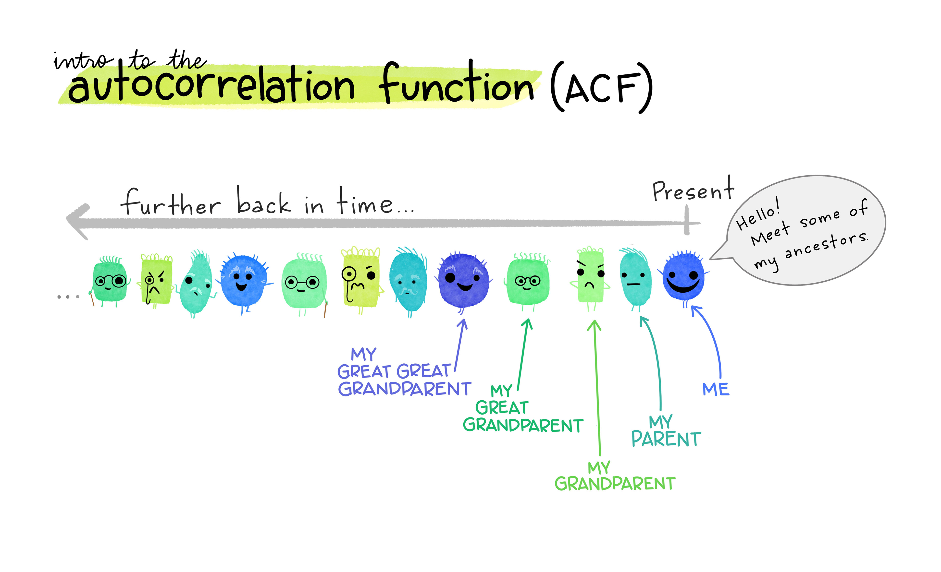
Go read Allison Horst’s piece on the autocorrelation function1. She is wonderful and I read everything she makes with delight a little envy.
How strongly is \(y_t\) correlated with \(y_{t-1}\)? For our AR(1) series the answer should be close to \(\phi\), and we can check it by correlating the series with a one-step-shifted copy of itself.
round(cor(y[2:n], y[1:(n - 1)]), 4)[1] 0.668That comes out to about 0.668, against the 0.7 we planted. We recovered the coefficient from nothing but the data. That is the recurring move of the whole book: simulate a process with a known answer, then confirm the tool finds it, so that when we turn the tool on data whose answer we do not know, we trust it.
This is the same correlation you already know, applied to a series and a lagged version of itself rather than to two different variables. Written out for a general lag \(k\), the autocorrelation \(\rho\) is
\[\rho(k) = \frac{\frac{1}{n-k}\sum_{t=k+1}^n (y_t - \bar{y})(y_{t-k} - \bar{y})}{ \frac{1}{n}\sum_{t=1}^n (y_t - \bar{y})^2}\]
To see the whole autocorrelation structure at once, you compute \(\rho\) at successive lags and plot it. That plot is called a correlogram, and the function ggAcf draws it. We use ggAcf from forecast rather than the base stats::acf; they are nearly identical (see ?ggAcf for the small differences).
ggAcf(y) +
  theme_minimal()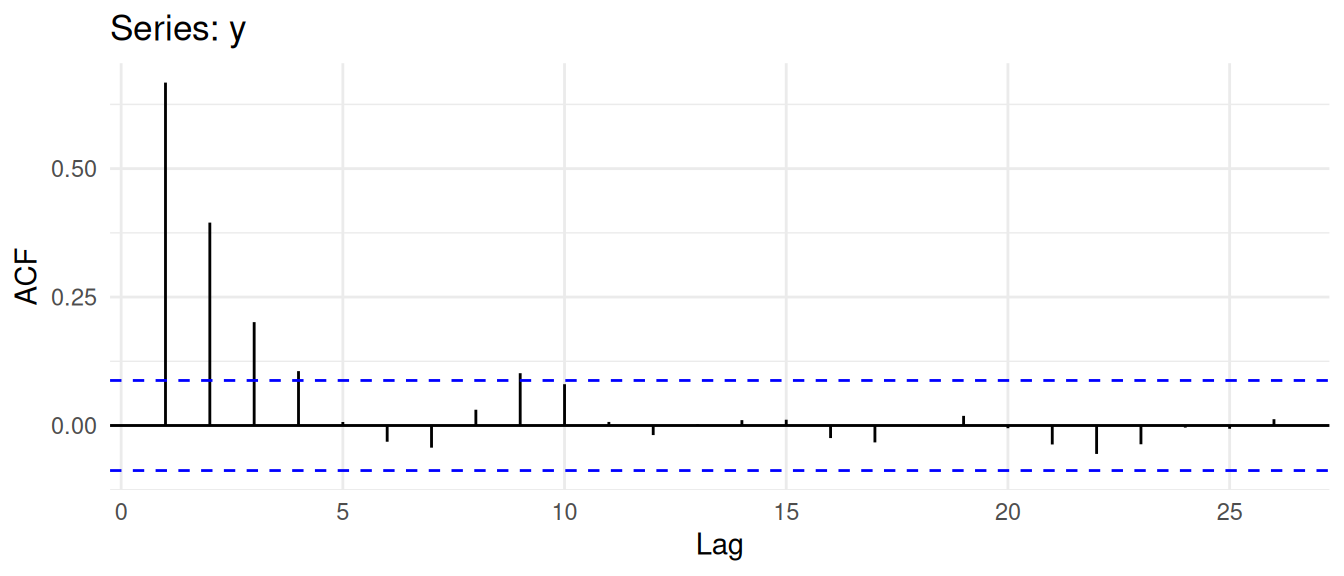
The correlogram shows the correlation at each lag. The lag-1 bar sits right at the \(\phi\) we recovered above. Notice that the autocorrelation does not stop at lag 1: there is still correlation at lags 2 and 3, decaying as \(\phi^k\) (\(\phi^2\), \(\phi^3\), and so on). That geometric decay is the AR(1) signature in the ACF.
The dashed lines are a significance band. If the series were independent noise, the correlation at any lag would be near zero, with a sampling spread of about \(1/\sqrt{n}\). The 95% band is drawn at \(\pm 1.96/\sqrt n\).
qnorm((1 + 0.95) / 2) / sqrt(n)[1] 0.08765225A word of caution that is really the first conviction of this book in miniature. We just tested 25 lags. With a 95% band, you expect roughly one bar in twenty to poke past the line by chance even if the series is pure noise. So a single lag outside the band is no reason to fire off a paper to Nature. Read the plot against the mechanism. A strong lag-1 correlation in a biological or physical system that has obvious memory is meaningful; a lone barely-significant spike at lag 8 is probably nothing. Always ask whether what you see in the data makes sense for the process that made it.
You will often want the numbers, not just the picture. They live inside the object ggAcf returns; str is, as always, your friend for finding them.
yACF <- ggAcf(y, plot = FALSE)
yACF$acf[, 1, 1]
[1] 1.000000000 0.667381959 0.394898921 0.201185905 0.105832323
[6] 0.006835833 -0.031653516 -0.043152324 0.030731602 0.101805417
[11] 0.080434533 0.006901371 -0.018551768 0.002020845 0.010443740
[16] 0.011214921 -0.024411046 -0.032823730 -0.001342588 0.018718373
[21] -0.005275216 -0.036887143 -0.055374925 -0.036574252 -0.004123666
[26] -0.006268373 0.012301501Note the 1.0 at lag zero. Every series is perfectly correlated with itself at no lag.
Return to the puzzle from the ACF: why is there correlation at lags 2 and 3 when our model only reaches back one step? Because the dependence chains. If \(y_t\) leans on \(y_{t-1}\), and \(y_{t-1}\) leans on \(y_{t-2}\), then \(y_t\) and \(y_{t-2}\) are correlated secondhand, through the value between them. The lag-2 correlation in the ACF is partly that echo.
The partial autocorrelation strips the echo out. The partial autocorrelation at lag \(k\) is the correlation between \(y_t\) and \(y_{t-k}\) after the effect of the intervening lags has been removed, which is exactly what a regression coefficient does when it controls for the other predictors. (Under the hood, ggPacf calls stats::acf with the type argument set to “partial” function to compute and plot it.)
ggPacf(y) + theme_minimal()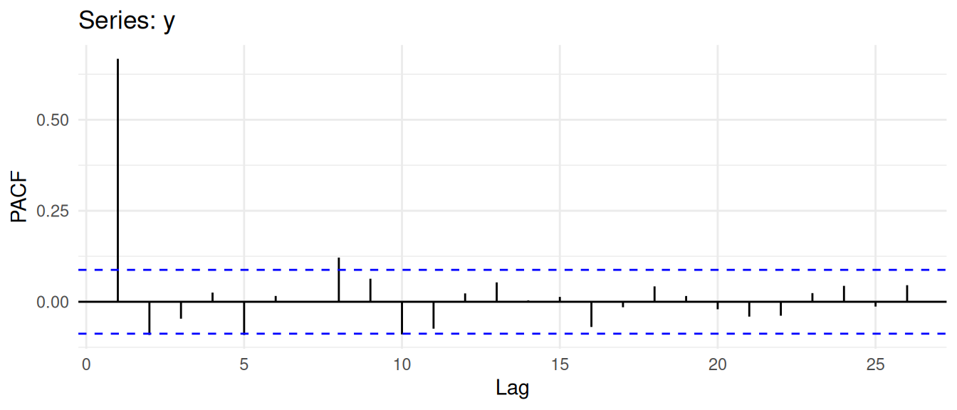
For an AR(1) process, once you account for the lag-1 relationship there is nothing left to explain at higher lags, so the partial autocorrelation drops to near zero after lag 1. That gives the pair of signatures you will use constantly: an AR(1) process has an ACF that decays geometrically and a PACF that cuts off sharply after lag 1. If instead the PACF is the one that decays slowly, you may be looking at a moving-average process, which we meet next chapter. For why an MA process flips the picture, see the aside on MA(1) ACF and PACF shapes.
If you want to see that the partial autocorrelation really is just a stack of regression coefficients, with the Pacf function reproduced from scratch three different ways, that is the aside on the PACF by hand. It is optional, but it demystifies the function.
The AR(1) idea extends to longer memory. An autoregressive model of order \(p\), written AR(p), lets the current value depend on the previous \(p\) values:
\[ y_t = \sum_{i=1}^p \phi_i y_{t-i} + \epsilon_t \]
So an AR(2) model is \(y_t = \phi_1 y_{t-1} + \phi_2 y_{t-2} + \epsilon_t\), an AR(3) adds a \(\phi_3 y_{t-3}\) term, and so on. Higher-order models have longer memory, reaching further into the past. We will fit and interpret them shortly. For now, hold onto the idea that \(p\) is how many steps back the process remembers, and that the PACF is the plot that tells you how large \(p\) should be, because it is the one that cuts off at the order of the process.
Simulated series are clean by construction. Let’s look at a few series that come with R and see how the tools behave on data that nobody designed.
The Nile series is the annual flow of the river Nile from 1871 to 1970, in units of \(10^8\) m\(^3\).
data(Nile)
as_tsibble(Nile) |>
  ggplot(aes(index, value)) +
  geom_line() +
  geom_vline(xintercept = 1899, linetype = "dashed", color = "red") +
  labs(x = "Year", y = expression(10^8 ~ m^3), title = "River Nile annual flow") +
  theme_minimal()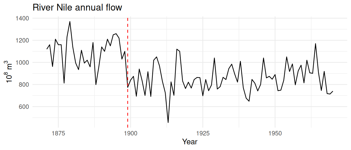
Before we touch the autocorrelation, look at the series itself. The flow drops noticeably around the turn of the century, marked here in red. That is not noise. The Aswan Low Dam was completed in 1902, and the upstream control and diversion that came with it cut the measured flow at the gauge. It is a textbook example of an intervention, an actual change in the system that shows up as a step in the level rather than as part of the natural variability. A series can fail to be well-behaved for reasons that have nothing to do with its own internal dynamics, and an abrupt human change to the watershed is one of them. We will treat it as a known break and not let it distract us from the autocorrelation question. A later aside comes back to this exact drop and asks whether the data alone, without the history, could have found it.
g1 <- ggAcf(Nile) + labs(title = "ACF") + theme_minimal()
g2 <- ggPacf(Nile) + labs(title = "PACF") + theme_minimal()
grid.arrange(g1, g2, ncol = 2)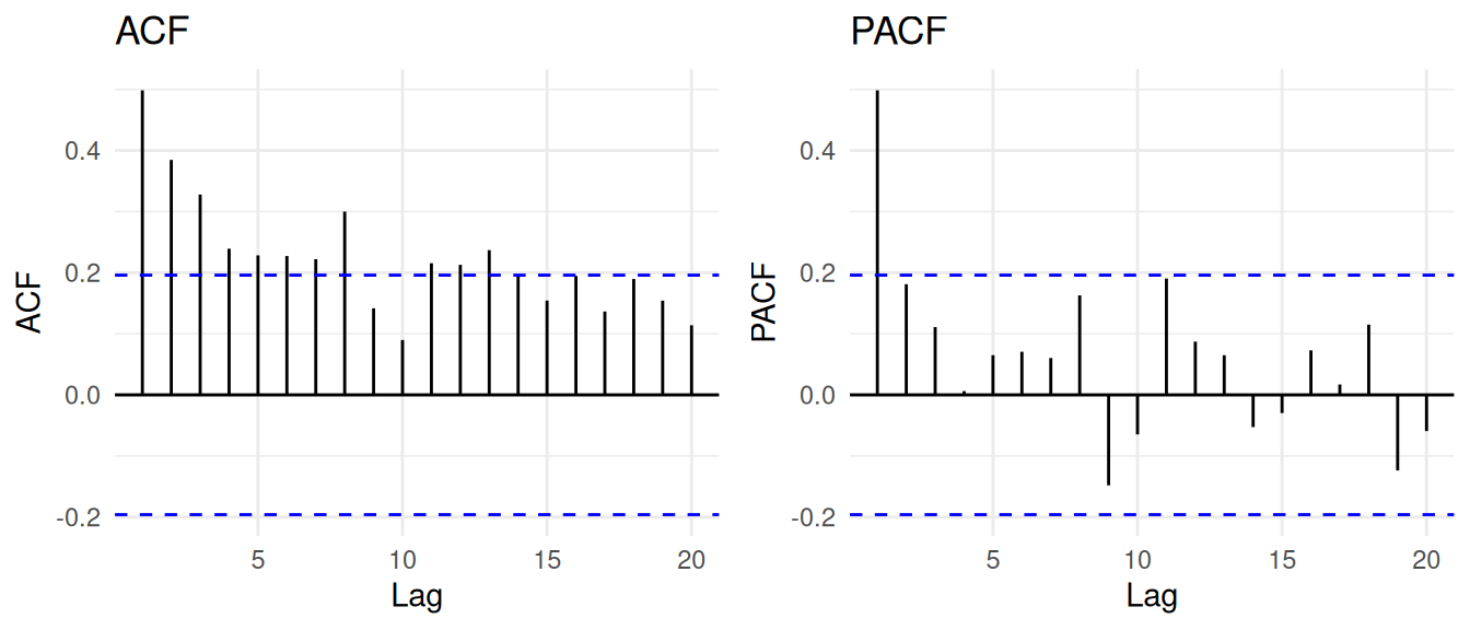
From the plot of the series, it is hard to say by eye whether high-flow years tend to follow high-flow years. The ACF and PACF settle it: there is a clear lag-1 correlation, the ACF tapers, and the PACF cuts off after lag 1. That is the AR(1) signature, so the flow record is reasonably described by \(y_t = \phi_1 y_{t-1} + \epsilon_t\).
(After we learn about ARIMA models, revisit this time series. There are some other wrinkles.)
The nhtemp series is the mean annual temperature in New Haven, Connecticut, in degrees Fahrenheit, from 1912 to 1971.
data(nhtemp)
as_tsibble(nhtemp) |>
  ggplot(aes(index, value)) +
  geom_line() +
  labs(x = "Year", y = expression(degree ~ F),
    title = "Mean annual temperature, New Haven") +
  theme_minimal()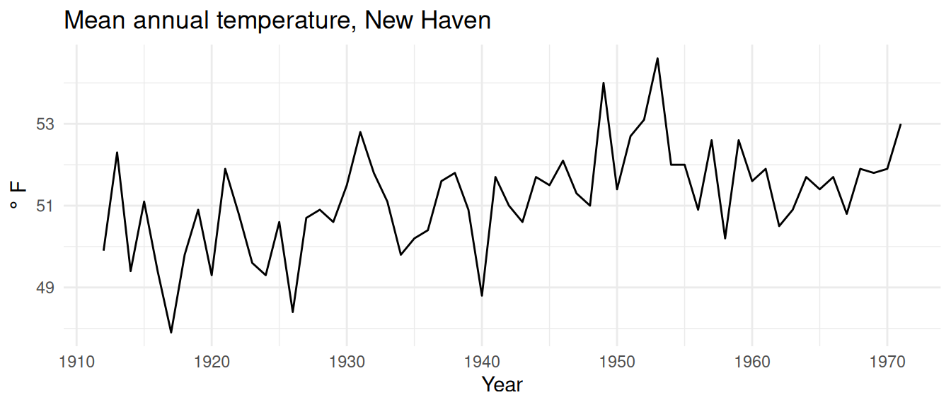
g1 <- ggAcf(nhtemp) + labs(title = "ACF") + theme_minimal()
g2 <- ggPacf(nhtemp) + labs(title = "PACF") + theme_minimal()
grid.arrange(g1, g2, ncol = 2)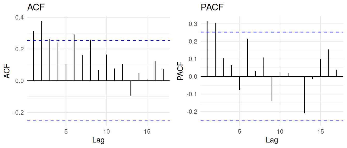
This one is a step up. The PACF shows a significant bar at lag 2 even after the lag-1 effect is accounted for, which points to an AR(2) process: \(y_t = \phi_1 y_{t-1} + \phi_2 y_{t-2} + \epsilon_t\). We will estimate those coefficients in a moment.
(After we learn about ARIMA models, revisit this time series. There are some other wrinkles.)
What about a series that does not just persist but cycles? Annual sunspot counts run from 1700 to 1988 and rise and fall on a roughly 11-year solar cycle.
data(sunspot.year)
as_tsibble(sunspot.year) |>
  ggplot(aes(index, value)) +
  geom_line() +
  labs(x = "Year", y = "Count", title = "Annual sunspot number") +
  theme_minimal()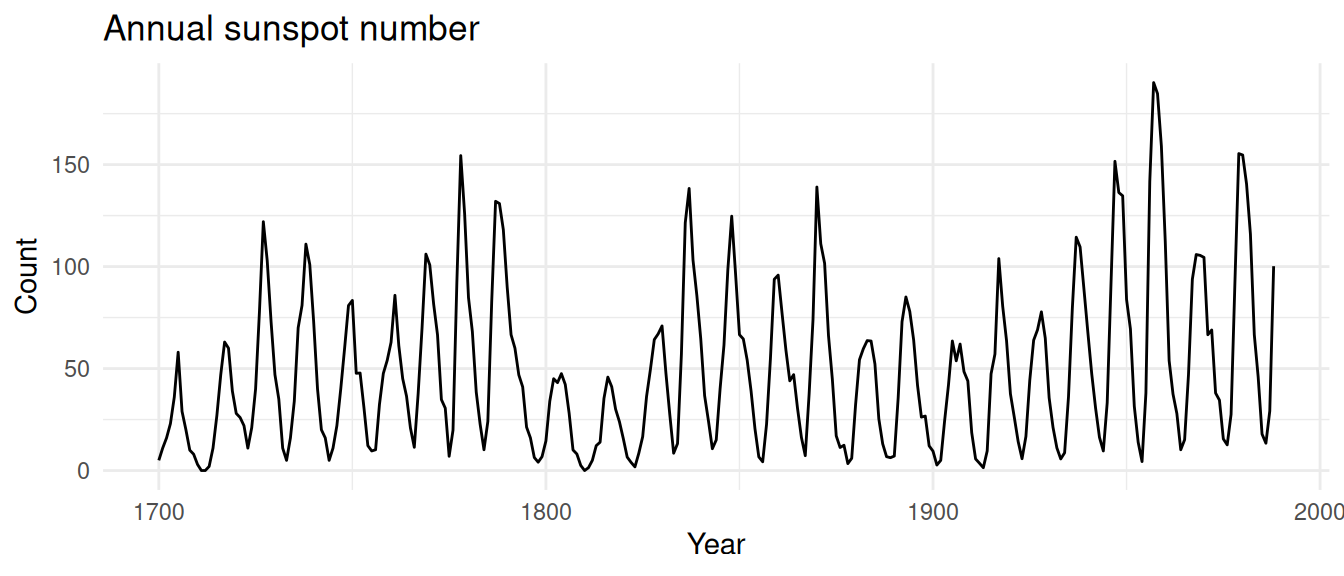
ggAcf(sunspot.year, lag.max = 40) + theme_minimal()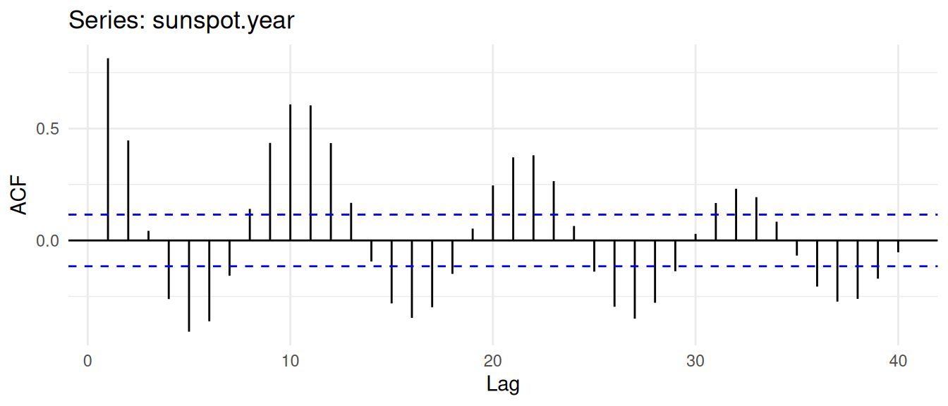
This is autocorrelation of a different character. The series goes up and comes down on a cycle, so the ACF does too: positive at short lags, then negative around half a cycle later, then positive again near a full cycle. A periodic series leaves a periodic ACF. Pulling the dominant cycle out of a series like this is the business of frequency-domain analysis, which gets its own chapter later in the book. We will let sunspots wait for it, because the 11-year cycle is the whole point there, and note here only that a cycling process announces itself in the correlogram.
The ACF and PACF are how you build intuition for the order of a model, and you should always look at them. But you do not have to guess the order by eye. You can select it with a criterion like AIC, which rewards fit and penalizes extra parameters, so it leans toward the simplest model that explains the data well.
Before that, one clarification, because it is easy to blur the ACF and the AR model together. The ACF reports correlations: how strongly \(y_t\) and \(y_{t-k}\) move together. An AR(p) model reports regression coefficients: how much each past value contributes to \(y_t\) once the other lags are held fixed. Correlation measures association with nothing controlled for; a regression coefficient measures a direct contribution with the other predictors accounted for. They are related but not the same, and the aside on correlation versus regression draws the line carefully.
The ar function fits an AR model and picks the order by AIC for you.
arNhtemp <- ar(nhtemp)
arNhtemp
Call:
ar(x = nhtemp)

Coefficients:
     1       2
0.2183  0.3067

Order selected 2  sigma^2 estimated as  1.353
For the New Haven temperatures, ar selects the order that minimizes AIC and reports the coefficients. Compare its choice to the PACF plot above; the formal criterion and your eye should be telling a similar story. The function fits by maximum likelihood rather than the ordinary least squares you are used to from regression. The two give similar answers for an AR model, with maximum likelihood being a touch more efficient in small samples. The help page for ar is worth reading.
We started with the idea that a value in a time series is a regression on its own past, made that precise as the AR(p) model, and built the two plots that read its structure. The ACF measures raw correlation at each lag and decays geometrically for an autoregressive process; the PACF removes the chained-through echo and cuts off at the order of the process. Together they let you look at a series, simulated or measured, and propose a model for the dependence in it.
There is one corner of the AR(p) model we have carefully avoided. Every coefficient we used lived strictly between -1 and 1, and every series came back toward its mean. What happens at the edge? Take an AR(1) and set \(\phi = 1\):
\[ y_t = y_{t-1} + \epsilon_t \]
The pull back toward the mean is gone, because the coefficient doing the pulling is now exactly one. Each shock gets handed forward at full strength and never fades. The series stops forgetting, the variance grows without bound, and the thing wanders off and never settles. That is a random walk, and it breaks the one assumption that everything in the next several chapters depends on: stationarity. So that is where we go next. We have been assuming our series are stationary this whole time without ever saying so. It is time to say what that means, why it matters, and how to tell whether your data have earned it.
The code below simulates four AR(1) series that share the exact same shocks \(\epsilon\) but differ in \(\phi\). Plot each series, then plot the ACF and PACF for each, twelve panels in all. Before you draw them, write down what you expect each to look like, then check yourself. How does the persistence of the series and the decay of the ACF change as \(\phi\) moves from 0.95 down to 0.25?
n <- 100
epsilon <- rnorm(n)
y1 <- y2 <- y3 <- y4 <- numeric(n)
for (i in 2:n) {
  y1[i] <- 0.95 * y1[i - 1] + epsilon[i]
  y2[i] <- 0.75 * y2[i - 1] + epsilon[i]
  y3[i] <- 0.50 * y3[i - 1] + epsilon[i]
  y4[i] <- 0.25 * y4[i - 1] + epsilon[i]
}
As a stretch, reproduce these four series with arima.sim instead of a loop.
Use a loop to simulate an AR(2) series with mean 0 and standard deviation 1. You will need two coefficients, \(\phi_1\) and \(\phi_2\). Start with \(\phi_1 = 0.3\) and \(\phi_2 = 0.5\), then experiment. Plot the series and look at its ACF and PACF. Predict the shapes before you draw them, then interpret what you get, paying attention to where the PACF cuts off. As a stretch, fit your series with ar and see whether it recovers the order and coefficients you used.
I have been lucky enough to work on a project in Alaska studying how returning salmon fertilize the riparian areas around the stream2, a project that involved decades of tossing dead salmon onto the banks3. Through it I came across a detailed record of sockeye salmon escapement at Hansen Creek, a small stream (about 4 m wide and 10 cm deep) in the Wood River system of Bristol Bay, southwestern Alaska. The series gives the total number of salmon returning to spawn each year from 1950 on. The file HansenSockeye.rds comes with the book in the data folder; read it with sock <- readRDS("data/HansenSockeye.rds").
Look at the series and its autocorrelation. As a hint at what drives it, sockeye spend two to three years in the ocean plus one to two in fresh water, returning to spawn at age three to five, and otoliths from Hansen Creek suggest most return at age four. What does that life history lead you to expect in the ACF and PACF, and does the record bear it out? What does the intersection of the fish ecology and the time-series structure tell you?
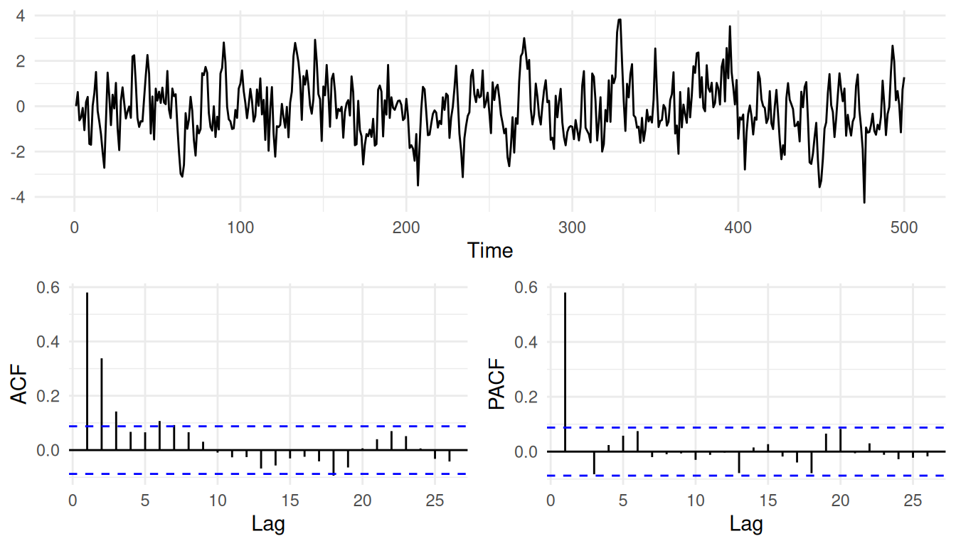
You will often want a series and its ACF and PACF in one figure. Here is a compact way to do it with gridExtra, which you can lift into your own work.
n <- 500
phi <- 0.6
epsilon <- rnorm(n)
y <- numeric(n)
for (i in 2:n) y[i] <- phi * y[i - 1] + epsilon[i]

layoutMat <- matrix(c(1, 1, 2, 3), nrow = 2, byrow = TRUE)
p1 <- ggplot(tibble(t = 1:n, y), aes(t, y)) +
  geom_line() + labs(x = "Time", y = NULL) + theme_minimal()
p2 <- ggAcf(y) + labs(title = NULL) + theme_minimal()
p3 <- ggPacf(y) + labs(title = NULL) + theme_minimal()
grid.arrange(p1, p2, p3, layout_matrix = layoutMat)